
Select a product:
Introduction to LLM AI Charts and Maps for Power BI
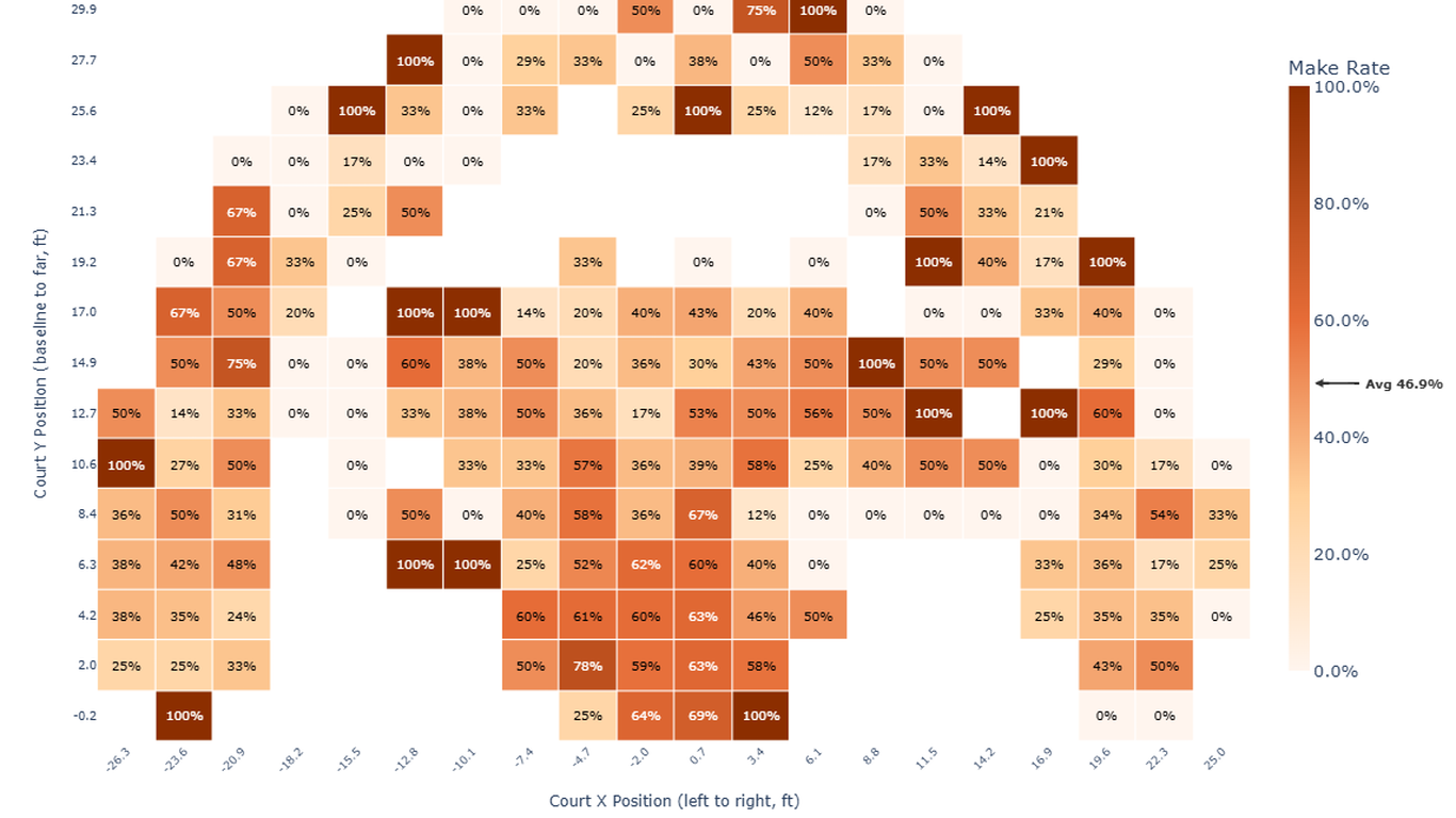
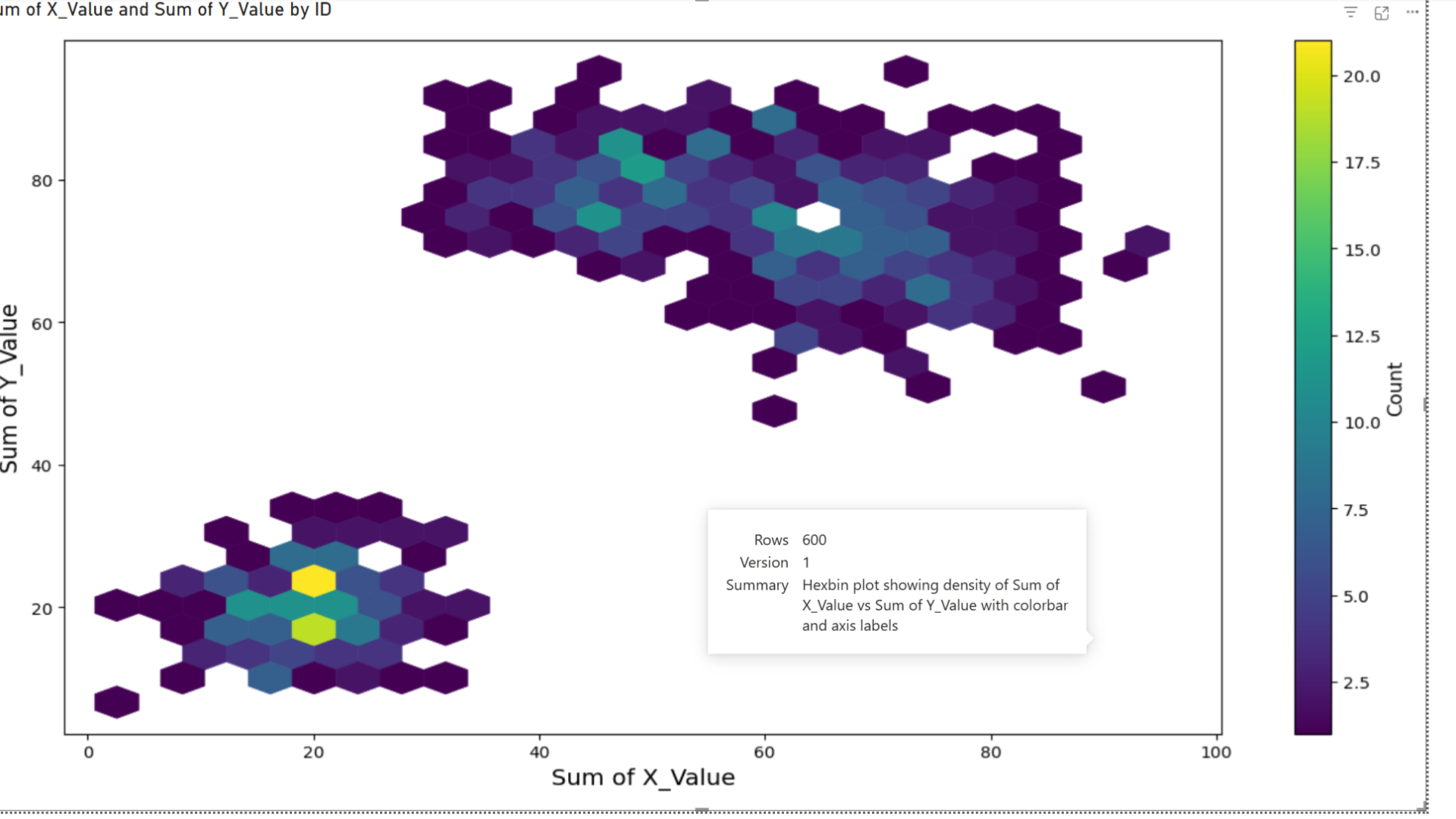
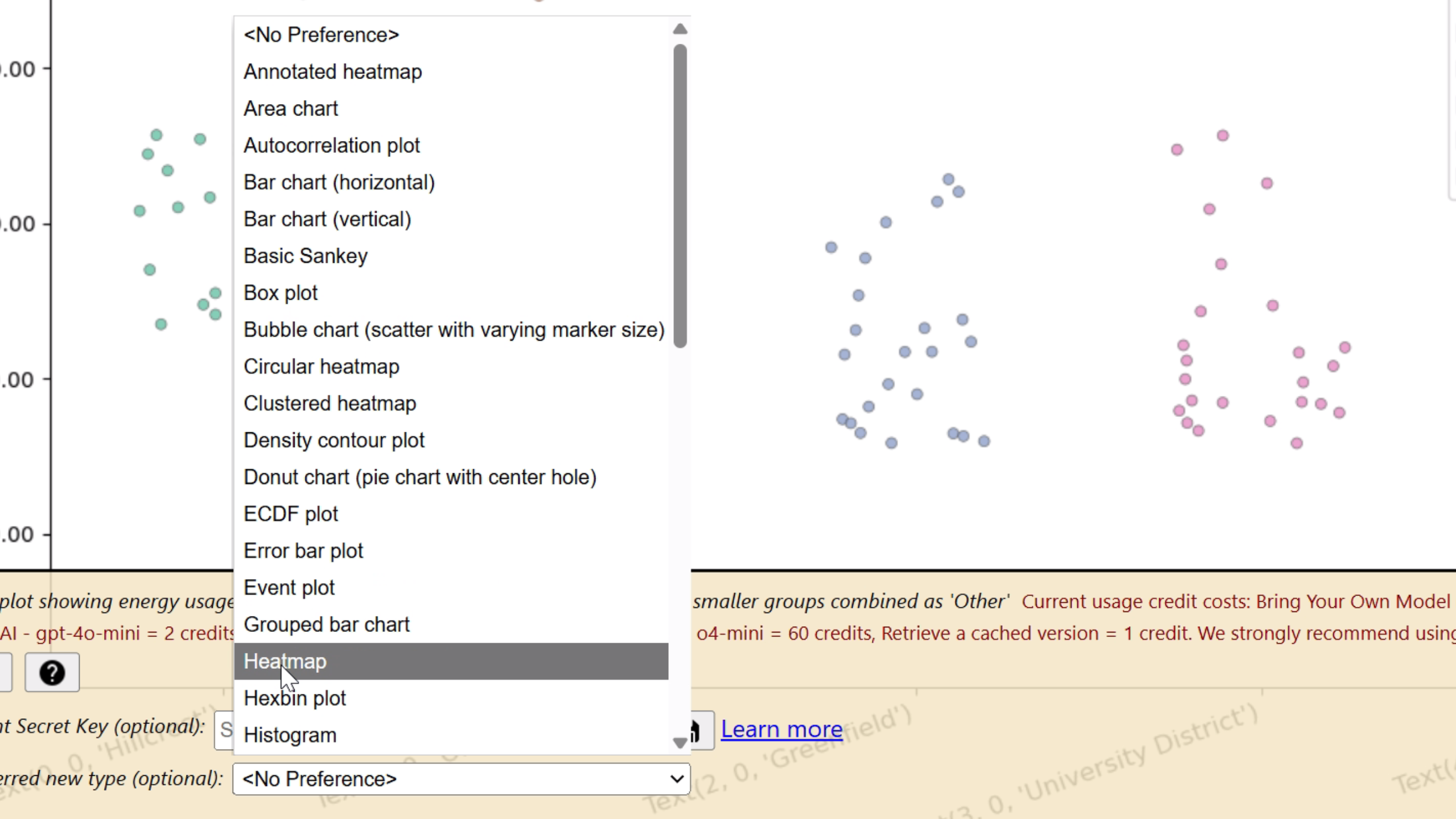
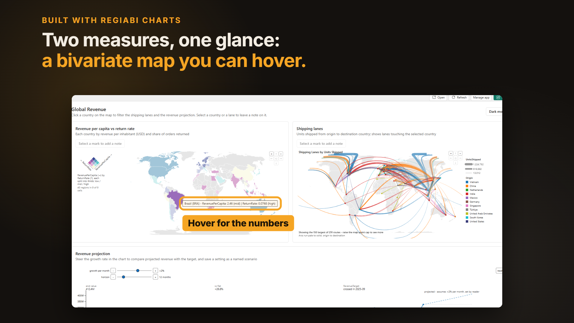
Table of Contents
- Introduction
- Licensing Setup
- Source Data Concepts
- Data Wells & the Virtual Table
- Chart Catalog
- Useful Client Settings
- Interactivity & Cross-Filtering
- Account Settings
- An Example of Iterative Development
- History Search
- Keys and Credits
- Unlocking & Offline / Air-Gapped Use
- Models and Privacy
- Setup Bring Your Own Model
- Frequently Asked Questions
Introduction
Make Generative AI for Charts and Maps Better.
That is what RegiaBI is for. LLM AI Charts and Maps for Power BI is RegiaBI inside your reports.
Most traditional Power BI visuals work by following rigid layout rules that determine how to draw lines, shapes, and text. These visuals expect you to provide source data in very specific ways (for example, explicitly mapping fields to the X or Y axis).
LLM AI Charts and Maps for Power BI is different. Instead of rigid rules, it allows you to provide a list of fields related to what you want to render, and the AI can self-identify:
- What type of chart makes sense, given the data
- How to best format the chart
This flexibility lets you explore potentially many different ways of rendering your data.
Three ideas run through the whole experience:
- Interactive – when the AI renders with one of the live interactive engines, the chart is not a flat picture. Clicking a bar, slice, point, node, or cell cross-filters the rest of your report, the selected marks highlight while the others dim, hovering reveals tooltips, and legends can cross-filter too. (A static Python image is also available when you'd rather have a fixed picture.)
- Insightful – every version carries a short, AI-written description of what it chose and why (chart type, derived measures, non-default aggregations). That summary shows in the hover information panel, can be pinned as a one-line caption under the title, and is searchable across your version history. The AI can also add derived measures that it thinks are useful, and you can ask it to add more or remove them. The AI can also add annotations and other chart elements like trend lines, forecast ranges, and reference lines. Settings can control much of this behavior, or you can ask for changes in plain English.
- Configurable – beyond plain-English prompting, a rich set of settings lets you steer results repeatably: favor a chart family, cap to a "top N", fix a date grain, pick the render engine, tune cross-filter dimming and the selected-mark glyph, choose the tooltip source, and more. And for the deepest control, advanced users can edit the generated chart code by hand — an Edit code-behind button opens your chart's Python or JavaScript in your account for true fine-tuning. This is entirely optional and aimed at those comfortable with code; you never need to touch it to use the visual.
You can then take the output generated by the visual and ask the AI to make adjustments using plain English. From simple requests like "make the legend smaller" to larger changes like "add a forecast range", you can quickly refine the chart toward your ideal layout.
How it works: The visual uses Large Language Models (LLMs). You can connect in one of three ways:
- Freemium – the lowest-friction starting point. No account, no payment, no setup. Each visual instance gets a per-instance usage budget (a finite credit grant); once exhausted, you'd start a fresh instance in another report or move to a paid license. Designed for evaluation.
- Use our hosted LLM service (routed through Microsoft Azure AI Foundry, with some models accessed via the provider's native API) – fast to start, no LLM setup required. Hosted models span a range of cost and quality tiers; the live list (with the current default highlighted) appears under Models and Privacy below, and the visual's own model picker always shows what's available to you. Usage credits from your organizational license cover the hosting cost, billed per token consumed (so cost scales with model choice, request size, and complexity).
- "Bring-Your-Own" (BYO) – use your own API key against your own provider account. Supported providers: Anthropic, OpenAI, and Azure OpenAI. In BYO mode you pay your provider directly for tokens consumed; we charge a small flat operating fee per request from your BIC credit balance.
Privacy: The visual transmits dataset shape (column names, types, and aggregate statistics like distinct count, min/max, mean), any commentary or per-field descriptions you have entered, and a limited sample of dataset rows used for chart-code execution. The dataset shape is safe-by-construction (aggregates only, no raw values), but commentary, descriptions, and the row sample are transmitted in the clear. Avoid placing personally identifiable information (PII) or other sensitive data into the dataset, commentary, or field descriptions. You can preview the exact payload before sending it via the "See what's sent" link on the visual's landing page (see Models and Privacy). See the LLM AI Charts and Maps for Power BI Privacy Policy for the full data-flow breakdown.
Reliability: The visual does not guarantee that every request will produce a usable chart on the first try. Results may vary, and sometimes charts may render poorly or not at all. In such cases, re-issuing the request or adjusting the instructions usually leads to improved results. Built-in settings can also help guide the LLM toward better solutions.
Versioning: Every render request is recorded in history. By signing into your bizintelligencechampions.com account, you can view past versions, revert to earlier ones, and manage your usage credits. All requests carry an associated version number.
Licensing: For sustained use, a bizintelligencechampions.com account with an active organizational license is recommended. A free account includes a 21-day trial license key and usage credits, issued as soon as you confirm your email address, so you can test the visual in your own environment. After the trial, you can continue with a month-to-month subscription or choose a longer-term discounted plan. The freemium mode above lets you try the visual without creating an account first. The visual requires an internet connection and uses external data access – meaning it cannot be Power BI Certified. Generating charts requires connectivity, but once you unlock a specific version it will render indefinitely, including in offline / air-gapped deployments.
Rendering: Depending on the chart type and library the LLM picks, your chart may render as a static image (matplotlib / seaborn via Python) or as an interactive chart (D3, an interactive Python engine, or a custom visual layer). Rendering is performed client-side – LLM-generated code executes in your browser via sandboxed runtimes (pyodide for Python, an inline Function constructor for JavaScript, or direct DOM rendering for HTML). Once the layout is determined, charts redraw quickly when model data changes.
Licensing Setup
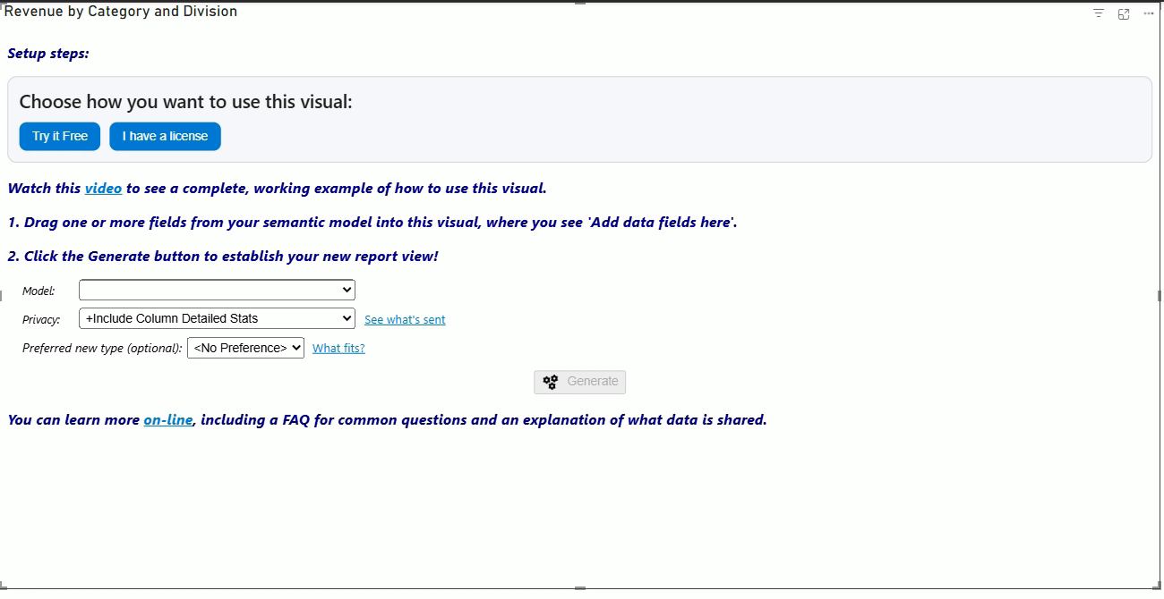
Everything license-related happens on the visual's landing page — there is nothing to enter in the Power BI format pane. The first time you add the visual to a report, it asks how you want to use it:
- Try it Free — freemium mode. No account and no key needed; you get a limited AI budget per visual instance to see what it can do. It is a limited preview rather than a trial — see what freemium leaves out just below.
- I have a license — opens an entry panel right on the landing page where you type (or paste) your licensee name, license key, and optionally a client secret. The visual verifies the details against your account the moment you save, so a typo tells you immediately instead of failing on your first Generate.
What freemium leaves out. Freemium is not a time-limited version of the full product — it is a deliberately reduced path, so that trying the visual costs you nothing and costs us little. Knowing what is switched off matters, because a chart you judge on freemium is not the chart a license produces:
- One attempt per chart. A licensed generation that produces something the quality checks reject is retried automatically; a freemium one is not.
- Lighter proofreading and reasoning. The final polish pass runs far less often, and the model is asked for its most conservative reasoning: it does not think through the problem first, and runs at the lowest effort setting it offers. On harder charts that is the difference you would notice.
- No prompt of your own. Freemium ignores the text box — you get the engine's own choice of chart, not the one you asked for in words.
- A watermark, and a hard stop once the instance's budget is spent. There is no second allowance per visual.
Everything above is lifted by a license — including the free trial key that comes with confirming an account, described next.
Where does a key come from? Creating a bizintelligencechampions.com account and confirming your email address gets you a trial key good for 21 days — a much larger allowance than freemium, with access to the full model catalog. Purchased licenses appear in the same place on your account page. Entered details are remembered by the visual; if you ever need to switch accounts or keys, use the Change license key link that appears on the landing page once a license is saved.
You do not need to change your reports to use a new license key, when a new key gets added to your account, which happens if you renew your organizational license - either automatically on a monthly or annual subscription, or by purchasing a fixed-term extension (e.g. 2 year, 5 year). As long as the key used in your reports refers to an account that has a non-expired key, your reports will work.
We encourage you to use the client secret key option, in addition to your license details — it's entered in the same landing-page panel. This increases the level of protection for your account (including usage credits).
One more thing worth knowing: our sample / demo PBIX files use pinned versions, so they render fully — interactivity included — with no license at all. To generate new versions from a sample's data, enter your own license details.
Source Data Concepts
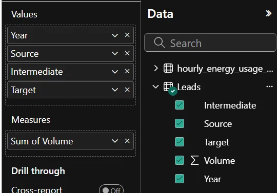
- Values – fields that describe each row (text, dates, or numbers — categorical or continuous are both fine).
- Measures – DAX measures, evaluated within the grain set by your Values and Group by fields (calculated based on that context, page filters, etc.).
- Group by – optional. One to three fields that define the primary grouping (series / breakdown) for the chart. These become the leading hierarchy levels, enabling group-level highlighting, drill-through, and tooltips.
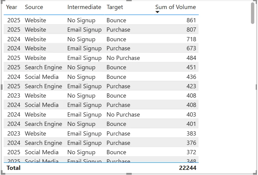
A key concept — granularity. The fields you place in Values and Group by together set the granularity (level of detail) of the data: each unique combination of their values becomes one row. Anything in Measures does not change the granularity — instead, each measure is calculated at that grain, producing one value per row. So if you want finer or coarser detail, add or remove fields in Values / Group by; the Measures well only adds numbers computed against whatever grain those fields define.
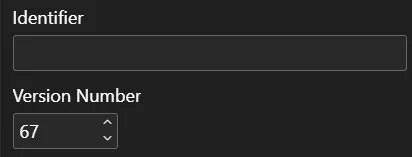
Every unique combination of data fields — and optionally an Identifier (configured in Settings) — is associated with a version number.
- Automatic increment: Generating a new chart while in Edit mode automatically increments the version number.
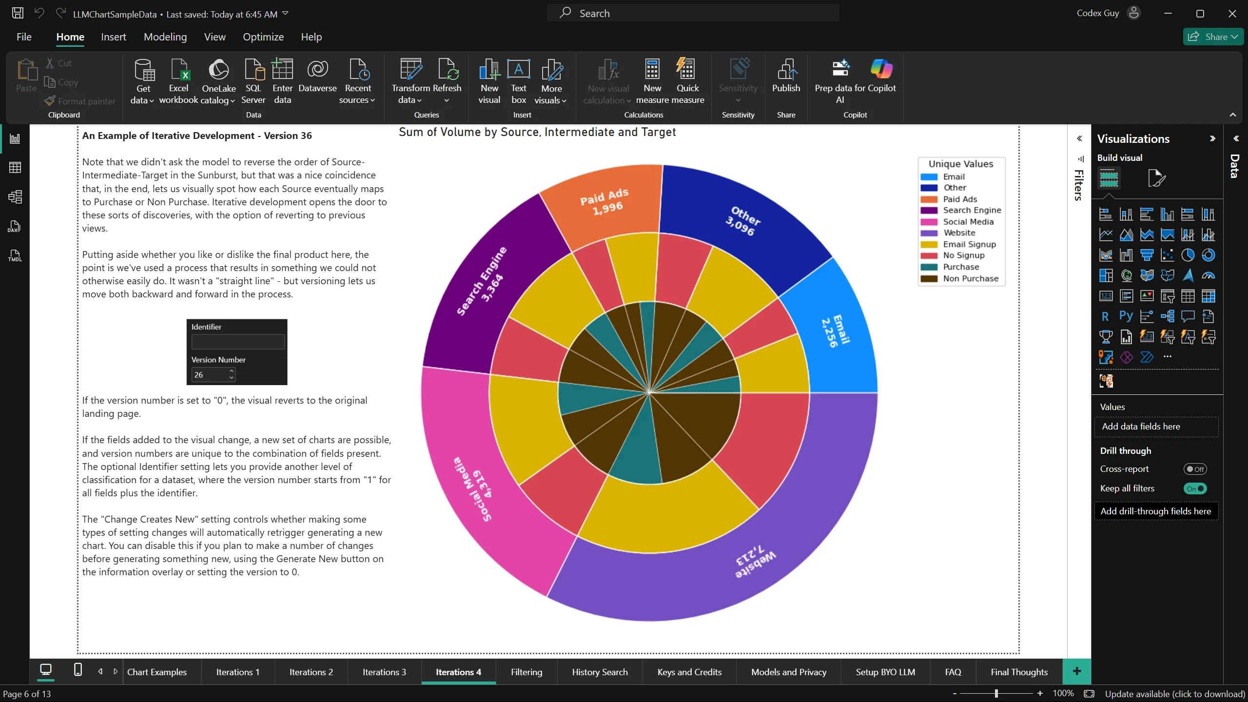
- Revert to previous versions: If you change the Version setting to a lower number, the visual will retrieve and redraw the chart logic for that version, provided it was a successful version. (Versions are always in the context of the choice of fields you are using.)
- Failed versions: A generation attempt that encounters an error still creates a version number, but failed versions cannot be used for rendering.
- Version 0: Setting the version number to "0" places the visual back into its landing page state (like it was when first added to the page).
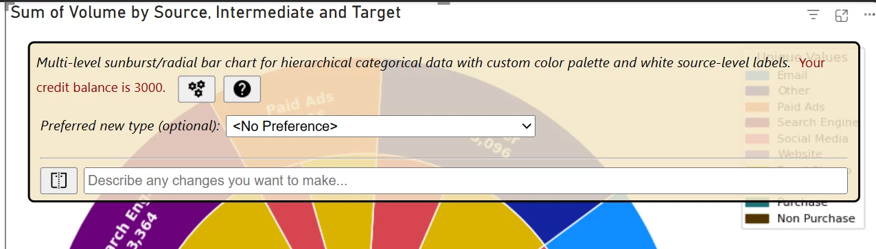
Another important feature is the information panel. You can make this panel appear by clicking on the chart surface, both in Edit and View modes.
In the above example, we're in Edit mode where additional options are available. From here we can optionally pick an explicit chart type and generate a new version based on that. We can also set the client secret code value (see "Keys and Credits" for more). Finally, we can ask for a new chart version that applies explicit changes that are requested using a prompt. (This is entered the lower text box.)
In v2, the information panel also talks back while you're editing — this is a big part of what makes the visual insightful:
- A reply to your last request, marked ✓ (did what you asked), △ (did it partially), or ✗ (couldn't, with the reason). This is how the visual explains itself when, for example, it chooses a different chart type than you requested because your data doesn't support it.
- An improvement suggestion (💡) — forward-looking advice, such as adding a typical dimension or measure that would unlock a richer chart.
- A rotating "Did you know?" tip highlighting a feature or setting you might not have discovered yet.
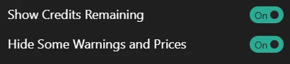
These author-facing messages show in Edit mode only (a report's viewers don't see them) and can be turned off with the Hide Some Warnings and Prices setting.
Data Wells & the Virtual Table
The single most useful thing to understand about this visual: it never sees your underlying table. When you add fields to the Values and Measures wells, Power BI builds a virtual table behind the scenes — one row per distinct combination of the Values-well fields, with each Measures-well field aggregated per combination — and that is the data the visual (and the AI) works from. Which fields you put in which well therefore decides which chart types are even possible.
Why should you care? Because the virtual table is a hard boundary the AI cannot see past. The model never connects to your semantic model — it works only with what crosses the wells. If detail was aggregated away, collapsed as a duplicate, or simply never added, no amount of clever prompting can recover it: ask for a "distribution of individual amounts" when only per-category sums came through, and the request doesn't fail loudly — you just get the best chart the data can support, which may not be the chart you meant. AI adds intelligence on top of your data; it cannot add data. Get the grain right first, and everything downstream — the suggestions, the chart choice, the chart itself — gets smarter.
Let's make that concrete with a small example table — 20 rows, two categorical columns
(Region, Product), one numeric column (Amount), and an
identity column (ID):
| ID | Region | Product | Amount |
|---|---|---|---|
| 1 | North | Alpha | 120 |
| 2 | North | Alpha | 145 |
| 3 | North | Alpha | 120 |
| 4 | North | Alpha | 180 |
| 5 | North | Beta | 95 |
| 6 | North | Beta | 210 |
| 7 | North | Beta | 155 |
| 8 | North | Gamma | 300 |
| 9 | North | Gamma | 240 |
| 10 | North | Delta | 75 |
| ID | Region | Product | Amount |
|---|---|---|---|
| 11 | South | Alpha | 130 |
| 12 | South | Alpha | 160 |
| 13 | South | Beta | 88 |
| 14 | South | Beta | 120 |
| 15 | South | Beta | 175 |
| 16 | South | Beta | 96 |
| 17 | South | Gamma | 260 |
| 18 | South | Gamma | 205 |
| 19 | South | Gamma | 330 |
| 20 | South | Delta | 140 |
Scenario 1: just the two categoricals
Add only Region and Product to Values. The virtual table
collapses to the distinct combinations — eight rows, and that's all the visual sees:
| Region | Product |
|---|---|
| North | Alpha |
| North | Beta |
| North | Gamma |
| North | Delta |
| South | Alpha |
| South | Beta |
| South | Gamma |
| South | Delta |
What can you expect? Honestly — not a lot. There is no magnitude anywhere: no measure, and every combination appears exactly once, so even an inferred "count" is 1 for every row. Checking this shape against the engine's actual eligibility rules, about two dozen structural chart types remain on the table (bar/pie/donut families, Treemap, Sunburst, Sankey, Network, heatmap-style grids…) — but each can only show which combinations exist. Everything that needs a number is off the menu: no distribution charts (Box, Violin, Histogram…), no Scatter, no Line, not even a Card. If a generation from a shape like this looks thin, this is why.
Scenario 2: add the ID column
Now add ID to Values as well. Because every ID is unique, the virtual table
stops collapsing — all 20 rows survive (the two tables above, minus Amount).
That changes everything: the visual can now infer a count — four Alpha rows in the
North, one lonely Delta — and the eligible list more than doubles (23 → 52 types in a
back-check against the real rules). The distribution and raw-observation families open up
(Box plot, Violin, Beeswarm, Histogram, ECDF, Event plot…), plus Card, Waterfall, and
others that need a magnitude. The ID's job here isn't to be plotted — it's to preserve the
grain so counting means something.
Scenario 3: a numeric in the Values well (raw grain)
Remove ID and add Amount to Values (not Measures). The virtual
table is now the distinct (Region, Product, Amount) triples — 19 rows, not
20: rows 1 and 3 (North / Alpha / 120) are identical, so they collapse into one. Probably not
what you intended — but this shape genuinely has a job: it keeps the individual numeric
observations, which is exactly what distribution analysis wants. A Box plot, Violin, or
Beeswarm of raw Amounts per Region or Product is only honest at this grain — aggregated data
can't show spread. The collapse is the trap to remember: identical observations silently merge, so
if duplicates are legitimate in your data, keep an ID column alongside to protect the grain.
Scenario 4: the numeric in the Measures well
Move Amount to Measures instead. Now its nature changes: Power BI
aggregates it per combination of the Values-well fields — you pick the mechanism
(Sum, Average, Min, Max…) or supply a DAX measure. The virtual table is back to the eight
combinations, each carrying one calculated number:
| Region | Product | Sum of Amount |
|---|---|---|
| North | Alpha | 565 |
| North | Beta | 460 |
| North | Gamma | 540 |
| North | Delta | 75 |
| South | Alpha | 290 |
| South | Beta | 479 |
| South | Gamma | 795 |
| South | Delta | 140 |
This is the natural shape for comparison charts, and the AI has real magnitudes to work with: the bar families, Lollipop, Pareto, Treemap and the hierarchy family, Heatmaps with true values, Waterfall, Marimekko, Sankey with weighted flows, and so on. One nuance: some distribution types may still be offered on a small aggregated shape like this, but they'd only ever see one value per combination — the picker weighs that, and now you know why a "distribution of sums" is rarely the right ask.
A final, subtle point: aggregation also changes the implicit row count. In Scenario 2 the
visual could infer "four Alphas in the North" from the grain itself; here every combination is
one summary row, so that inference is gone. If the count matters to your story, add an explicit
DAX count measure (e.g. Rows = COUNTROWS('Sales')) to the Measures well alongside the
Sum. In our back-check that second measure opens the door further (52 → 58 types) — the
two-measure family: Scatter, Regression with confidence interval, Joint plot, Polar, Multiple
line, and the multi-KPI Card.
Eligibility lists above were verified against the engine's actual chart-type rules as of July 2026; the catalog grows regularly, so treat the counts as illustrative rather than contractual.
Chart Catalog
The engine can render every chart type in its catalog. You don't pick from this list directly — you describe what you want (or simply let the AI decide) and it chooses the best fit for your data's shape. This catalog is generated live from the engine's current chart metadata, so it always reflects what's actually available in the deployed build.
Every type is there with a picture, what it's good for and the data it works best with, and you can search and filter the list.
Useful Client Settings


- Consume usage credits.
- Produce a chart that is not saved. (I.e. if the page is refreshed, the saved chart will return to view.)
- Is not guaranteed to be what you prefer to present.
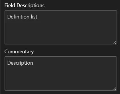
- Is not open to additional prompting by the viewer. (It does use your prompting through the Commentary and Field Definitions settings.)


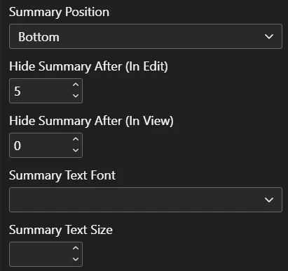
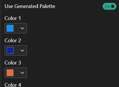
The visual controls what's inside the visual — not its container. Container-level formatting — background, border, shadow, padding — belongs to Power BI's standard format pane (under General → Effects), and neither the visual nor the AI can change it. No prompt can reach it: it sits outside the boundary the visual is allowed to touch.
The most common surprise this causes: a solid background where you expected transparency. Rendered charts default to a transparent background, but the container's own Background toggle is a separate Power BI setting — if it's left On, Power BI paints a solid fill behind the chart, and the visual can't do anything about it on its own. Asking the AI for "a transparent background" won't help either — the render already is transparent. The fix is in the format pane: General → Effects → Background — switch it off (or raise its transparency to 100%).
The flip side is worth knowing too: container settings are also how you add polish that the AI deliberately leaves alone — a card-style border, rounded corners, a drop shadow. Our demo reports get their "card look" exactly this way.
Interactivity & Cross-Filtering
One of the things that sets LLM AI Charts and Maps for Power BI apart from a typical "AI image" tool is that most of its output is live, not a flat picture. How interactive a chart is depends on the render engine the AI picks (or that you pin with the Render Type setting):
- Static Chart (Python) – a fixed image (matplotlib / seaborn). No hover, tooltips, cross-filter, or selection. Best when you want a guaranteed, pixel-stable picture.
- Interactive (Plotly), Interactive (D3) – live charts with click-to-cross-filter, hover tooltips, and selection highlighting. Plotly suits standard statistical charts; D3 covers more bespoke / custom layouts.
- Leave to visual (default) – lets the engine choose the best renderer for your data and chart type.
Click to cross-filter. On an interactive render, clicking a mark — a bar, slice, point, cell, Sankey node, etc. — filters the rest of your Power BI report to that selection, just like a native visual. The marks you selected stay vivid while the others dim back, so the focus is obvious at a glance.
Selection Dim Opacity (%). Controls how far the non-selected marks fade when you cross-filter (1 = nearly invisible, 100 = no dimming). The default of 25 applies uniformly across heatmaps, bar / scatter / line, pie / treemap / sunburst / funnel, Sankey, and D3 charts.
Selected Mark Glyph. Optionally place a small high-contrast glyph (a Dot or Check) on each selected mark. This is off by default — most charts read fine on dimming alone — but it helps when marks are pale or light-coloured (for example an already-pale heatmap cell) and the dim is hard to see. It is automatically suppressed on flow / relationship and distribution-shape charts (Sankey, Chord, Arc, line, area, box, violin), where the highlight already makes the selection clear.
Tooltips. Hovering a mark on an interactive render shows a tooltip. The Tooltip Source setting chooses where that content comes from — Auto (default), the Visual (Power BI's own tooltip), or the Chart (the tooltip the generated chart code builds).
Plotly-specific controls. For Plotly renders you can additionally:
- Plotly Legend Click Behavior – clicking a legend entry can Cross-filter (default), hide/show the trace (Plotly's own default), or be disabled.
- Plotly Sankey Node Behavior – Sankey nodes can be Click to cross-filter (default) or Drag to rearrange.
- Show Plotly Toolbar – show Plotly's hover toolbar (zoom, pan, box / lasso select, autoscale, reset). Drag-to-zoom and single-click cross-filter work either way.
Drill-through and group highlighting. Fields placed in the Group by well become the chart's leading hierarchy levels, which is what enables group-level highlighting, drill-through, and richer tooltips on grouped / hierarchical charts (e.g. treemap, sunburst).
Note: cross-filtering and selection require an interactive renderer. If a chart came back as a static Python image and you want it clickable, set Render Type to one of the interactive options (or Leave to visual) and regenerate.
Account Settings
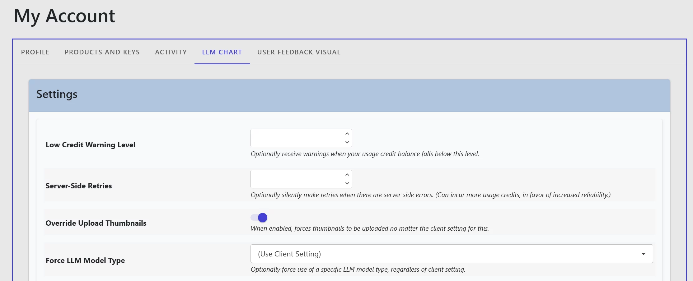
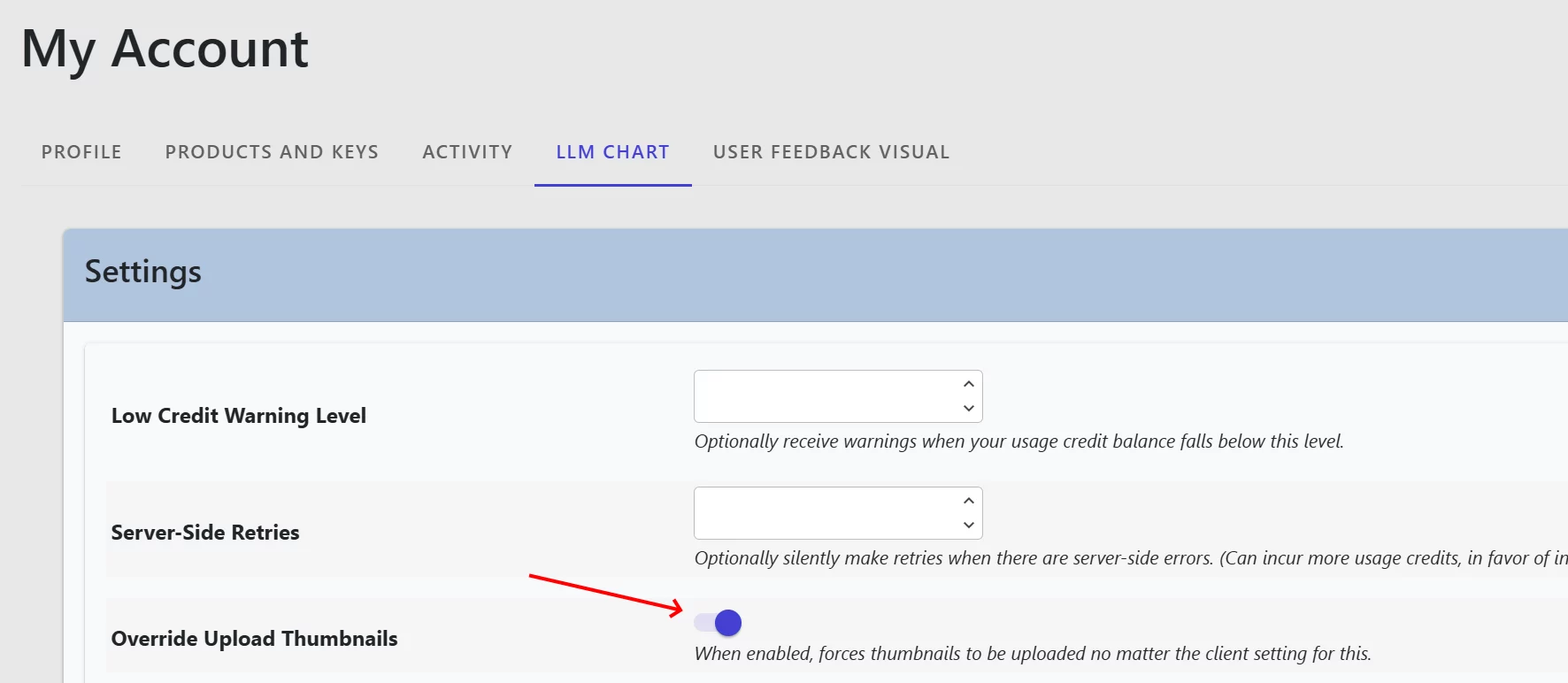
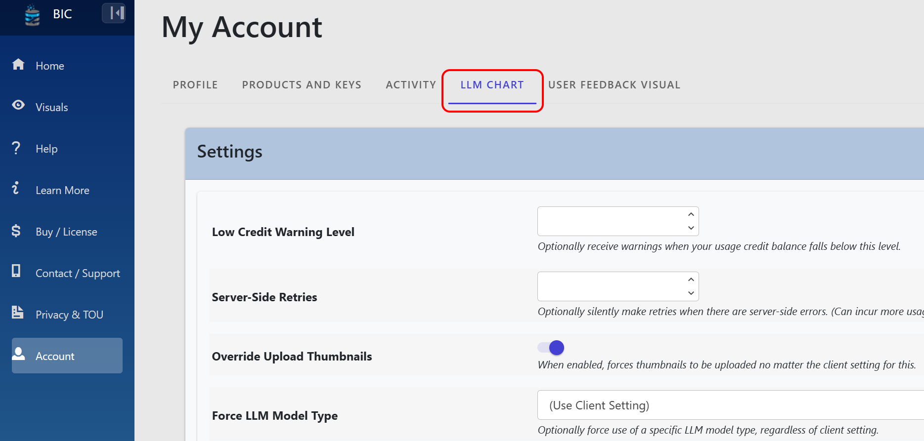
- Low Credit Warning Level. Get an alert if your usage credits drops below a level that you can choose.
- Server-side Retries. Similar to the client-side retry setting, this can help catch certain types of errors and retry them silently. This may use additional usage credits, depending on the type of error.
- Override Upload Thumbnails. When disabled, the option to upload thumbnails is based on the client setting Save Thumbnails. When enabled, it will ignore the client setting and save thumbnails for all instances of the visual, for your account.
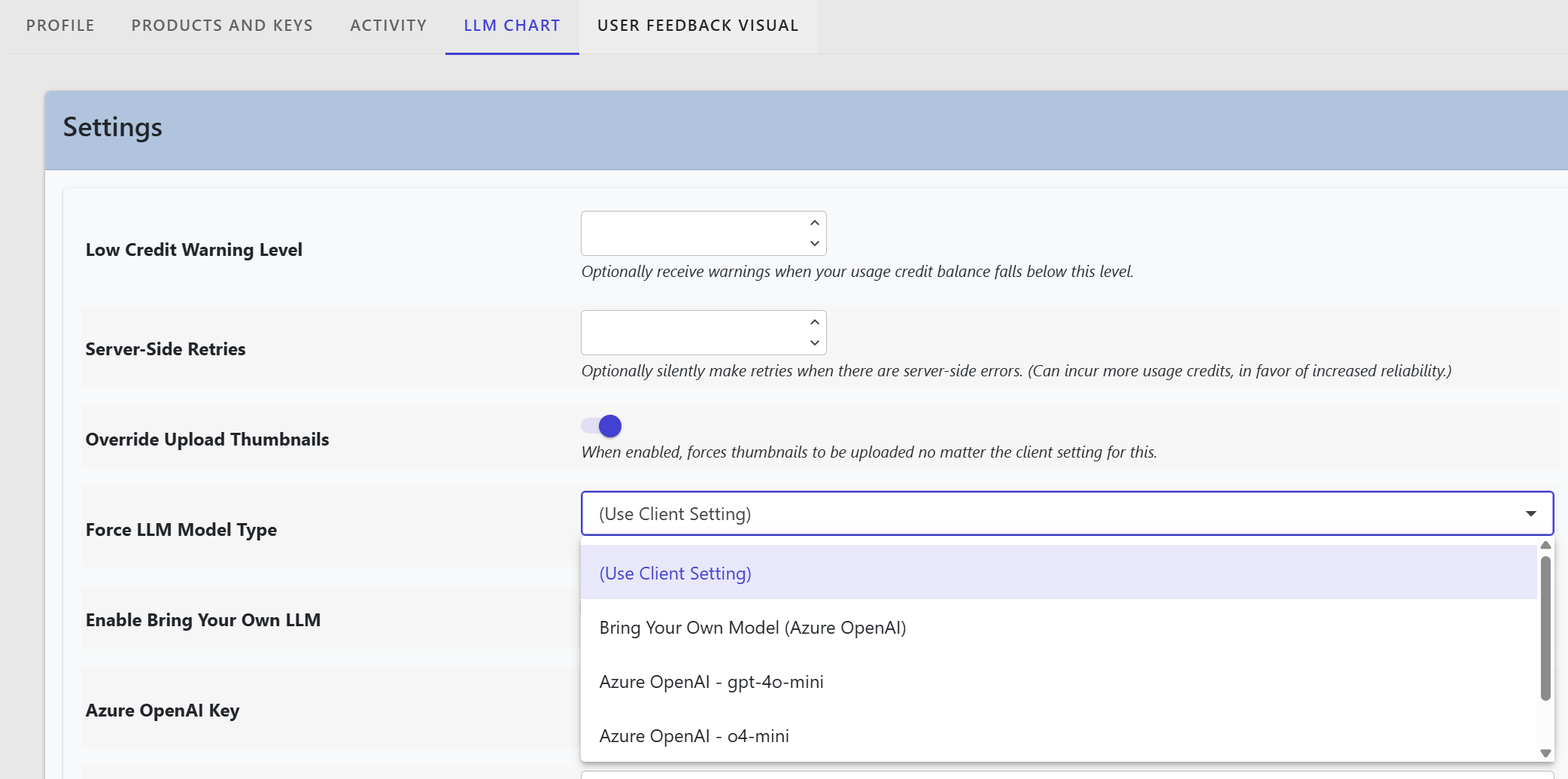
- Force LLM Model Type. This is a way to override any client-side selection of model type. If you have developers who will be able to change the model type setting on the client, this is a way to make an account-level decision to stick with a particular LLM model. This can make it simpler for developers but also potentially control costs better, since you can identify the cost (e.g. usage credits) across all instances of LLM AI Charts and Maps using your account.
An Example of Iterative Development
History Search
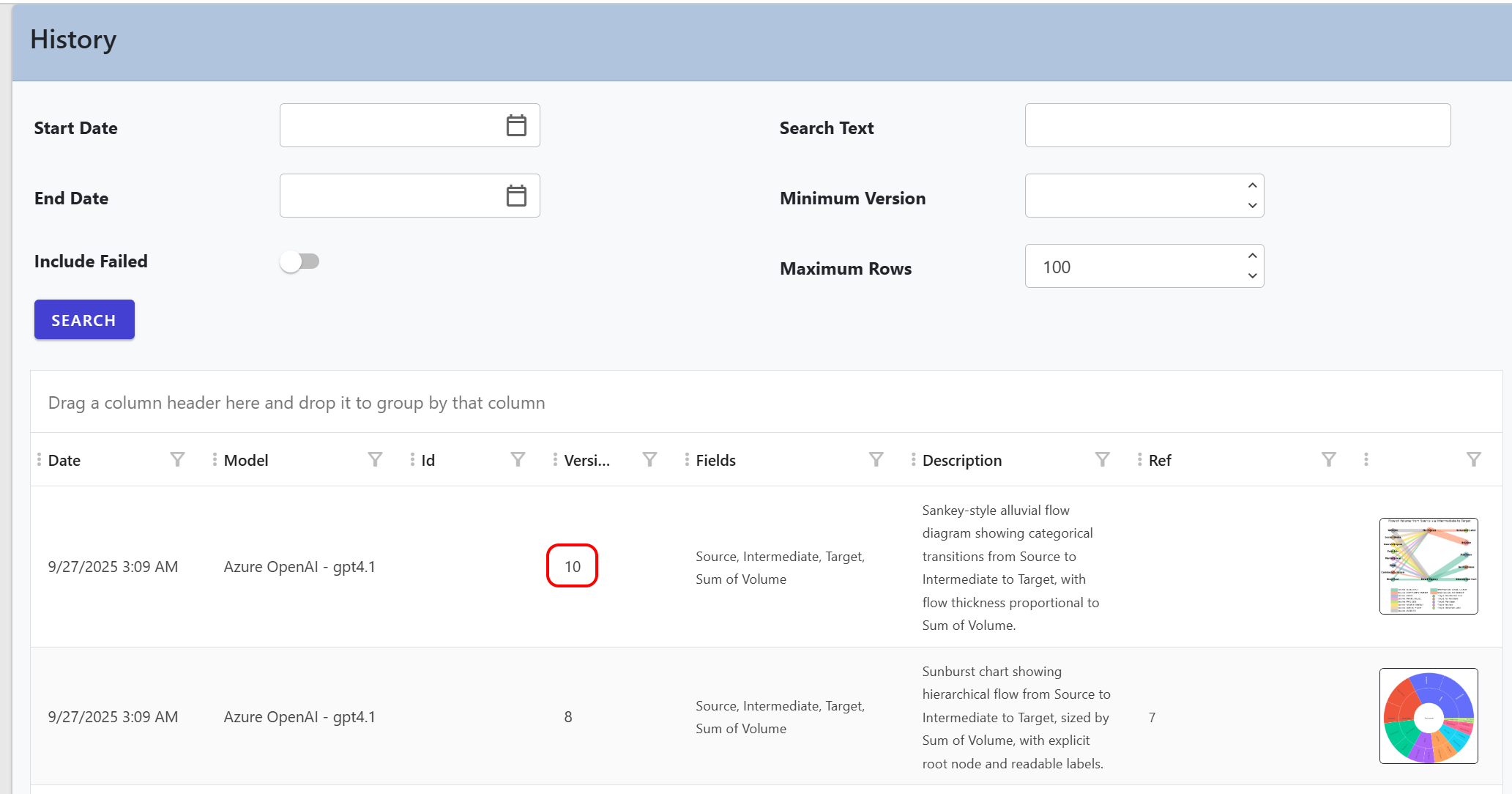
There are two sections: search criteria and results. For search criteria, you can use:
- Start Date, End Date. You can express this in local time. This compares to the date and time the version was recorded.
- Text. This text is wild-card compared against fields and the description text.
- Include Failed. Normally you shouldn't need to see failed versions, but you can optionally enable this to identify facts like when they happened.
For search results, you can see:
- Date. This is expressed in your local time.
- Identifier. If you used an identifier and at least one version has a non-blank value, this will be shown.
- Version. This is the all-important version number that can be set in the client-side settings.
- Fields. All data fields that participated in creating the listed version are shown here. The field list plus identifier form a unique "request group" that has its own version numbering, starting at "1". You can't "cross over" and start using a version for a different set of fields and/or identifiers.
- Description. This is generated by the LLM as a summary of what it did, to create the chart layout.
- Ref. If you generated the version based on another existing version, this provides a reference to the source version number. This helps paint a picture of version lineage.
- Thumbnail. If you've enabled thumbnails, this helps remind you of what the resulting chart looked like.
Keys and Credits
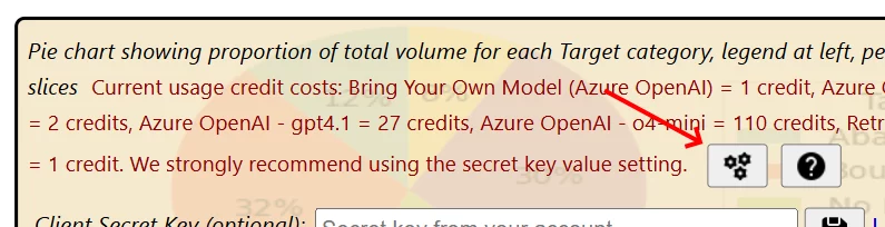
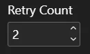
- Generating a new version: charged per request based on the number of tokens the language model processes — both the input (your dataset shape, any commentary and field descriptions, and a sample of rows) and the output (the generated chart code and its summary). The richer the request and the more capable (and costly) the model, the more tokens are consumed and the more credits the request uses. Each attempt is counted, so a request that retries (see the Retry Count setting) consumes the tokens for each attempt. A small per-request minimum applies, so even a tiny request costs at least one credit. Because this is token-based, there is no single fixed price per chart — cost ranges with your data size, prompting, model choice, and how many attempts are needed.
- Loading an existing version: a small flat charge per load (no language-model call is made, so no tokens are consumed). This applies only when a version must be fetched from our services — not during a report load or refresh in View mode, since versions are cached.
- Bring-Your-Own (BYO): when you use your own Anthropic, OpenAI, or Azure OpenAI / Azure AI Foundry account, your provider bills you directly for the tokens consumed. From your BIC balance we charge only a small flat operating fee per request — the token cost itself does not come out of your BIC credits.
You can find the latest rates and worked examples on the usage credits price list.
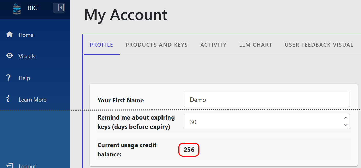
You can check your credit balance in both your Account Profile and within the visual (tooltip and information overlay). You may also set a credit warning level to receive an email alert when your balance drops below a threshold you choose.
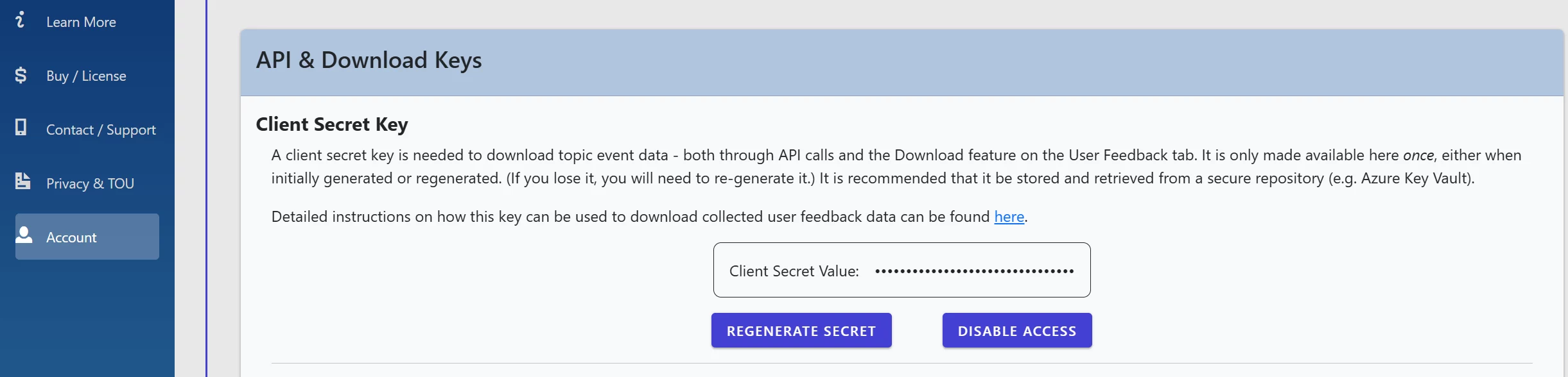
For added security, the visual allows you to set a Client Secret Key:
- Generate this key from Account Profile → Product and Keys → API and Download Keys.
- The key expected in the visual is your account’s API key.
- Note: You can only set this key inside the visual on the landing page or information overlay (not in settings) — it is never displayed for security reasons.
- If your account has an API key enabled, you must configure it as the Client Secret Key in the visual.
Unlocking & Offline / Air-Gapped Use
Normally, loading a saved version asks our service for the rendering logic, and the visual checks in with us to confirm your license. Unlocking changes that for a specific chart version: it is a one-time action (a credit charge, taken once for that version) that permanently licenses that version to you.
Once a version is unlocked:
- It loads for free. Re-displaying an unlocked version doesn't consume further credits — you've already paid to unlock it.
- It keeps working indefinitely. The visual carries a cryptographically signed proof of the unlock, so that version continues to render even after your organizational license has lapsed. (You still need a current license to generate or unlock new versions.)
- It renders offline — including air-gapped. Because the signed proof can be verified locally, an unlocked version draws even when the visual can't reach our servers at all. Versions that haven't been unlocked are blocked when we're unreachable.
This is the supported path for environments with no outbound internet access. You can't create a chart air-gapped (generation needs to reach our LLM service), but you can do your design work where there is connectivity, unlock the specific versions you want to keep, and then deploy that report into an air-gapped or intermittently-connected setting where those unlocked versions render reliably and indefinitely.
You unlock versions from your chart history on your bizintelligencechampions.com account. The current unlock cost is credit-based and may change over time; your account always shows the charge before you confirm.
Distributing to Others — Pinning (No License Required)
Unlocking licenses a version to you. Pinning goes one step further: it prepares a finished chart to be handed to other people. When you pin a version for distribution, the visual freezes that rendering and strips your license, keys, and account credentials out of the report. The result is a self-contained chart that, technically, carries no license at all.
A pinned rendering:
- Renders for anyone, anywhere — watermark-free. Power BI Service, Desktop, embedded, even fully offline. The recipient needs no bizintelligencechampions.com account, no license, and no usage credits.
- Leaks nothing. Because the credentials are stripped out, a shared file can't be used to generate against your account or spend your credits.
- Is a frozen snapshot. The recipient can view and interact with the chart, but can't re-generate or edit it. To change a chart, you re-pin a fresh version from your licensed account and re-deliver.
Why this matters for consultants and agencies. If you build Power BI reporting for clients, you can license LLM AI Charts and Maps for Power BI once, through your own consultancy, and use it to build and pin as many client deliverables as you like. Your clients run the finished reports with no license of their own — you license once and deliver to many. It's the same mechanism behind our sample PBIX files, which ship pinned so they render fully for anyone who opens them.
You pin versions from your chart history on your bizintelligencechampions.com account — the same place you unlock them. One practical note: connect once after pinning and save the report before sharing, so the stripped, share-safe copy is the one your recipients receive.
Models and Privacy
You have three choices for how requests reach an LLM: freemium (no account, evaluation mode), use our hosted LLMs (routed through Microsoft Azure AI Foundry, plus some models accessed via the provider's native API), or Bring-Your-Own (BYO) with your own API key (Anthropic, OpenAI, or Azure OpenAI).
Using our hosted LLMs means:
- You can start using the visual immediately — no model setup is required on your part.
- Information about your data is included in a prompt that goes through the model, hosted in Microsoft Azure AI Foundry or accessed via the upstream provider's native API.
- Prompts are logged for up to 90 days so we can diagnose problems and improve our algorithms.
- Your metadata is not used for training. It is not accessible to other customers.
- For security and compliance, prompts may be temporarily stored and reviewed by the upstream provider if flagged for abuse (per that provider's published terms).
Currently available hosted models (this list is generated live from our catalog — it evolves as we tune offerings, and the visual's model picker always shows what's actually available to you):
- Anthropic - claude-fable-5 – Anthropic Claude Fable 5 — is Anthropic's most capable model. Top-tier design judgment and analytical depth on the most ambitious charts, at the highest per-call cost. Trial / paid only (not available on freemium). Choose it when quality matters most and budget is generous.
- Anthropic - claude-fable-5-1 – Anthropic Claude Fable 5.1 - the current top of the Anthropic range, for the hardest charts. Thinking is always on and cannot be switched off; effort is the only lever.
- Anthropic - claude-opus-5 – Anthropic Claude Opus 5 - our deep-reasoning frontier model for the most ambitious or complex charts. Highest quality at a premium per-call cost. Trial / paid only (not available on freemium).
- Anthropic - claude-opus-5-5 – Anthropic Claude Opus 5.5 - our deep-reasoning frontier model for the most ambitious or complex charts, at a lower price than Opus 5. Trial / paid only (not available on freemium).
- Anthropic - claude-sonnet-4-6 – Anthropic Claude Sonnet 4.6 — our balanced default. Consistently high-quality charts with strong design judgment at a mid-tier cost. Recommended for everyday use.
- Anthropic - claude-sonnet-5 – Anthropic Claude Sonnet 5 — the best combination of speed and intelligence. Fast, high-quality output with strong chart-design judgment and reliable code generation. Recommended for everyday use.
- Anthropic - claude-sonnet-5-5 (current default) – Anthropic Claude Sonnet 5.5 - the newest Sonnet: fast, high-quality output with strong chart-design judgment and reliable code generation. Recommended for everyday use.
- Azure OpenAI - gpt-6-astra – OpenAI gpt-6-astra - the top of the OpenAI range, for the hardest charts. Reasoning effort is its only quality lever.
- Azure OpenAI - gpt-6-luna – OpenAI gpt-6-luna - the lowest-cost model in the catalogue, with reasoning. For high-volume or draft-quality work rather than the charts that have to be right.
- Azure OpenAI - gpt-6.1-sol – OpenAI gpt-6.1-sol - the capable mid-range OpenAI model. Reasoning effort is its only quality lever.
You can override your model selection at the account level (applies globally to all your visual instances) by signing into your bizintelligencechampions.com account.
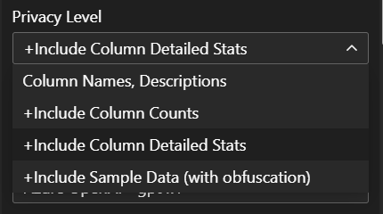
The amount of data included in generated prompts is controllable via the Privacy Level setting. The default sends dataset shape (column names, types, and aggregate statistics like distinct count and min/max) plus any commentary or per-field descriptions you have entered. A limited sample of dataset rows is also transmitted for chart-code execution; these rows are not obfuscated. Avoid placing personally identifiable information (PII) or other sensitive data into the dataset, commentary, or field descriptions.
You don't have to take our word for it. Right on the visual's landing page, next to the privacy picker, is a "See what's sent" link. Clicking it opens a preview overlay showing the exact JSON payload that would be transmitted for the current data and settings — before you ever press Generate. Because the payload reflects your chosen Privacy Level, you can raise or lower that setting and watch precisely what changes, so there are no surprises about what leaves your report.
Setup Bring Your Own Model
Bring-Your-Own (BYO) LLM mode lets you supply your own API key against your own provider account. Three provider families are supported: Anthropic (their Messages API directly), OpenAI (api.openai.com directly), and Azure OpenAI (your own Azure OpenAI / Azure AI Foundry deployment). In BYO mode you pay your provider for tokens consumed; we charge a small flat operating fee per request from your BIC credit balance.
The walkthrough below shows the Azure AI Foundry setup path end-to-end. For Anthropic or OpenAI BYO, the setup is simpler: just generate an API key in your provider's console and paste it into the corresponding field on your bizintelligencechampions.com account's LLM AI Charts and Maps settings.
Azure AI Foundry walkthrough — prerequisites: an Azure subscription. The following steps cover basic setup, from that starting point.
1. Create an Azure AI Foundry
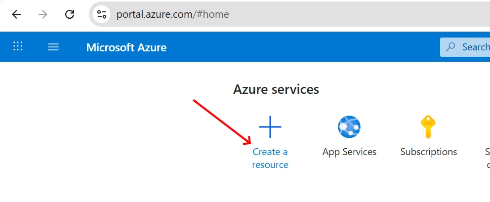
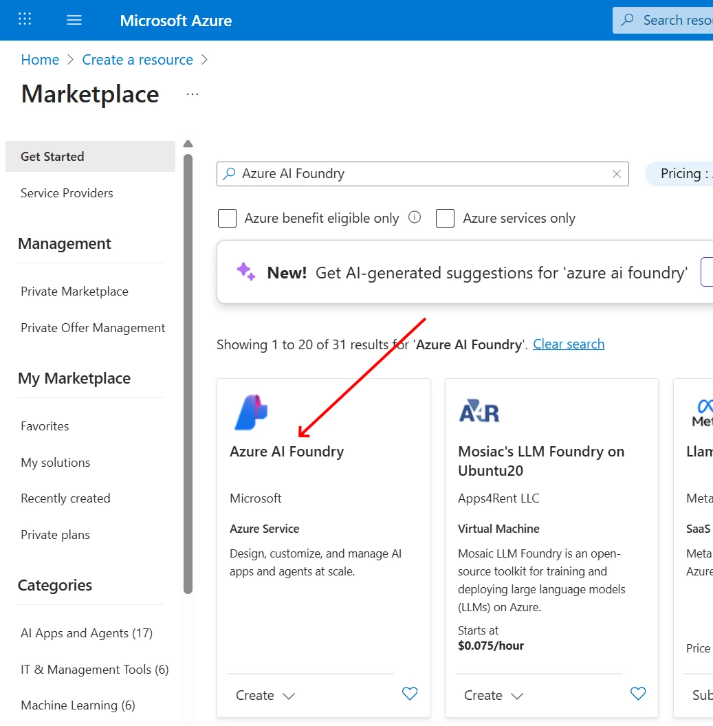
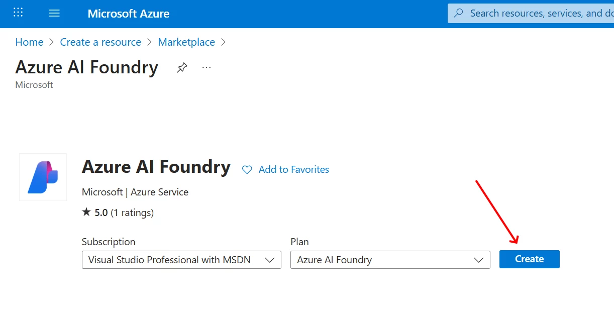
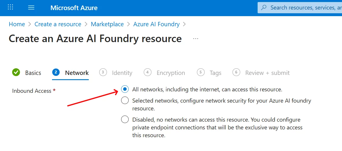
In this example, we accepted most defaults, outside of what is shown above.
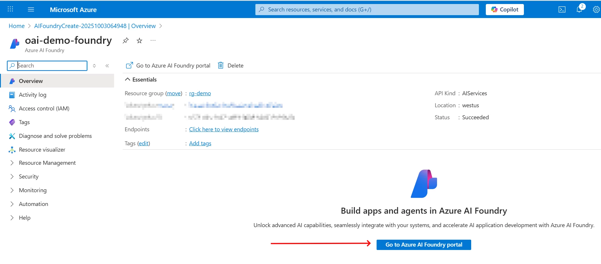
2. Go to the Azure AI Foundry Portal
Visit the foundry you just created in the previous step...
3. Find a model and create a deployment for it
You can start with the Model Catalog:
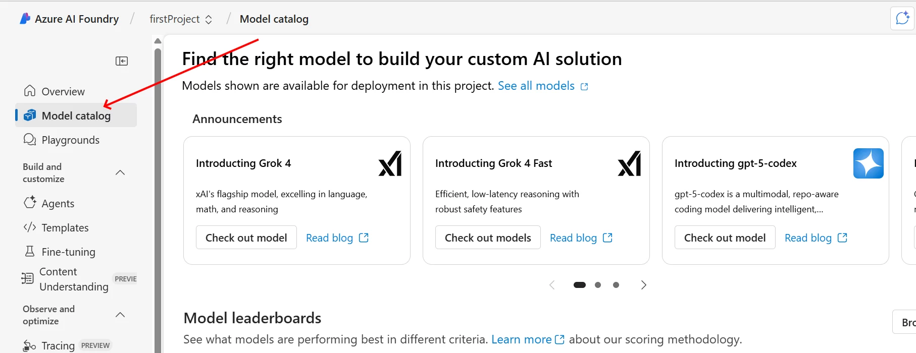
Here we found and picked "gpt-4.1":
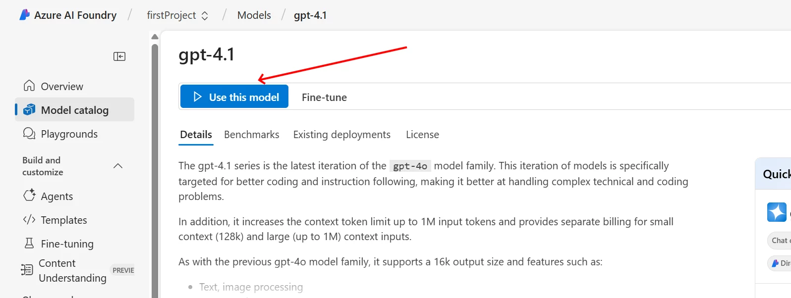
We clicked "Use this model" and are prompted for additional details and have the option to "create resource and deploy":
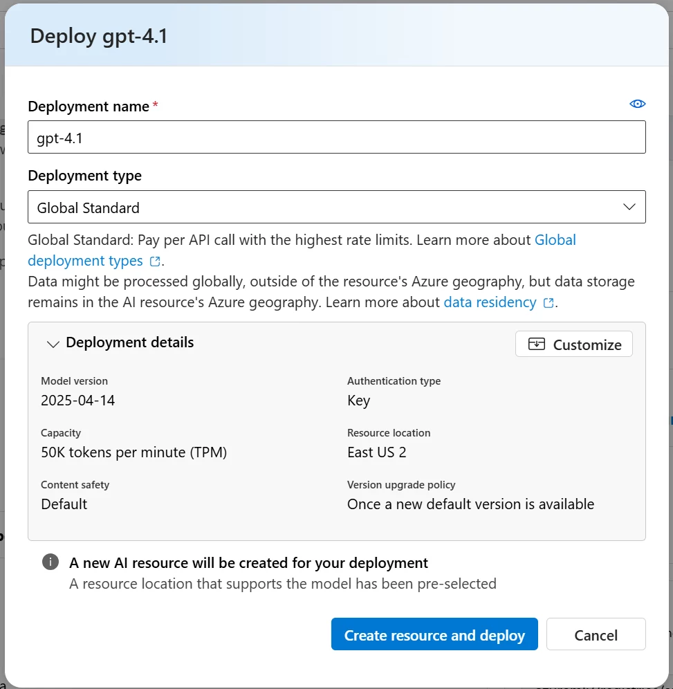
Details about deployment types and pricing are not in scope here: this example is only showing basic setup. More details can be found by visiting Microsoft. After our resource was created, we might see something like:
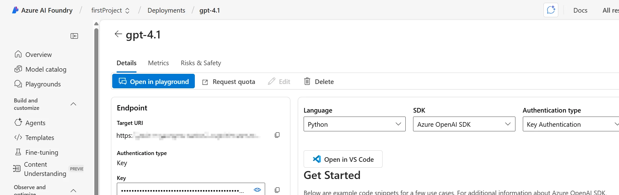
4. Extract three settings and copy to your bizintelligencechampions.com account
The source for these settings are shown here:
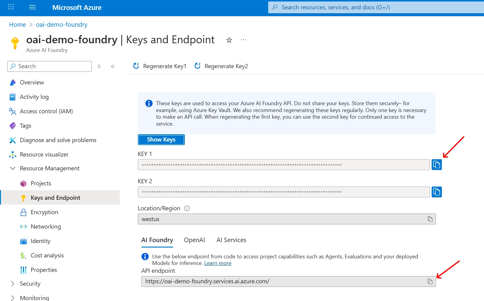
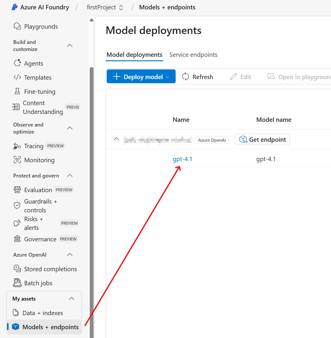
(You can also obtain the key and endpoint using Foundry, with the "Get endpoint" button.)
These values should be placed here, in your bizintelligencechampions.com account:
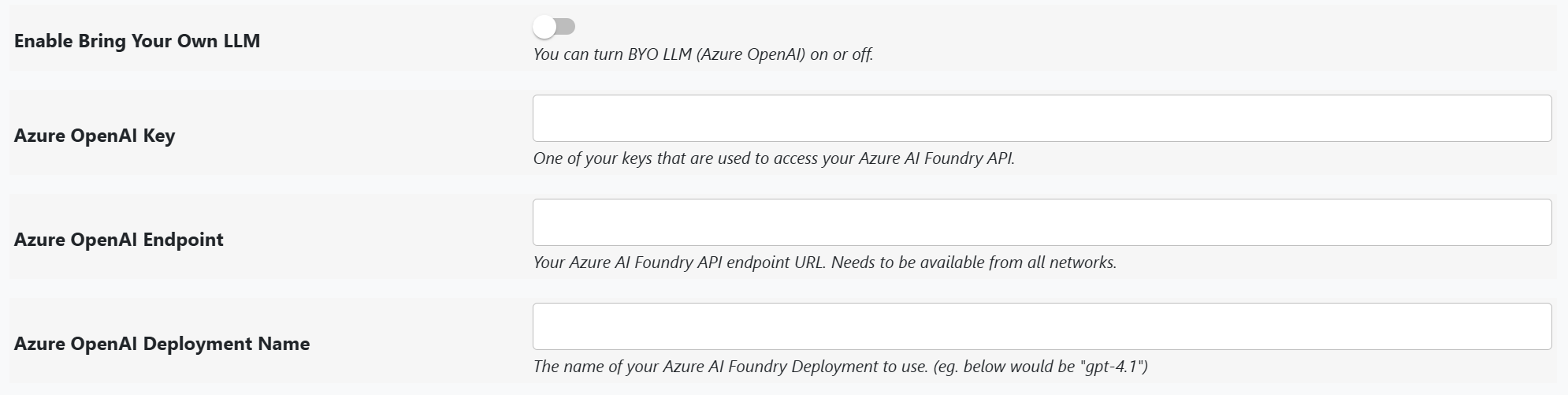
You can enable BYO LLM on a visual-by-visual basis, or globally at your account level (default model = BYO LLM).
FAQ
Q: Once I've set up my instance of LLM AI Charts and Maps for Power BI with my data, am I charged usage credits?
A: Not unless you've allowed report viewers to generate new versions. (The default setting is false.)
Credit usage is typically incurred during design.
Q: What's the difference between the "Values", "Measures", and "Group by" data wells?
A: Values does not allow DAX measures and is generally intended for categorical data (though not strictly required).
Measures allows DAX measures, which are typically continuous but do not have to be.
Group by is optional — one to three fields that define the primary grouping (series / breakdown). They become the leading hierarchy levels, which is what enables group-level highlighting, drill-through, and richer tooltips.
Q: Can I click the chart to cross-filter the rest of my report?
A: Yes, when the chart renders with an interactive engine (D3, Vega, or an interactive Python engine). Clicking a mark filters the report and highlights your selection while the rest dims back. A Static Chart (Python) render is a fixed image and is not clickable — set Render Type to an interactive option (or Leave to visual) and regenerate if you want interactivity. See Interactivity & Cross-Filtering for the full set of controls.
Q: I keep getting errors or invalid charts as output.
A: Your dataset may not be understood well enough by the LLM. Try adding more details in the Commentary setting
(a free-text area where you can provide up to 200 characters of guidance for the model).
If issues persist, please submit a support request
or email info@bizintelligencechampions.com.
We review usage details and make improvements in future releases based on real-world use cases.
Q: I make requests for certain chart types, but the visual never shows these.
A: An explicit chart type is treated as a strong preference, but it can be overridden when your data can't support it.
For example, a scatter plot requires two continuous variables — if your dataset only has categorical values,
the visual will choose a more appropriate chart type. In v2 you're no longer left guessing why: when the visual
picks something different from what you asked, it can reply in the hover information panel (while editing) with a
short note marked ✓ (did what you asked), △ (did it partially), or ✗ (couldn't — with the reason). So you might see,
for instance, "✗ A scatter plot needs two numeric measures; showed a bar chart of counts instead."
These author messages appear in Edit mode unless you enable the Hide Some Warnings and Prices setting.
Q: I know what I want in terms of "top 10" or "group by month" (instead of by day or year).
Do I need to keep requesting changes using the iteration process?
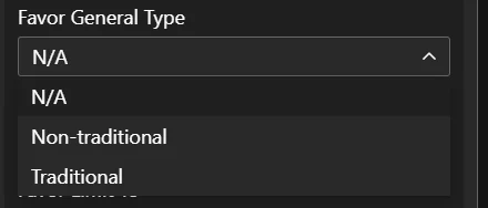
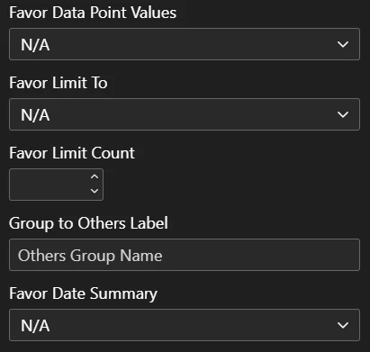
A: Not necessarily. Settings such as Favor Limit To and Favor Date Summary are designed for these cases.
You can use settings to influence results, or continue refining with adjustment requests—both approaches work.
Q: Are my results guaranteed to be accurate?
A: No — nothing is guaranteed with AI. Like any work product, results should be validated and tested.
What the visual does do is narrow the ways a chart can go wrong: a validation pass checks the proposed
chart against the shape of your data before any code is written, generated code is put through automated
quality checks and retried when it fails them, and the What fits? view tells you when the chart type
you asked for is not something your current fields can support. Once you have a version you trust, pin it
— a pinned version renders that same code every time, so a chart you have checked does not drift.
Q: Does the visual work in every cloud environment?
A: In most standard scenarios, yes. However, some government clouds (e.g. DoD) may have restrictions that prevent communication with our services, which is necessary for the visual to function. We recommend testing in your target environment, using the trial option. If you encounter difficulties, feel free to submit a support request.
Q: Which model type is "best"?
A: This is subjective, and the catalog evolves — so rather than pin specific names here, see the live list under Models and Privacy. In general: the current default is chosen to give a strong quality-vs-cost balance; higher-tier models produce cleaner output on complex requests at proportionally higher cost; and the lowest-cost option trades some quality (and a higher retry/error likelihood) for price. The visual's model picker lists each option, and you can override the choice per visual or account-wide.
Bring-Your-Own (BYO) mode also lets you use models we don't host directly — supply your own API key for Anthropic, OpenAI, or Azure OpenAI / Azure AI Foundry.
Q: Am I charged usage credits even when the LLM returns a version that does not render properly (e.g. an error)?
A: Yes - its considered usage. Charges are token-based: each call to the language model consumes input and output tokens whether or not the result ends up rendering, and those tokens are what you're billed for. So the actual number of credits per chart is not fixed - given the iterative process of building your chart, there is a range that depends on your prompting, how much information you provide to the LLM, your model choice, and how many attempts are made.
Q: I'm low on usage credits. What options do I have?
A: You can buy a standalone usage credit pack (60,000 credits for $149). Credits are also included with each organizational license term:
- 1-year license = 100,000 credits
- 2-year license = 250,000 credits
- 5-year license = 700,000 credits
Longer terms provide more credits per dollar. Purchasing a new license while one is active extends your current end-date — you never lose days. See the price list for current pricing.
Q: Can I use LLM AI Charts and Maps for Power BI in an air-gapped scenario (no internet access)?
A: For generating charts, no — creating a new version requires reaching our LLM service. But you can render previously unlocked versions with no connectivity at all: unlock the specific versions you need while you have internet, and they will render indefinitely in an air-gapped or intermittently-connected deployment. See Unlocking & Offline / Air-Gapped Use for details.
Q: Will the visual be Power BI Certified?
A: Not likely. Certification requires no external data access, but the visual depends on our services and some public CDNs
(e.g. cdn.jsdelivr.net).
Q: What does it cost?
A: Licenses come in monthly and annual terms, and usage credits can also be bought on their own — current
figures are on the pricing page and the price list.
Two things are worth knowing before you compare: credits are consumed while authoring, not when people
read your report, and Bring-Your-Own-Key mode reduces credit consumption to a
low fixed service fee per request, because you pay your AI provider directly instead.
Q: I'm a BI consultant who builds Power BI reports for clients. Can I license LLM AI Charts and Maps for Power BI through my consultancy, build the dashboards, and hand the work product over to the customer?
A: In specific scenarios, yes. The clean case is delivering pinned versions: pinning freezes the rendering and
strips your license, keys, and account credentials out of the report, so a pinned deliverable carries no license at
all and is effectively free to hand over — see Distributing to Others — Pinning.
You can still deliver versions that aren't pinned — for instance, so the customer can keep generating new charts
themselves — but then the license those visuals reference has to be theirs, not yours. The same rule applies
to LLM AI Charts and Maps for Excel. And if you're building standalone visuals inside an application with our
MCP / programmatic tools, only authoring needs a license: your consultancy holds it, and
no license is required to view what you produce.
Q: Can I use the charts outside Power BI?
A: Yes. The engine behind LLM AI Charts and Maps is RegiaBI, and it can hand you a chart as
source code for your own app — React, or any web page that runs JavaScript — through its MCP
server or its API. The chart runs on a free, open-source runtime (@bicharts/chart-host) with no
key and no call back to us. You can try
a live demo, and RegiaBI for developers has the install lines and recipes.
Q: If I build these charts into my own app, do my users need a license?
A: No. Only authoring needs one: generating a chart through the MCP server or the API needs a RegiaBI
trial or paid account. Once it's generated, the chart is source code in your app, and it runs free — no
key, no license check, no call to us — for you and for everyone who uses what you've built. A consultancy
can author under its own license and hand the finished charts to its client.
Q: Where does the visual run — Desktop, the Service, mobile?
A: Anywhere Power BI runs a custom visual: Power BI Desktop, the Power BI Service, and embedded scenarios.
Once a version has been unlocked or pinned it renders from code cached inside the report itself, with no call to
our service, so those renders keep working offline as well. Mobile layouts and static exports (PDF / PowerPoint)
follow Power BI's normal custom-visual behaviour — if one of those is central to your rollout, confirm it
during the trial, in your own tenant.
Q: Our tenant blocks uncertified visuals. Can we still use LLM AI Charts and Maps for Power BI?
A: Usually yes, with your Power BI administrator's help. As noted above, we are uncertified by design because the
visual calls our service. An administrator does not have to open up uncertified visuals generally: they can add
it as an organizational visual, or allow it specifically. If they need the list of endpoints the visual
contacts in order to approve it, ask us and we will supply it.
Q: What do you keep, and for how long?
A: We keep the request and the generated code behind each version, because that is precisely what powers version
history — returning to, comparing, unlocking, or pinning an earlier chart. You can see everything held against
your account under Account → LLM AI Charts and Maps. What is sent in the first place is governed by the
Privacy Level setting, and you can preview the exact payload before you generate
by clicking See what's sent. In Bring-Your-Own-Key mode the model call goes to your own endpoint instead of ours.
If you need material removed from your history, contact us.
Q: I have an idea for improvement, how can I share this? (or: I'm not seeing an answer to a question I have.)
A: We’d love to hear from you. Please email info@bizintelligencechampions.com
or submit a ticket.