
In short
In July I said I'd build some Fabric Apps. I present a fully functional one in this article: a planning page for a regional sales director, built by a coding agent over a Power BI semantic model from a few plain-English prompts, on Microsoft's current data app template and its published agent skills. This standard route works: the app was built, deployed, and saved notes and scenarios to its own database (i.e. write-back), in six prompts. What didn't land as well was the presentation: at best it took some wrangling, at worst hand-written code. Remember that the implied message we're getting is that agents will be so powerful that we won't need to write code anymore, so this article is at least an indirect test of that claim.
I also asked whether RegiaBI - the chart engine behind LLM AI Charts and Maps for Power BI and for Excel - could carry the load here too. One test used the same prompts, the same model, and the same CLI, but with a RegiaBI MCP server (the second MCP server of the title, beside Rayfin's own) available to the agent. The result: the agent wrote less code, used fewer tokens (i.e. cost you incur), and delivered faster, with subjectively "nicer" results. (That build took five prompts to the standard route's six; the title counts the RegiaBI one.) I'll leave it to you to decide whether the difference is "worth it" or not, but if agents really are going to write all our code, it matters a great deal what they build it from.
This is round two of the bake-off in One Does Not Simply Draw a Choropleth, against a harder opponent, and it puts the bivariate maps and what-if charts from the September update to work.
Useful takeaways. Agents guess, and these types of apps still require some wrangling - at minimum for cosmetic issues but sometimes much more. However, tested components seem to outperform widgets rebuilt from scratch, and the harder the widget, the bigger that gap gets. I documented every prompt, run, and snag in the appendices, if you're interested in the details.
Part 1 - Building a Fabric App the standard way
What is a Fabric App?
If you work in Power BI and haven't met them yet: Fabric Apps, in preview since Build 2026, are web apps built on Microsoft's Rayfin SDK. You describe your data in TypeScript, and one command gives you a Fabric SQL database, a GraphQL API, Entra sign-in and hosting, plus connectors to a semantic model, a lakehouse, a warehouse or a SQL database. A query against a semantic model runs as the signed-in user.
A Fabric App isn't a Power BI report. There's no report canvas and no field wells, and its interactivity is code. What it's for is the app a report can't be: one that writes back (notes, saved scenarios), has a flow of its own, or looks like your product rather than a dashboard. (Kurt Buhler's comparison is still a good account of how a Fabric App differs from a report.)
You could build one by hand - it's React and TypeScript - but everything about the template says the intended builder
is an agent: it ships with an AGENTS.md, a dozen agent skills and Rayfin's own MCP server. That matters more than it
sounds. If building a Fabric App takes someone who can write a React app, the audience is much smaller than for Power BI.
If it takes someone who can describe the page they want, it's most of the people reading this. So that's how I built it,
and how I'd expect most Fabric Apps to be built.
Everything below was true on 2 and 3 October 2026 for Microsoft's data app
template as create-rayfin 1.36.2 scaffolds it, Claude Code 2.1.287 and the Fabric Apps preview. It's a preview, and
it moves.
Scaffolding one, and what to watch out for
One command scaffolds an app: npx -y @microsoft/create-rayfin@latest --template dataapp. The data app template is a
React 19 + Vite single-page app with the semantic-model connection and query hooks already wired, Microsoft's
Vega-Lite chart component and a data grid, plus an AGENTS.md and a dozen agent skills. The running app must be inside
the Fabric portal, and deploying it (npx rayfin up) needs a capacity. A trial works. Microsoft just announced at
FabCon 2026 that Fabric Apps will become available to Power BI PPU users, so it's clear that they want more people to try them!
The things most likely to bite:
- The region. Fabric Apps isn't in every Fabric region.
- The tenant setting. "Enable Fabric App Items (preview)" does nothing until you click Apply.
- The versions you get. The template pins its own Rayfin packages, and they trail npm.
The rest covers why an agent asks to deploy, the template test that fails out of the box, and the other template that the Rayfin skill itself prefers, along with every step verbatim: Appendix A.
The build: four prompts and a deploy
I asked a coding agent - Claude Code, on Claude Sonnet 5.5 - for the app in four prompts, each sent exactly as written, one per turn, with Microsoft's Rayfin plugin loaded:
1. Create a new Fabric app called global-revenue with `npx -y @microsoft/create-rayfin@latest --template dataapp`,
   for the Fabric workspace "Global Revenue Demo", and connect it to the semantic model "Global Revenue v2" in that
   workspace.
2. Build the main page for a regional sales director. I want a world map that compares revenue per capita with return
   rate, a map of the shipping lanes between countries, and a revenue projection I can steer with a growth rate
   against our target. Clicking a country should filter the other charts.
3. Let people click any country or shipping lane and leave a note on it. Save each note in the app's database with
   who wrote it and when, and show it on that mark the next time anyone opens the page.
4. Let people save the growth rate they picked as a named scenario with a comment, and show everyone's saved
   scenarios beside the projection.
A fifth prompt, "Deploy it to the Global Revenue Demo workspace in Fabric.", came when I was ready. The model is Global Revenue v2, a public, synthetic star schema: 40 countries, monthly sales and targets from 2019 to 2025, 291 shipping lanes and a what-if growth parameter.
What went well. The agent read Rayfin's skill, scaffolded the data app, connected the model and proved
a live DAX query. It built the page with Microsoft's VegaVisual charts, wrote its own DAX, saved notes in the app's own
database with who wrote them and when, and saved named scenarios that everyone sees. It themed the page well, handled
loading and empty states, and added a dark-mode toggle on its own. Clicking a country filtered the other charts. It
type-checked and built. The whole thing took six prompts - the four, the deploy, and one answer when the first deploy
attempt stopped on a half-made item - and about twelve minutes of agent time for the four.
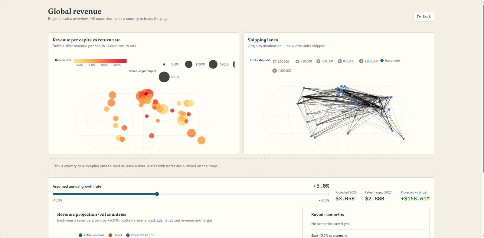
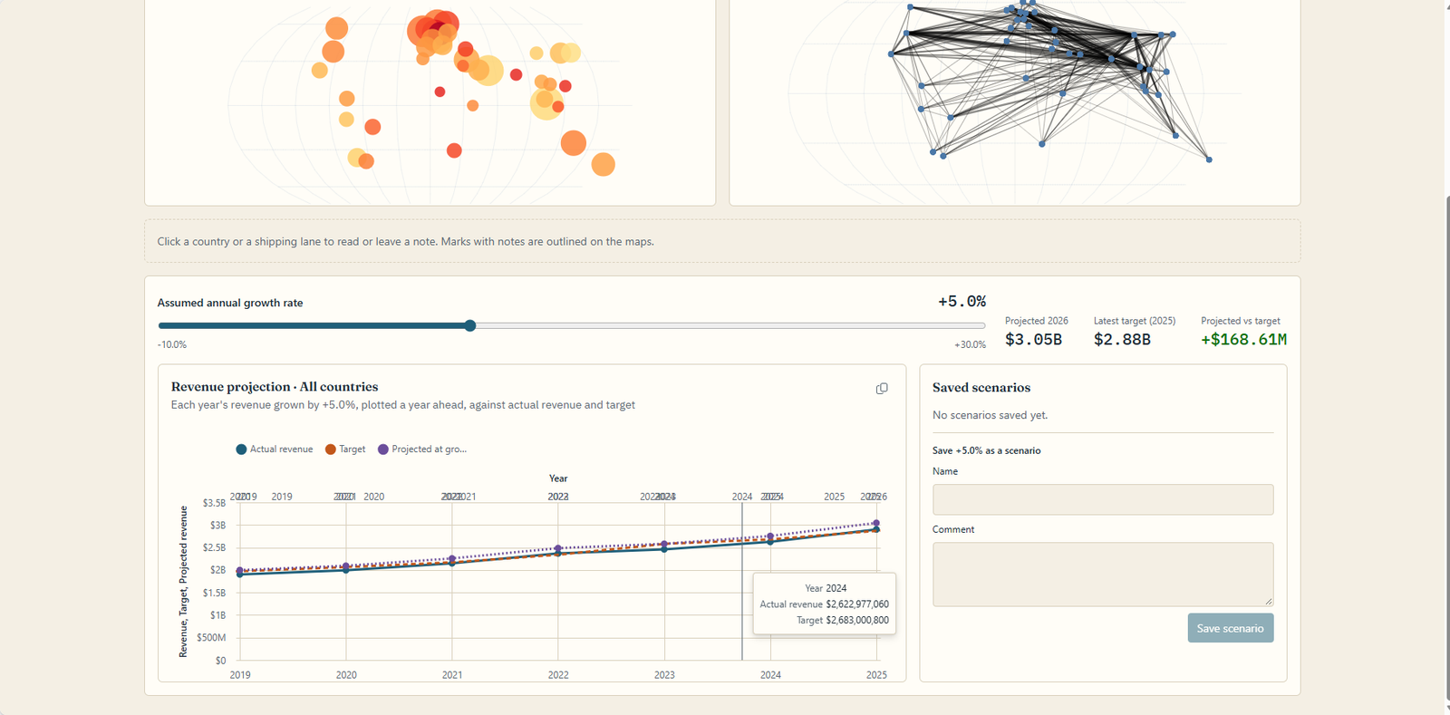
What didn't land well was the presentation:
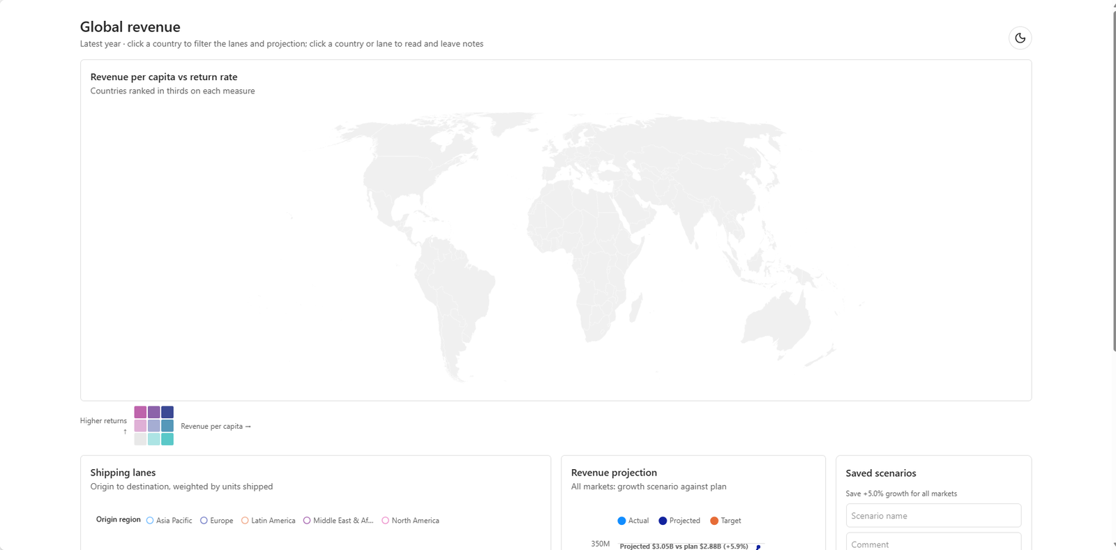
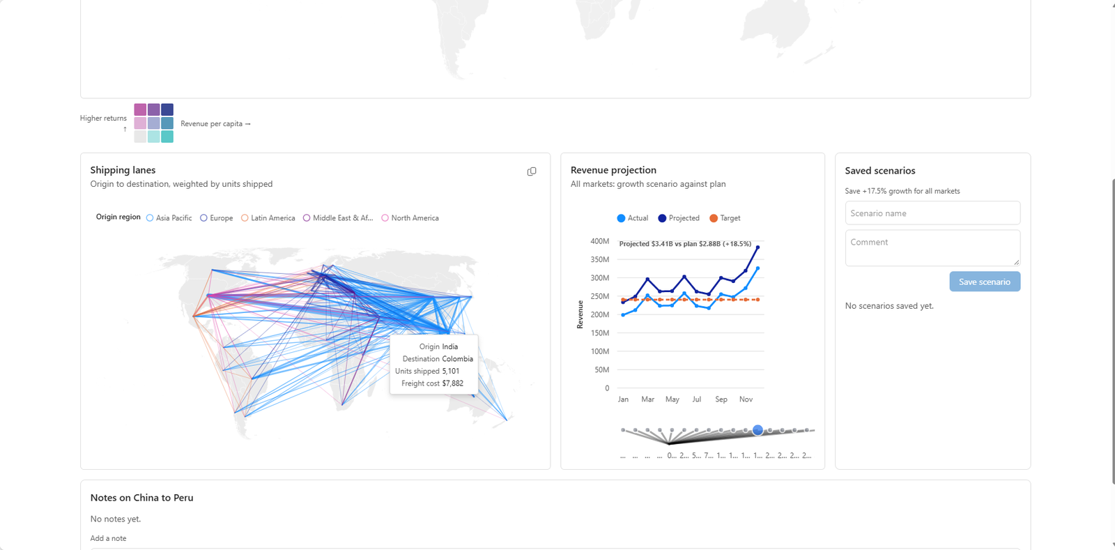
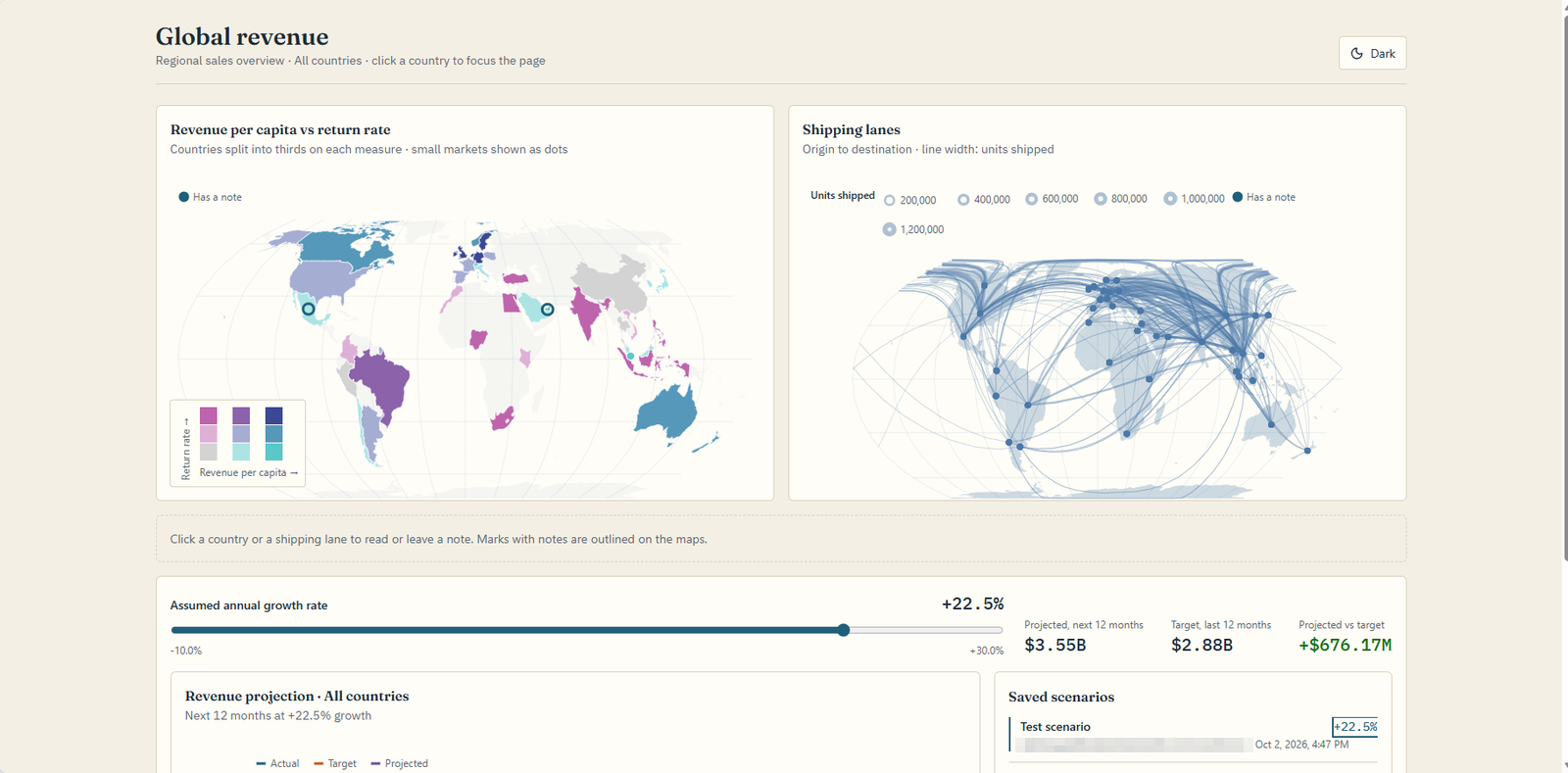
- The comparison map was bubbles, sized by one measure and colored by the other, on a bare graticule with no land drawn. You can't see where the two measures disagree, or which country is which.
- The routes were straight lines between country centers, a dense web with no direction and no land beneath it.
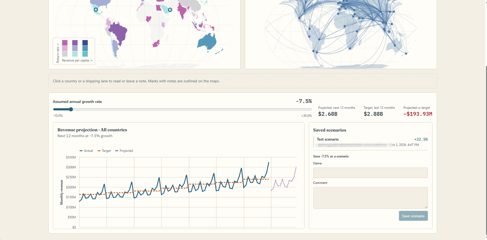
- The slider sat above the chart. The steerable projection was a line chart with a growth slider and three readouts built beside it.
- The projection wasn't one. Its subtitle said it plainly: "Each year's revenue grown by +5.0%, plotted a year ahead". It drew the last year of data, grown, a year later. More on why in Part 2.
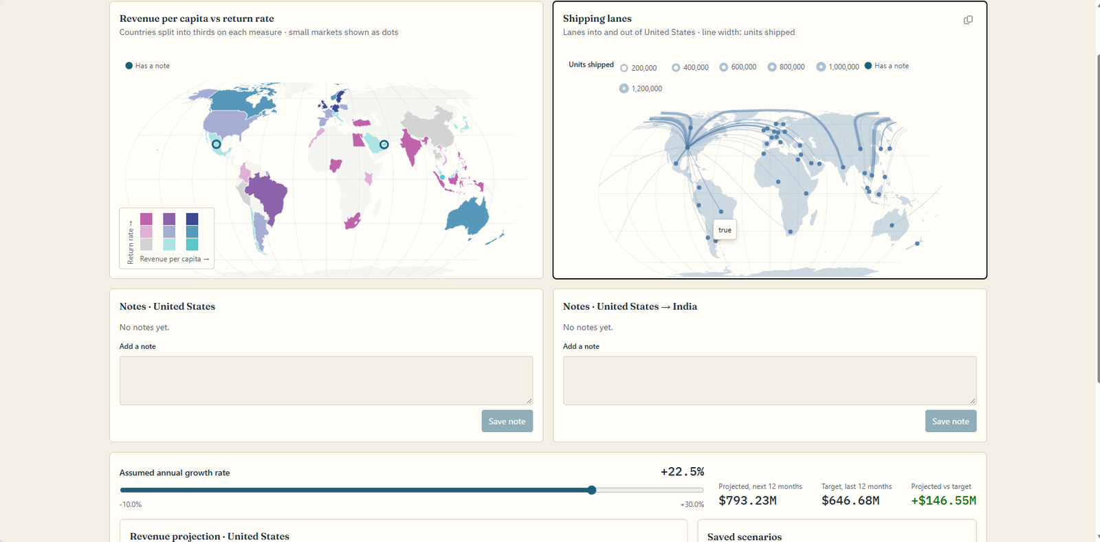
Clicking around turned up smaller things: a lane's tooltip sometimes read just "true", no zoom or pan on either map, and nothing on the map showed which country you'd picked. None of the turns said it had drawn something other than what was asked.
What the standard route got wrong
The app worked. The charts weren't what I'd asked for. A comparison map that can't show where two measures disagree, routes that cross oceans as ruler lines, a "steerable" projection whose control lives outside it and whose forecast is the past - those are the parts of a planning page people actually look at. So, the question I'd been circling since the maps article: could the engine I've been building for Power BI and Excel carry the load here too? That engine is RegiaBI, the one behind LLM AI Charts and Maps for Power BI and for Excel, and it has an MCP server a coding agent can call. Same prompts, one more sentence.
Part 2 - The same app, with RegiaBI
The result first
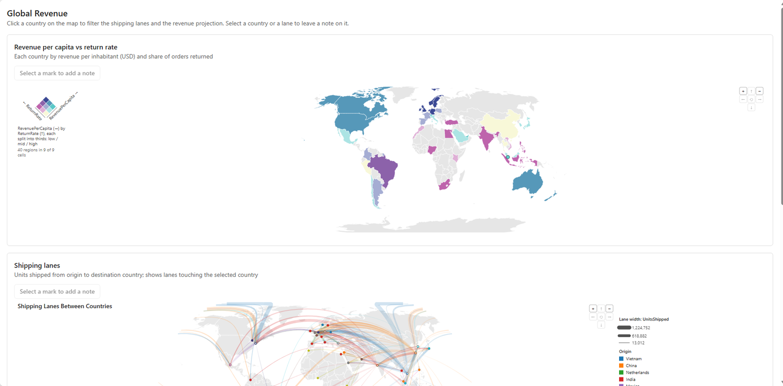
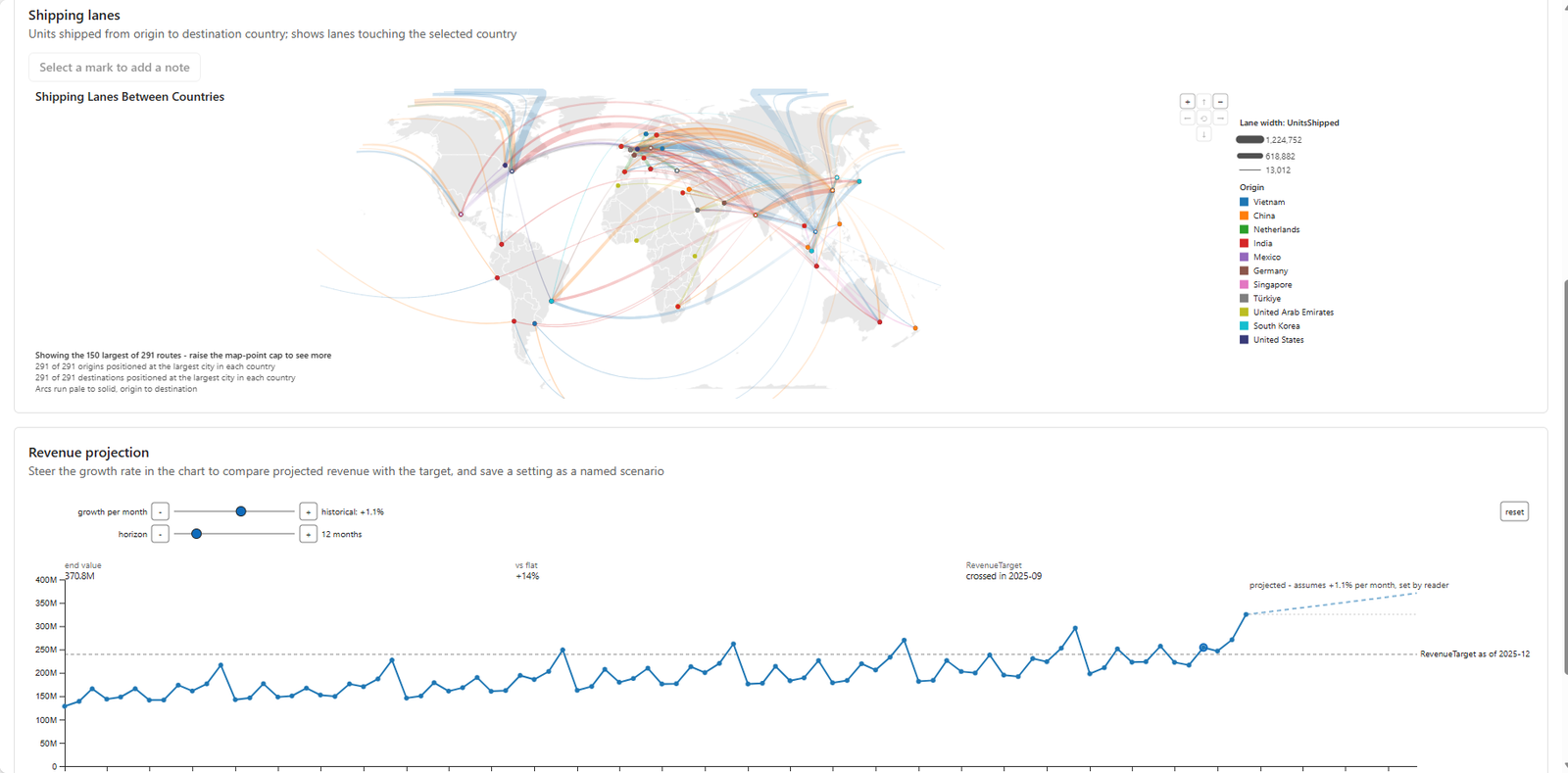
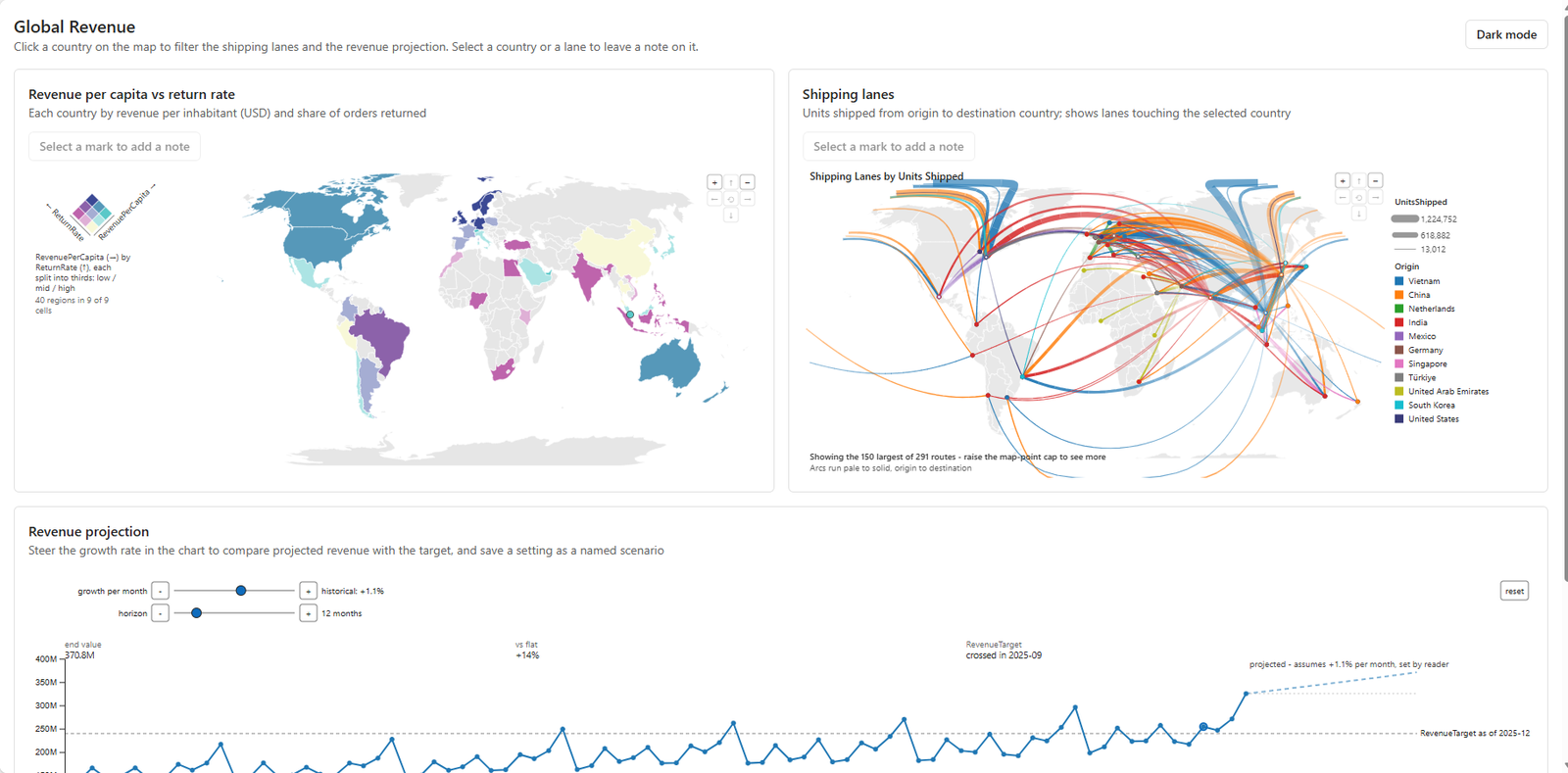
Here's what came back, on the same model, from the same five prompts with "Use the RegiaBI charts server for the charts." added to the second:
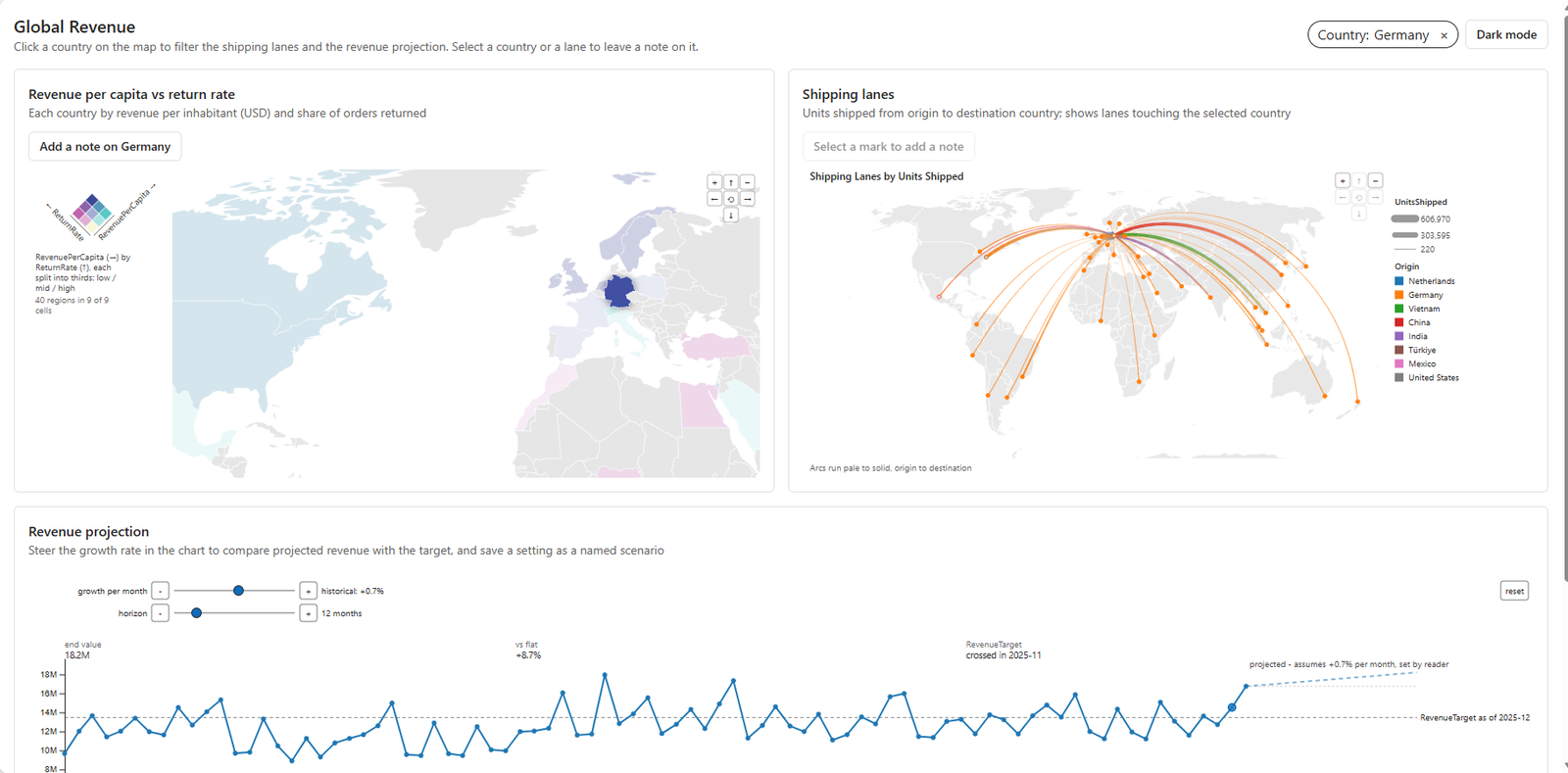
- A bivariate world map. Each country colored by revenue per capita and return rate through a 3×3 key, so the places where the two disagree stand out. Zoom and pan built in.
- A flow map over real land. The shipping lanes as great-circle arcs, wider for more units, colored by origin and fading from pale to solid toward the destination, so you can see which way goods move. It shows the 150 largest of the 291 routes and says so on the chart.
- A what-if projection you steer from inside the chart. Monthly revenue against the target, compounding forward from the last actual month, with growth and horizon controls, a reset, and readouts (the end value, the gap against flat, the month the target is crossed) drawn in the plot.
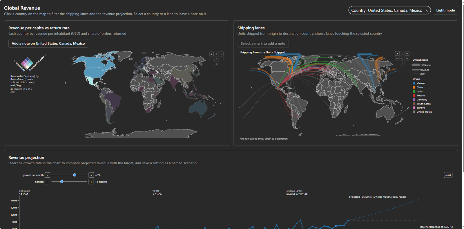
Clicking a country dims every other country and filters the lanes and the projection. A chip at the top names the filter and clears it. Ctrl-click adds a second country, and a click on a legend swatch selects its group. A note left on a country or a lane shows as a badge on that mark the next time anyone opens the page. A saved scenario is the projection's own state, saved and applied again.
| The build | With RegiaBI | Standard route | Standard route, chart types named |
|---|---|---|---|
| Prompts required, deploy included | 5 | 6 | 6 |
| The three charts as asked | 3 of 3, first try | 0 of 3 | 0 of 3 |
| Agent time, prompts 1-4 | 7.8 min | 12.3 min | 13.4 min |
| Tool calls on the page-building turn | 18 | 62 | 37 |
| Agent output, prompts 1-4 | 20k tokens | 71k tokens | 75k tokens |
| Lines the agent wrote by hand | about 165 | about 1,050 | about 850, plus 720 of specs and queries |
The first two data columns ran on 2 October, the third the next day (below). Same model, same CLI, same plugin and template, and the same stand-in user (a second model that answers the agent's questions as the sales director would; Appendix B). The only differences in what I typed were the eight words in prompt 2 and the workspace's name: each app had a workspace of its own. The per-phase summary of each final run, and how each number was counted: Appendix C.
An app an agent builds is non-deterministic by nature: send the same prompts again and you get a subtly different app - a different layout, different card titles, a control placed somewhere else. I'd call that more feature than bug. Each run is a fresh draft of the same idea, and you keep steering the one you like. What should stay fixed is what the components carry. In an earlier series of three builds a side, the RegiaBI runs landed on the same three charts, behaving the same way, every time, while the pages around them differed in the details (Appendix J).
"You told it which charts to use." So I told the other one too
Nothing in my prompts names a chart type. But our server's guide, which the agent reads first, has a short table that maps requests to the catalog: "two measures compared across countries" to a bivariate map, "routes or flows between places" to a flow map, "a forecast the reader steers" to a what-if projection. The agent went from that table straight to the three charts. That's the product working as designed - the guidance is part of what you get - but the standard route had no such hint. So I ran it once more, with the chart types named in the prompt, in the guide's own words: a bivariate world choropleth, an origin-destination flow map, and a what-if projection with its growth-rate slider drawn inside the chart.
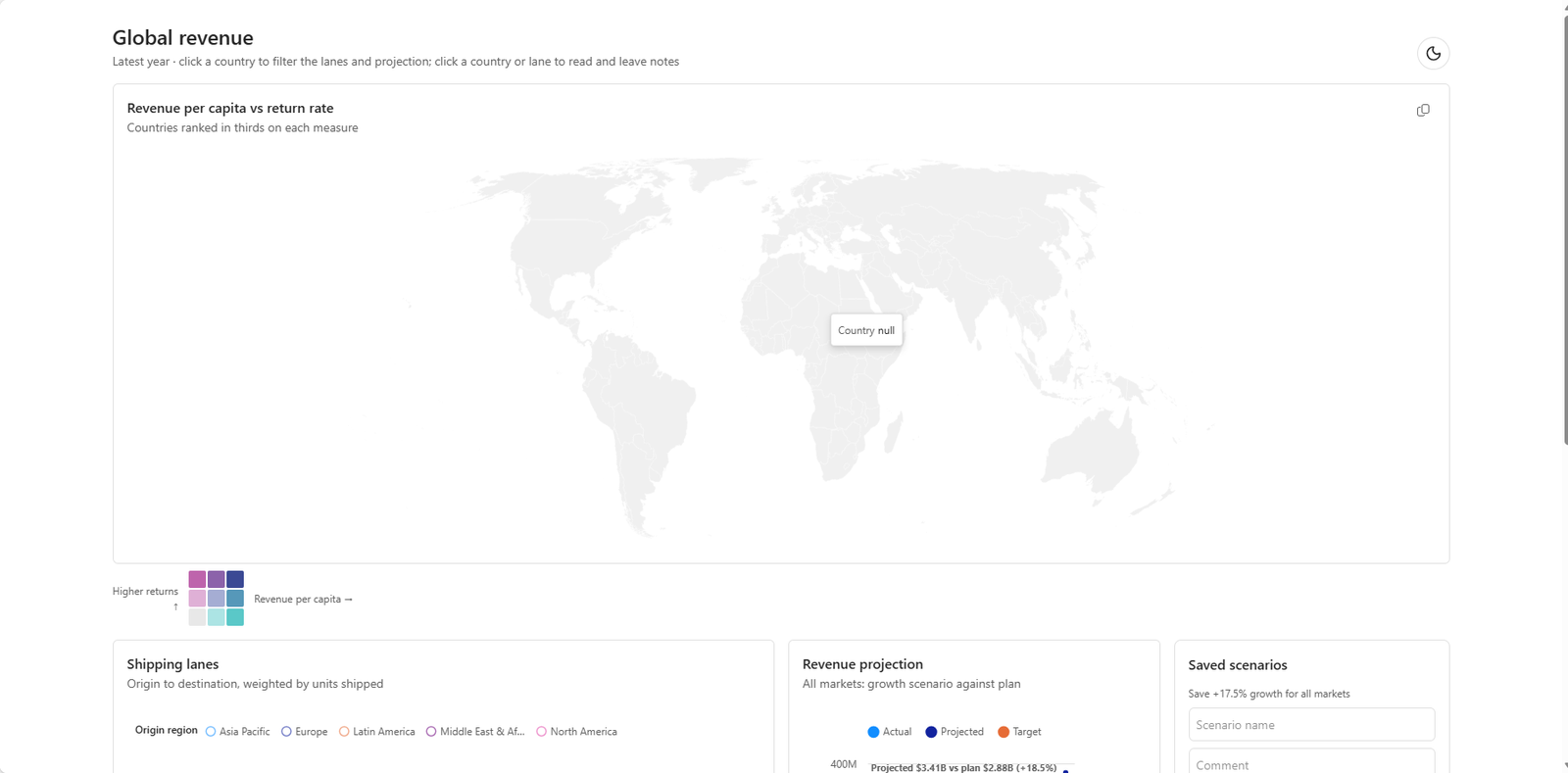
This non-RegiaBI build did even worse! It reached for the bivariate map and drew a world with no country colored at all; hover one and the tooltip reads "Country null", because its join between the model's countries and the map's shapes failed. The lanes were still straight lines between country centers, and selecting a country or a lane changed nothing on the map, so you can't tell what's selected. The projection moved its slider into the chart but still drew the last year of data twice - actual, and actual grown by the rate - rather than a forecast from the last month. It took the same six prompts, 13.4 minutes of agent time and 75k output tokens for the build, and about 850 hand-written lines plus 720 lines of chart specs and queries. Naming a chart type isn't the same as having one.
The second chance
A first build is only half the story. A real user looks at the page and asks for changes or fixes, so each app got a second chance: a few prompts aimed at its own worst visible problems, in the voice of an app builder.
The standard-route app got four: "There is no land showing for the maps, ideally we'd see the shape of countries."; "The flow map would look better using arcs instead of straight lines."; "The revenue per capita map would ideally be a bivariate choropleth."; and "The projection is showing for historical months. The intention was to have projections show for FUTURE months, projecting out from the last available month. Also, labels are overlapping in the projection view."
The RegiaBI app got three: "add a dark mode button at the top.", "put the choropleth and flow map side-by-side." and "make the flow lines a bit darker (via opacity)."
The standard route did better than I expected. Land, arcs and a real bivariate map each took one prompt, and they look reasonable. Its projection didn't take, however. It now drew twelve future months, but their shape was still last year's, grown and shifted - starting well below where revenue actually was - after a prompt that described the fix exactly. It looks like an answer. It isn't one. The RegiaBI app took its three in under 90 seconds each. Counting one redeploy each, that's nine prompts in all for the RegiaBI app and eleven for the other.
Then I clicked around both. Here's what each app does after its second chance:
| Behavior | With RegiaBI | Standard route |
|---|---|---|
| Selecting a country shows it | Every other country dims | Nothing changes on the map |
| Several countries at once (Ctrl-click) | Yes | No |
| Click a legend entry to filter | Yes | No |
| Zoom and pan the maps | Both maps | Neither |
| What's filtered, and how to clear it | A chip with a clear button | A subtitle line; click the country again |
| A lane's tooltip | Origin, destination and units | The word "true" |
| Which way goods flow | Routes fade from pale to solid, colored by origin | All one color, no direction |
| The line-width legend | Line samples, matching the routes | Circles, for a value drawn as width |
| Adding a note | A button names what's selected and opens a dialog | Panels open inline and push the page down |
| Steering the projection | Growth and horizon inside the chart, a reset, readouts | One growth slider above the chart |
| Dark mode | The charts follow, map land included | The charts follow |
Only the last two rows were ever asked for. Nobody asked either app to dim the other countries, take a Ctrl-click, filter from the legend, pan and zoom, show what's filtered or say which way goods flow. One app does all of it because its components do. Not doing things like highlighting the selected country is arguably fatal: how can a user know what they've selected? Will Microsoft's charts address some of this? Almost certainly, and the template is moving quickly. But this compares what each app does today, from the same prompts. Plus, RegiaBI now has a "lead" on features, and expect this to continue and grow.
What I mean by wrangling
As I've demonstrated, the build process is rarely a straight line from prompt to page. The agent guesses, and the app along with its charts needs multiple turns with the agent - a process that I call wrangling. It certainly helps to be very precise and offer a lot of detail in your prompts, but even then, the agent will make mistakes and need correction. The more complex the app, the more likely it is that the agent will need to be guided through multiple iterations to get it right.
This is an old idea wearing new clothes. Nobody writes their own date picker, data grid or charting library for each new app. You pick a component that's already been built and tested, and you configure it. Agents have quietly undone that habit. Writing code costs them so little that they can build every widget from zero, every time, and it's tempting to conclude that component development is dead.
For the simple pieces, that's mostly fine. A bar chart or a plain map comes out well enough, and if a detail's missing you ask once and it's there. Selection is a small example of what does slip: dimming, Ctrl-click and legend selection came free on one side and were missing completely on the other. Each one is more prompts to fix, if you notice it's missing. That's not a great story for software quality.
The gap widens as the pieces get bigger. A what-if projection with its controls inside the chart, a flow map with land, arcs and zoom, a bivariate map with its key: each one is a small app, not a chart, and its parts have to agree with each other. An agent can get one of those right on a good day. Getting it right every time, from scratch, is a different story, and the projection above is the proof. That's the case for a library. A component gets that behavior right once, under test, and every app that uses it gets it right too. Component development isn't dead. Not yet, anyway.
That's what RegiaBI is turning into: a gallery of small, finished pieces - mini-apps, really - that behave the same way in a Fabric App, a Power BI report, an Excel workbook or your own web page. The agent still assembles the page. It just stops having to invent how the pieces behave.
To be clear about what RegiaBI is: not a charting library you install and call, and not a pile of code an agent wrote on its own. It's two layers. A small open-source host handles the behavior every chart needs - selection, dimming, filters, notes, theming - so no agent ever has to invent it. And each chart is generated for your data from a tested design, checked before it reaches you, and lands in your project as ordinary code you own. If that sounds like the "copy it into your repo" style of component kit some front-end developers already use, it's close - except the component is fitted to your data, and when you want it changed, you ask for the change and it's checked again, rather than hand-editing and hoping.
The projection, and why the agent guessed
The model's Projected Revenue measure, [Revenue] * (1 + Growth Rate), is perhaps not ideally named, but it does support a projection. The standard route's projection chart drew the last year of data, grown by a percentage, which is not really a forecast, given it's all living in the past. The agent on the standard route seemed content with that measure as the answer to "projection."
The RegiaBI what-if projection chart doesn't assume that measure is enough, because it encodes what a projection is: history as it happened, a forecast from the last actual month, the controls inside it, and a state the app can save.
To be fair, with more explaining, the standard route might have caught on to what we were really after - with more wrangling. It speaks to the pattern you need to adopt, which is: be verbose, be clear.
How it works
An agent writing a chart is guessing twice: about your data (which columns add up, how many countries there are, which column is the key) and about what each chart type needs. An MCP server gives it tools to ask instead. Ours was introduced in the maps article, and in a Fabric App the agent sets the app up, runs each chart's DAX and profiles every row, asks which charts fit, generates them and checks each one at its real size before anything is deployed (Appendix K has the tools one by one).
The server is in the official MCP Registry as com.regiabi/chart-mcp.
Adding it is one line, run once by me as setup - registering a server is a permission a person should give:
claude mcp add --scope project bic-chart -- npx -y @bicharts/chart-mcp
At view time, what runs is the generated chart code and the open-source host: no key and no call to us, only DAX, as the signed-in reader.
The whole interaction layer of the RegiaBI page is short enough to print. Trimmed of layout:
const country = useBicFilter("CountryCode", { label: "Country", display: "Country" });
const lane = useBicFilter(["OriginCountryCode", "DestinationCountryCode"], { label: "Lane" });
const scenario = useBicControls();

<BivariateWorldChoroplethChart table={table} selects={country}
  annotations={noteBadges(notes, COUNTRY_NOTES)} />
<OriginDestinationFlowMapChart table={table} selects={lane}
  filterBy={{ filter: country, columns: ["OriginCountryCode", "DestinationCountryCode"] }}
  annotations={noteBadges(notes, LANE_NOTES)} />
<WhatIfProjectionChart table={table} controls={scenario} />
A filter is a key in the model's own terms, and a chart that selects it handles the click, the dimming, Ctrl-click,
the legend and the clear. Notes are badges keyed by the model's columns (a country by its code, a lane by both ends), so
they find their marks again after a refresh, a filter or a resize. The projection's controls are page state, so a
scenario saves and restores them. On the standard route, the same behavior is a dozen lines per chart that parse
Vega-Lite's selection predicates back into a country, then shared state, then each noted mark drawn with an outline -
and still no dimming, multi-select or legend selection. That works. It's just wrangling, and it was written fresh.
Already improving. While writing this, I found note badges misbehaving on a zoomed map - fixed once, in the
open-source host (@bicharts/chart-host), the next day, and every app that uses it can pick it up on its next build. (Including LLM AI
Charts and Maps for Power BI and for Excel.)
Sidebar: why Sonnet? Both apps were built by Claude Sonnet 5.5 in Claude Code, at the default effort: the mid-tier model most people already pay for, so this is what an ordinary subscription gets. An Opus-class builder might change both sides; I haven't run that comparison.
An extra test: a 3D scatter
I also asked each side for a 3D scatter of the countries, with revenue per capita, return rate and revenue on the three axes, sized by population, "that I can spin and zoom." The template has no 3D chart, and the agent without RegiaBI knew it: "The app's standard chart library (Vega-Lite/Flint) has no 3D scatter support." (Flint is Microsoft's open-source chart-type catalog, which the template's skill points at: about 35 named types compiled down to Vega-Lite.) It asked which library to use, recommended Plotly, and built it, loading Plotly's 4.6 MB only when the chart appears. The result works, spin included, with a couple of nits: I couldn't get it to zoom, and it opened very small. With RegiaBI, the chart server returned a 3D scatter in D3 that spins (drag it, use the arrow keys or the on-chart pad) and zooms, on the same route the app's other charts use, in about a quarter of the agent's time (208 seconds against 796) and two prompts instead of four. The detail is in Appendix E.
Interestingly, RegiaBI has a Plotly version of the 3D scatter too, written in Python. In this example, the chart
server hands the app the D3 version, since a Fabric App is JavaScript and runs D3 charts through
@bicharts/chart-host.
What it costs
Through the RegiaBI MCP you pay only for the act of writing code. The output it writes is yours to run, ship and keep, for any number of viewers, forever (the RegiaBI terms, section 1(d)): no calls to us, no license check, and an open-source host (Apache-2.0).
Part 3 - Beyond Fabric
Because the charts are the same generated code in every host, a Fabric App is one place to put them, not the only one. The same three charts run in a Power BI report on any tier, and on a public web page that nobody needs a license to view. What each route gets and gives up, side by side: Appendix L.
Replay it, and where it stops
Everything to repeat the build is public or printed here: the prompts above, the setup list (Appendix B), every step from nothing (Appendix F), and the data and model. You'll need a Fabric capacity (a trial works), the tenant settings applied, a RegiaBI license to author charts, and an MCP-capable agent. What will differ, even with the same prompts: the page's layout, the agent's code and questions, and, on your own data, the charts the server offers.
- Fabric Apps is a preview. Everything here was true on 2 October 2026 for
create-rayfin1.36.2, the Rayfin plugin as cloned that day, and Claude Code 2.1.287. - Charts are generated once and redraw on live rows. A new column, or a new question, means a new generation.
- Neither app can delete or reset a note or a scenario. One more prompt could add it; neither got one.
- The MCP needs a RegiaBI account, trial or paid, to author. The published app needs nothing from us.
What's next
Two directions to watch:
An app that guides the build. Everything here ran through a coding agent in a terminal, with a setup list that a person works through first. The next step is a small app that guides the build and does the agent's work on our side, so there's no agent of your own to configure - unless you'd rather keep using yours, and the MCP server stays for anyone who does. The goal for this is to widen the audience of who can actually build Fabric Apps.
Checking the result by looking at it. The worst misses in this article - a map with no country colored, a flow map missing half of Canada, a white world on a dark page - passed every check that reads code. They showed up only when someone looked. LLM AI Charts and Maps for Power BI and for Excel already have an answer for that: an optional vision review that takes the chart as it actually rendered, judges it against what you asked for, and proposes a fix if it sees a problem - you decide whether to apply it. The next step is bringing that to the MCP and to Fabric Apps, so each chart in a finished app gets looked at the way a reader would see it, before a reader does.

Comments
No comments yet — be the first.
Leave a comment
Your email is never shown — we use it once to confirm the comment.