Our Visuals

The RegiaBI mark: a gold data drum breaking apart at the bottom

The engine underneath

A chart that fits your data, first try — no charting code to learn. That is RegiaBI, and it runs outside Power BI too.

What RegiaBI does

LLM AI Charts and Maps for Excel icon

LLM AI Charts and Maps for Excel

Select a range. Say what you would like to see — or say nothing at all. A real, interactive chart is drawn in the worksheet: not a picture, not a chat window, and no code for you to write. It sits on the sheet as an object you can move, resize and print, it follows your cells as they change, and it is saved inside the workbook, so it redraws whenever the file is opened.

Highlights...

See it work before you sign in

Show an example chart draws a finished chart over our own sample table. No account, no sign-in, and nothing of yours is measured or sent — it is the product doing the thing, on data we supply.

What fits? reads the columns in your range and lists the chart types that suit them, ranked. It reaches no AI and costs nothing, so you can see what your own data could become before you decide anything.

Viewing costs nothing, ever. Send the workbook to a colleague and the chart draws for them with no add-in to configure and no sign-in. Generating a chart is what needs a licensed account.

How it works, in three steps
  1. Select a range whose first row is the column headers, then Menu > Use selection. The range summary tells you what it read.
  2. Highlight a chart type from the list, or leave it to choose. Add a sentence about what you want, or leave the box empty.
  3. Click Generate. The chart is drawn in the sheet, and after that it redraws from the code in your workbook as your cells change — instantly, with no further call to us.

Not quite right? Adjust takes a sentence — “make the bars horizontal”, “label the top five” — and keeps your chart while it applies the change. Every version is kept, and you can bring an earlier one back.
Click images to enlarge.
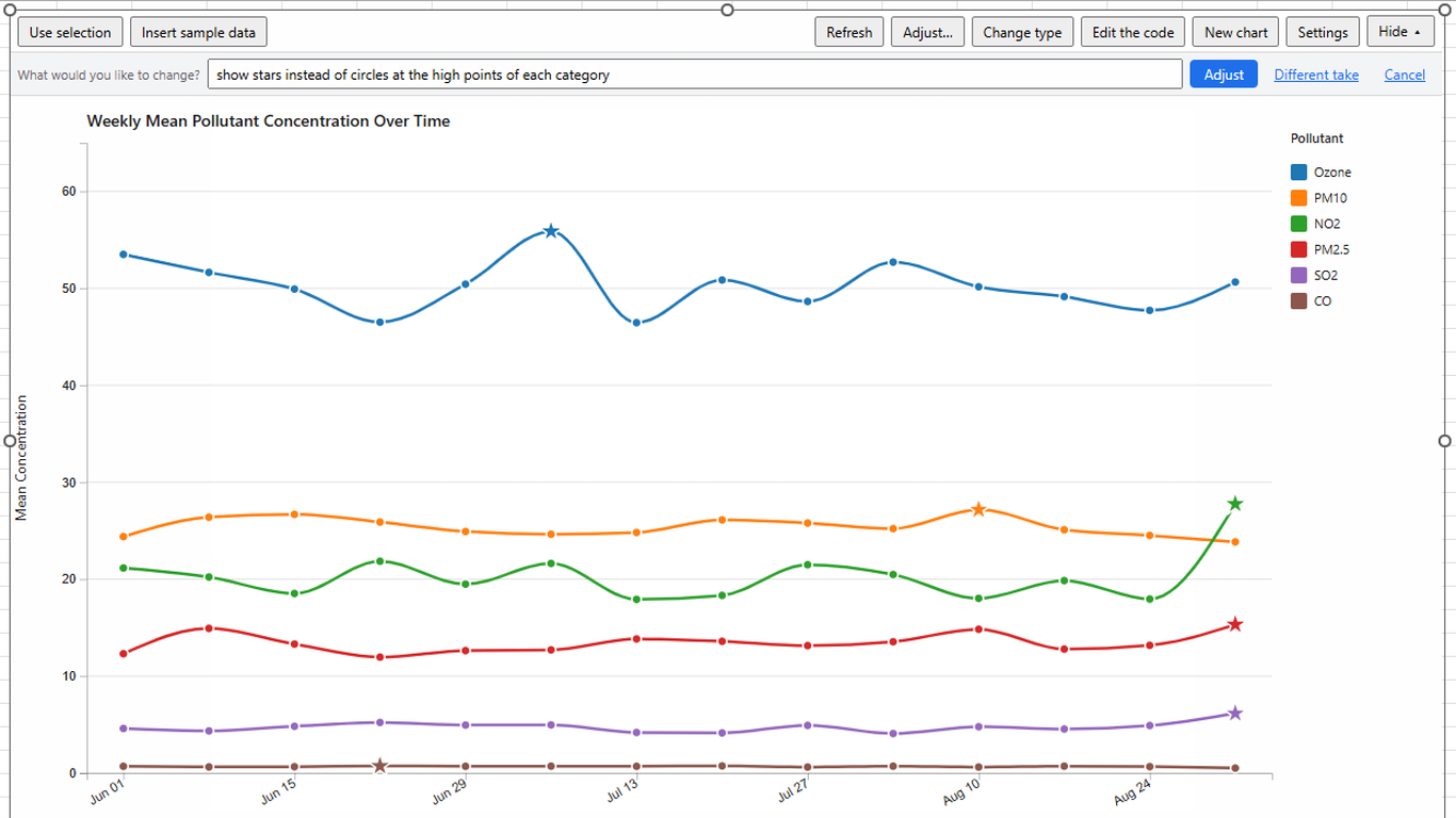
LLM AI Charts and Maps for Excel: a multi-series line chart drawn in the worksheet, being refined in plain English
The chart is drawn in the sheet, and refined in plain English: here we asked it to “show stars instead of circles at the high points of each category” and it kept everything else exactly as it was.
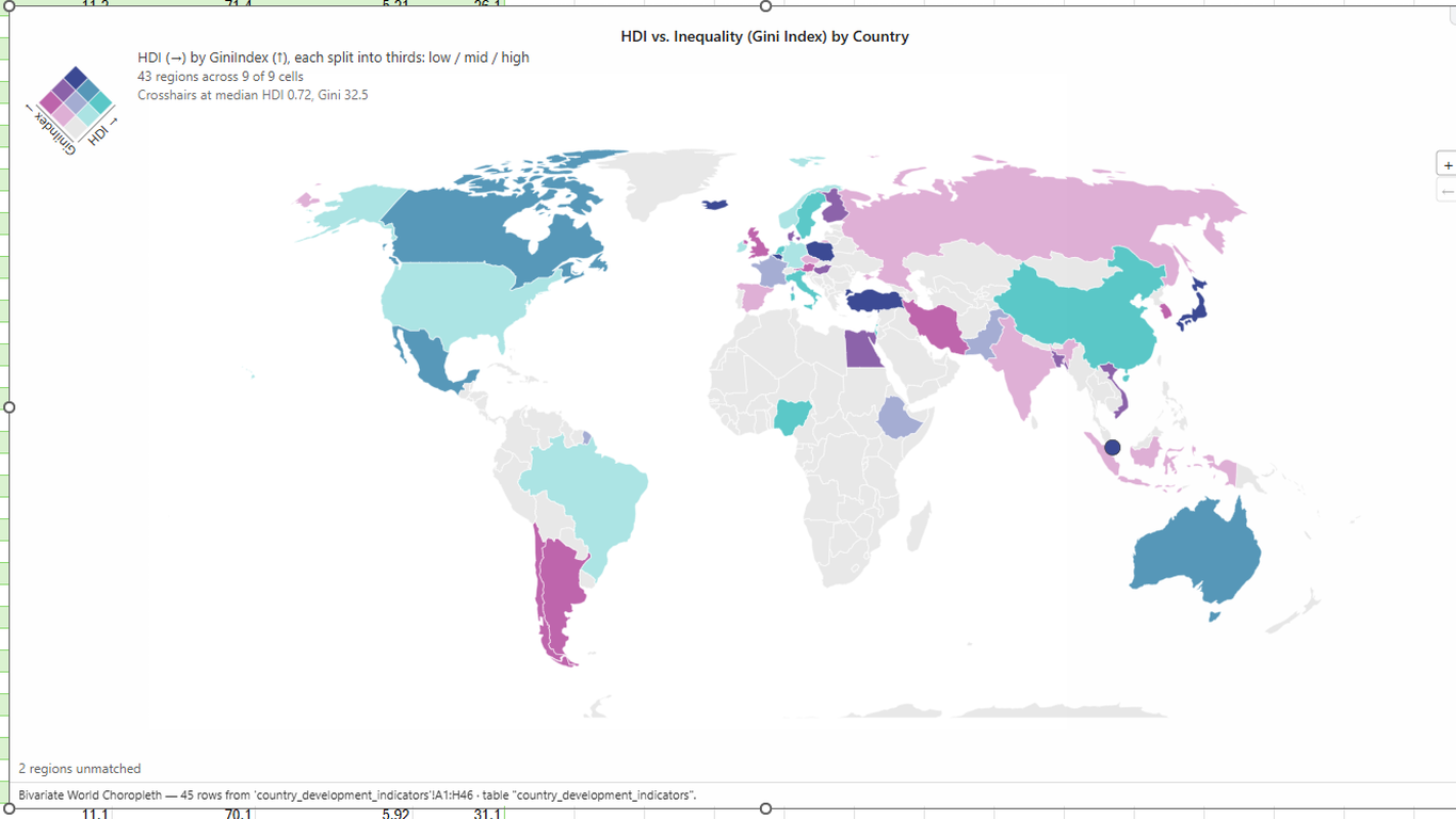
Choropleth maps from ordinary worksheet columns — here a bivariate world map of human development against inequality, with its own legend and an honest count of the regions it could not match.
LLM AI Charts and Maps for Excel: a bivariate world choropleth drawn from a worksheet range
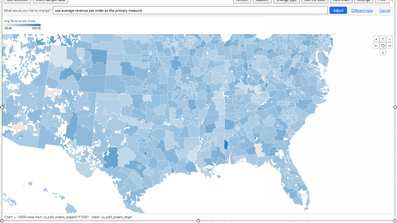
LLM AI Charts and Maps for Excel: a zoomable US postal-code choropleth over ten thousand worksheet rows
Ten thousand rows of postal-code orders, mapped and zoomable — and re-pointed at a different measure by typing “use average revenue per order as the primary measure”.
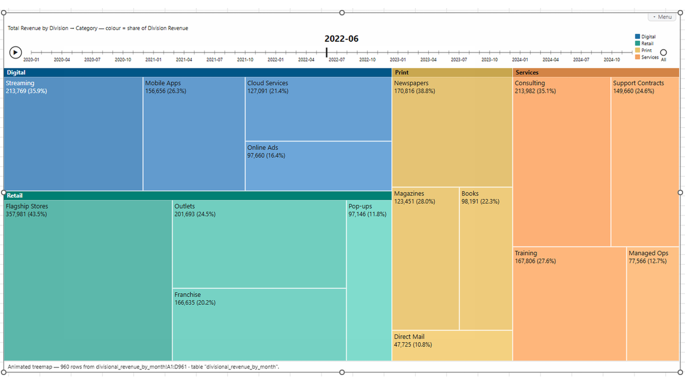
An animated treemap with its own timeline control, built from a table on the sheet. Excel has no chart like this, and you did not have to write one.
LLM AI Charts and Maps for Excel: an animated treemap with a time player, drawn from a worksheet table
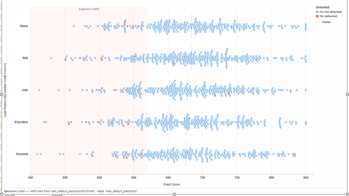
LLM AI Charts and Maps for Excel: a beeswarm plot of 1,400 worksheet rows, with an annotated band
A beeswarm over 1,400 rows, one dot per loan, with the subprime band shaded and the medians marked — the kind of picture that usually means exporting the data somewhere else.
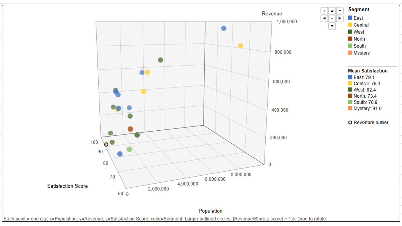
A rotatable 3D scatter, drawn on the sheet and still interactive: drag to turn it, hover a point for the numbers behind it.
LLM AI Charts and Maps for Excel: an interactive 3D scatter plot drawn on the worksheet

The same engine as the Power BI visual

This is LLM AI Charts and Maps for Power BI in a second host: the same chart catalog, the same chart picker, the same plain-English refinement, the same account and the same credits, and one license covering both. What changes is where the data comes from — a range with a header row instead of a semantic model — and a short, honest list of things the two hosts do differently: what is different in Excel.

The deeper walkthrough — range binding, the sample table, linking an account, bringing your own AI model, and the full chart catalog — is on the Excel deep-dive page, and the reference documentation is in Help.


This application may no longer respond until reloaded. Reload 🗙