Our Visuals
Select a Product:

LLM AI Charts
Put AI to work without giving up control — you choose the data, parameters, and versions, while AI suggests smart visualizations. Dozens of chart types, responsive layouts, and quick setup give you powerful insights - with you always in charge.
Highlights...

The engine underneath
This visual is a front end. The reason it hands you a chart that fits your data on the first try is RegiaBI.
No D3 to learn, no HTML tricks: describe what you want — or let it propose — and get a working, interactive chart you adjust with plain requests. Sometimes it shows a view, or measures a thing, you had not thought to ask for. And every chart is executed and measured before you see it — checked, rather than merely returned.
What RegiaBI doesClick images to enlarge.
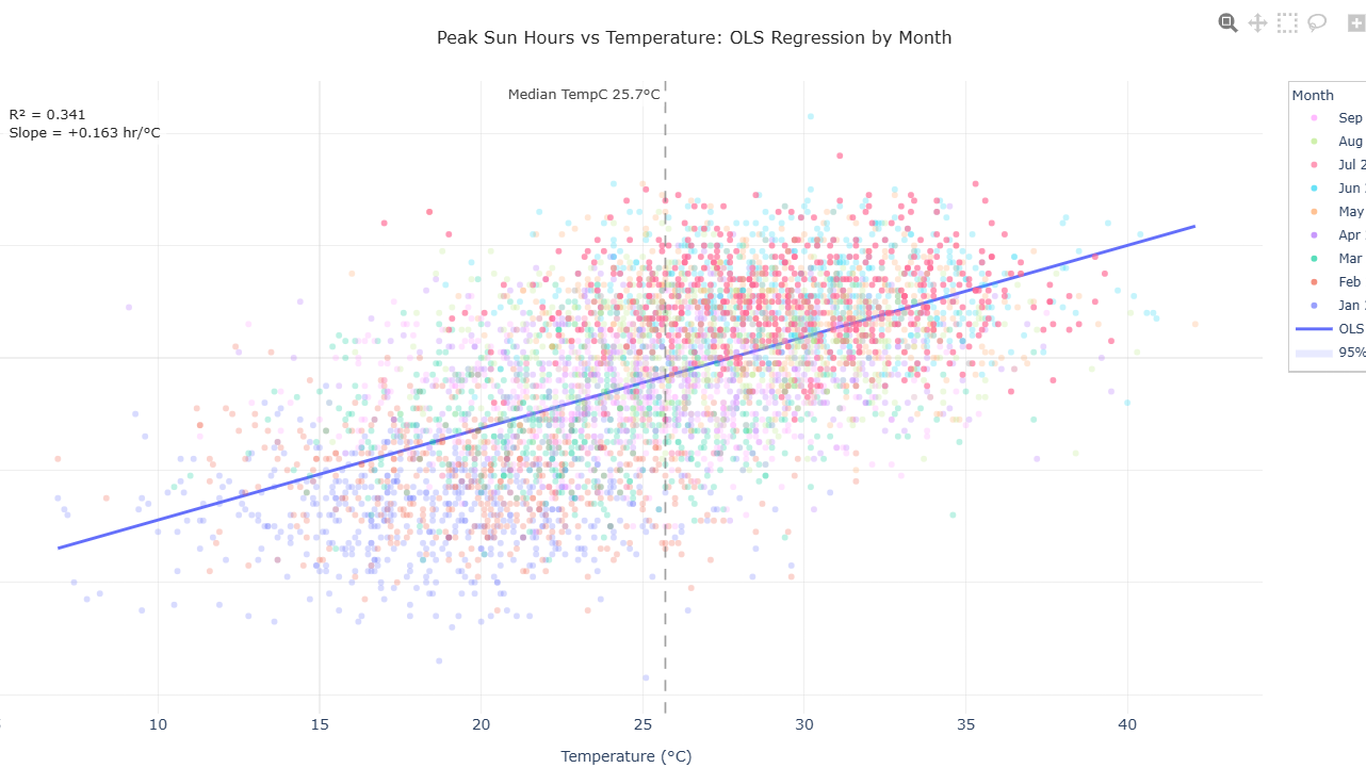
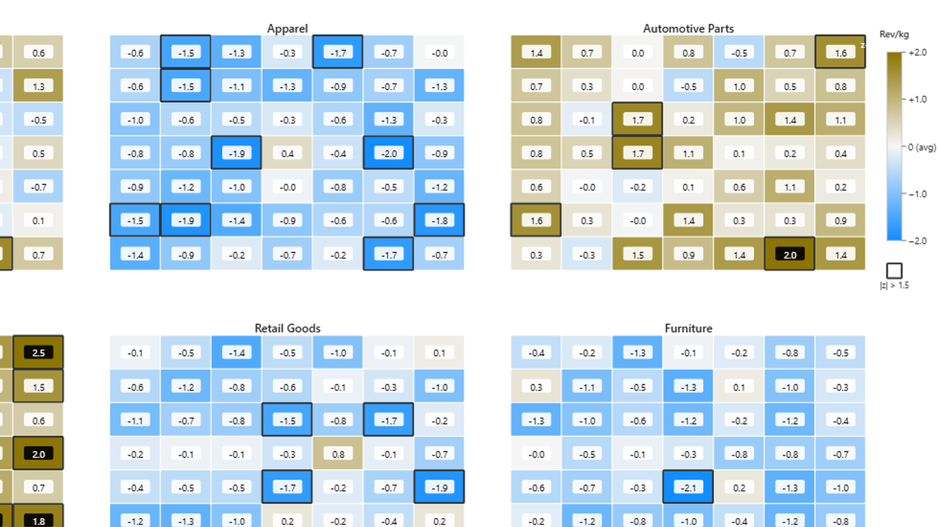
Interactive, Insightful and Configurable: the three pillars of LLM AI Charts. Here's an example of where it chose a chart type, added its own derived measures and annotations, and we've clicked on a legend mark, which in turn filters the data both inside and outside the chart.
In this example, the visual has decided to split into multiple facets, use a color scale (tied to our report palette), give us clickable axis marks, provide tool-tips, and more!
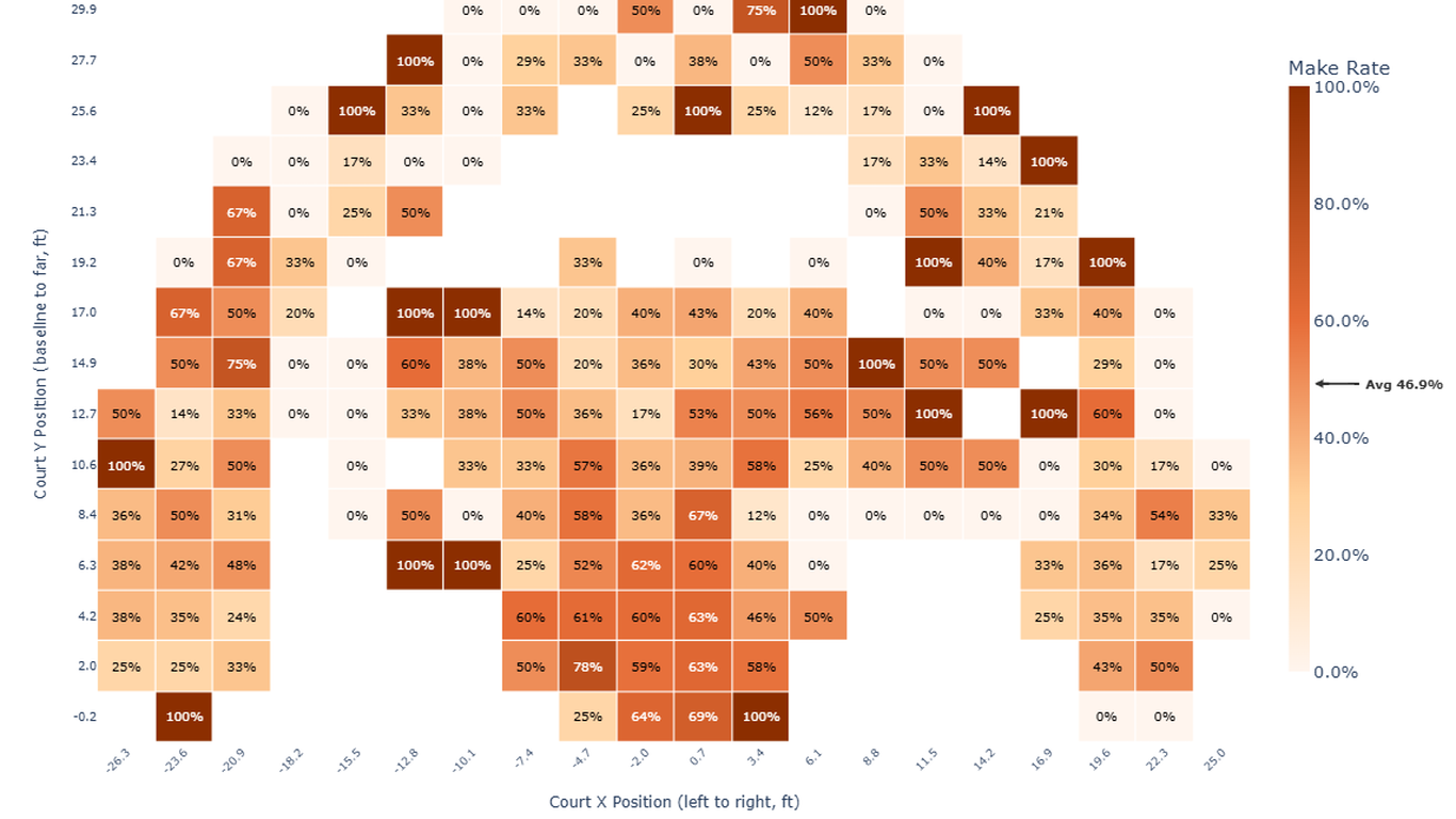
Here's an NBA shot chart: rendered as a heatmap, it becomes fairly obvious which areas of the court are "hot zones". This was the visual's first unprompted choice, in a test run. And it's all interactive, too: if we included a filter for "Team", for example, we'd expect the visual to honor the filtering (and it does so quickly).
With over 75+ chart types directly supported (and tested), it's truly "one visual to rule them all!" LLM AI Charts can render many chart types that are hard to impossible for out-of-the-box Power BI, and can do so without you having to learn new languages like Vega or HTML.
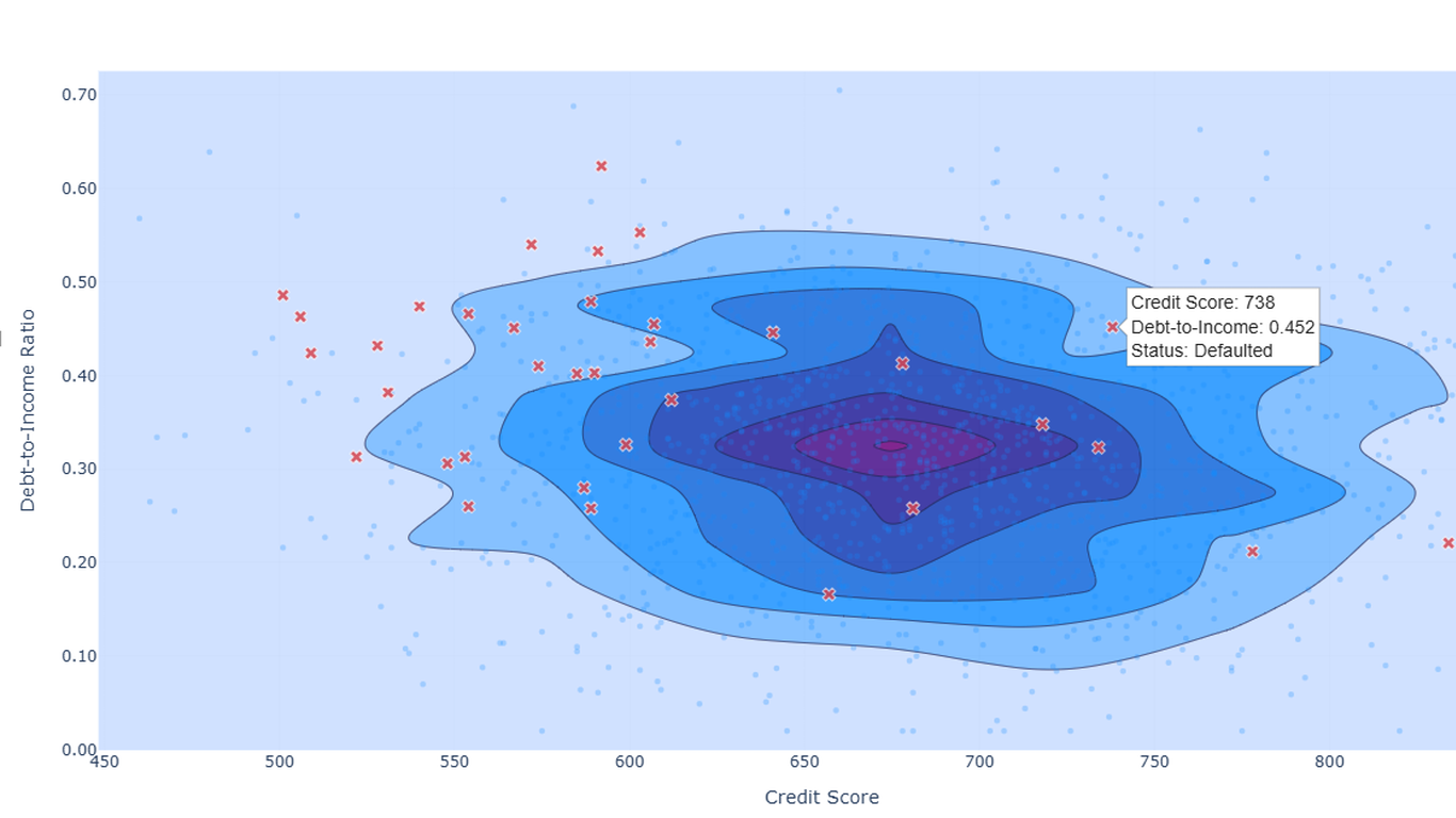
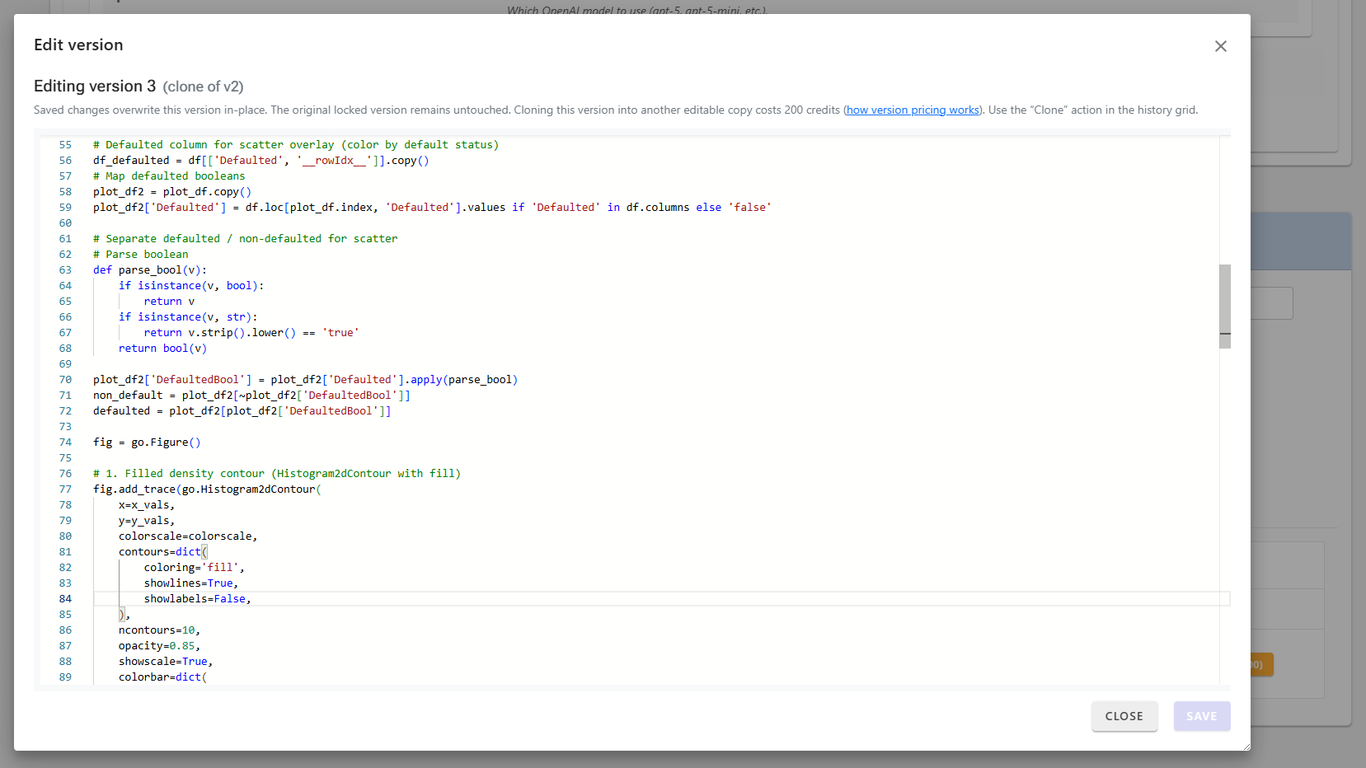
Starting in v2, you can edit the code-behind for charts! This opens the door to infinite customization possibilities, for those willing to write Python or JavaScript.
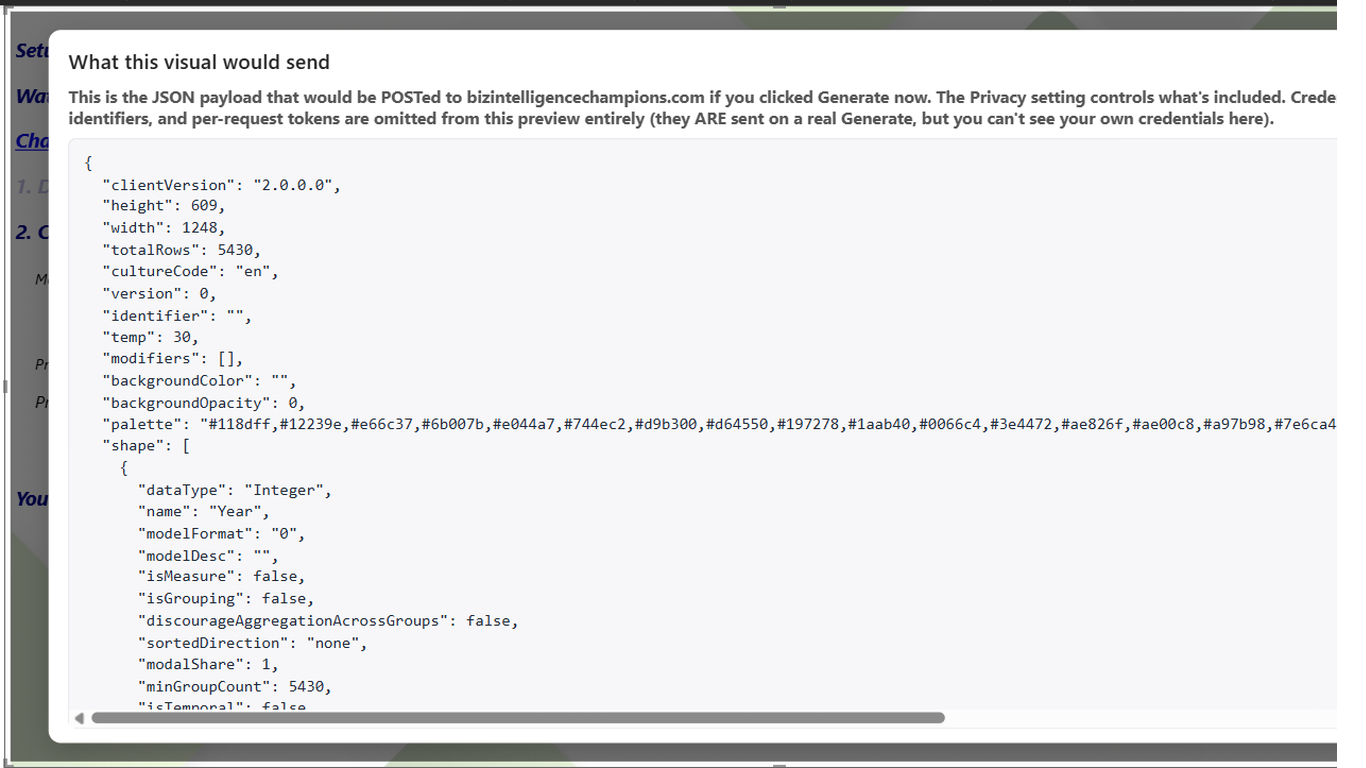
You control how much data is shared between your environment and the LLM, ensuring privacy and compliance. If you have questions about what data would be sent, you can get an accurate look at the payload. We encourage you to use your own LLM keys/endpoints that are sanctioned by your organization; we store them on our server in encrypted form and never share or use them outside of LLM AI Charts.