
From an idea to a shipped, interactive chart in an afternoon — the animated treemap is the newest of 78+ curated visual types that are open for you to reshape as you see fit. Available to everyone now.
Power BI report authors have always had a wall: the moment you want a visualization that isn't in the box (or on AppSource), you're suddenly building "off road" - SDK's, Deneb, HTML, and so on. Many teams just don't and live with limitations.
This article shows that wall coming down. We'll go from a few plain fields to a fully interactive animated treemap — a chart type Power BI simply doesn't have — then crack open the D3 code behind it, restyle it by typing a sentence in English, and ship it in a report that anyone can open. No SDK. No Vega. No separate app.
Bespoke isn't the point, though. A main strength is the curated, production-grade chart types — and an engine that knows what won't work on your data, and says so instead of cheerfully building it anyway.
That second half is why this exists at all. General-purpose AI is unguarded: it will build whatever you ask, confidently, and whether it actually fits your data is your problem to discover. I run into that constantly — building this product has largely been the process of turning each of those discoveries into a guardrail. The aim isn't perfection; it's better output with less effort, with every path left open: keep a good first run as-is, tweak it around the edges, or crack it open and build a complete solution of your own in JS or Python. That loop — hit a problem, encode the lesson — is what the library is made of.
The animated treemap is just the newest to join the library. The hundreds more aren't hypothetical — browse D3js.org and they're right there: gorgeous, and every one a static example wired to nothing. Turning one of those into a live, cross-filtering visual on your data used to be the wall; now it's an afternoon. That's the pipeline. (Hold that thought; there's a challenge for you at the end.)
From field wells to a living chart
Drop Division, Category, Revenue, and Year into LLM AI Charts, pick a model, and — new in 2.0.7 — the visual can tell you what fits: a list of chart types suggested from the actual shape of your data, so the choice is informed rather than blind. Here I've picked Animated treemap explicitly:
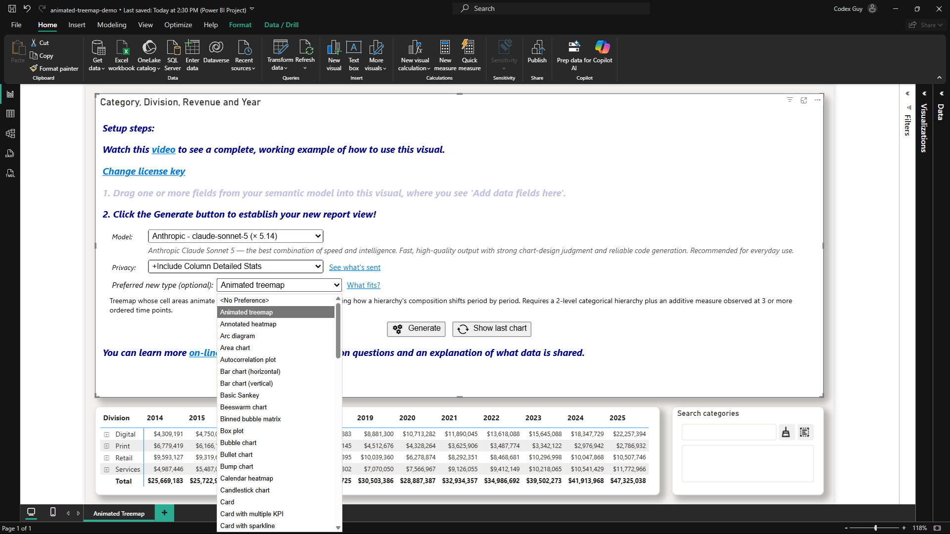
(The data here is a synthetic, curated sample: Divisional Revenue by Year, now in the dataset gallery. Grab the CSV and follow along with the exact same data if you like.)
(New to the visual? Learn more about how to use it here: bizintelligencechampions.com/learn/llmchart.)
One click of Generate later, here's the result — press play and the years sweep by; tiles grow, shrink, and glide between positions, labels riding along:
That's the first wow, but it's not the important one.
The important part: it's a citizen of your report
Click a tile — the rest of the report cross-filters. Click a division header, a legend swatch, a year on the timeline — same. Other visuals filter it right back. In the demo report there's a matrix and a search/filter visual alongside it, and the treemap behaves exactly like a native visual sitting between them, because that's what it is.
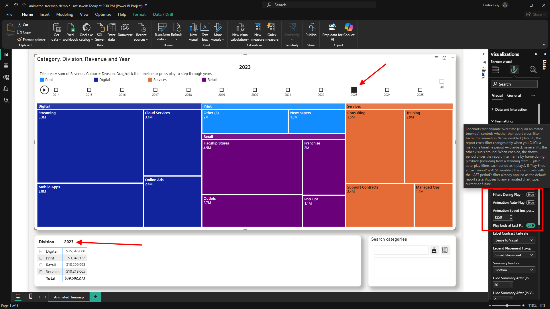
There are purpose-built settings for animated charts, too: Filters During Play (should playback drive the report frame-by-frame, or only clicks?), Auto-Play, speed, and Play Ends at Last Period (false means "All" is the final landing spot).
This is where I'll draw a respectful contrast with Microsoft Fabric Apps (currently in preview). They can genuinely be rich, interactive dashboards — I plan to build some — but they're a code-first web stack (React, TypeScript, DAX, CLI deploys) whose interactivity is hand-wired and ends at the app's own frame — Kurt Buhler's comparison with Power BI reports is excellent on the trade-offs. LLM AI Charts is the other side of the same coin: it brings that code-level richness to widgets inside the reports you already have — low-code, no web skills required — for anyone who'd rather stay in Power BI (there are many good reasons) or extend a report solution that already works. And if you do have the skills, everything here cracks open — keep reading.
Now crack it open
Hover the visual, hit the pencil:
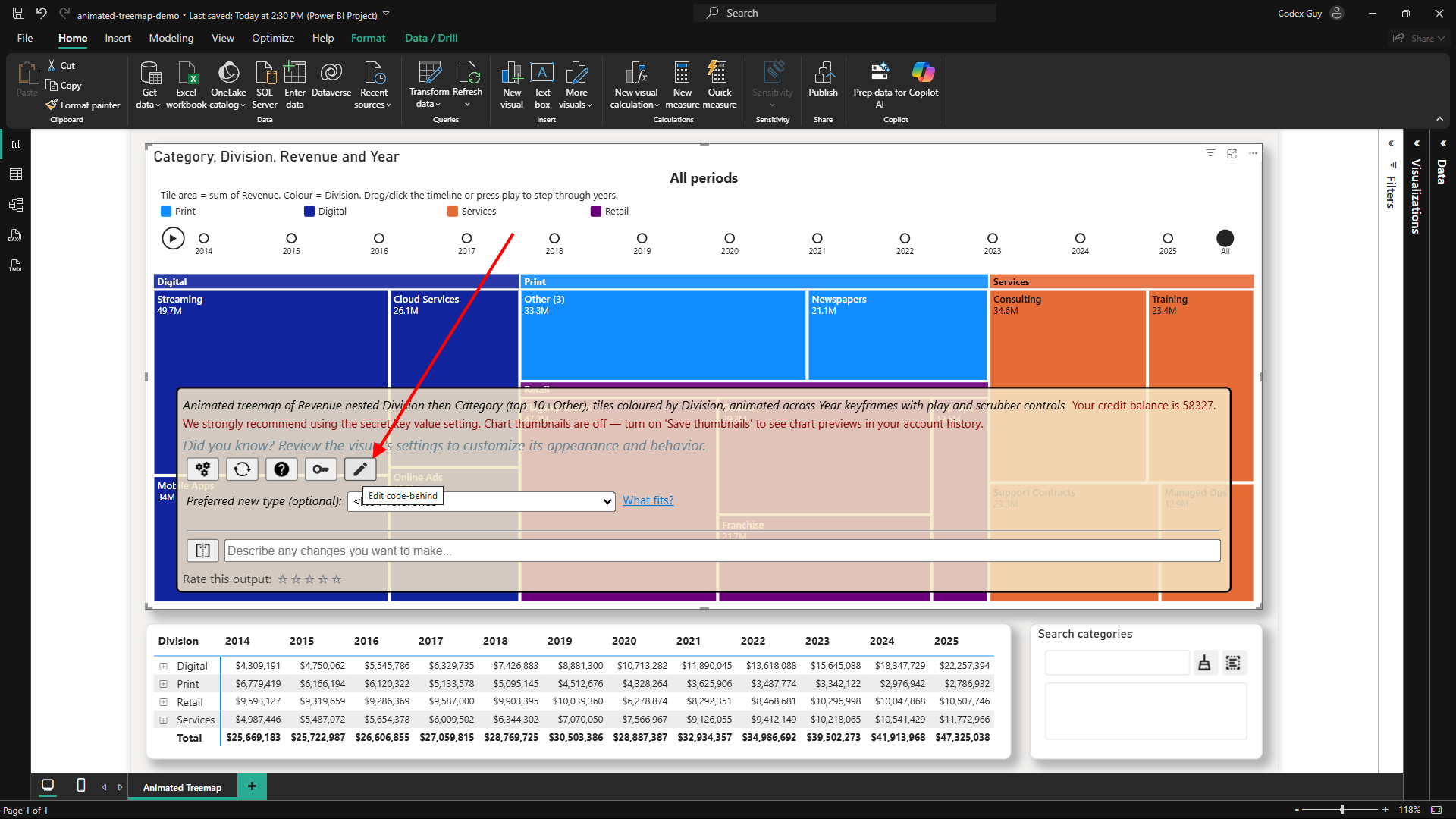
Behind this chart is readable, ordinary D3.js — a single render(container, data, options) function. Not a black box, not a proprietary spec: the same D3 that powers half the data-viz on the internet:
function render(container, data, options) {
  const { columns, rows } = data;                  // your Power BI data, already shaped
  const svg = d3.select(container).append('svg');  // ordinary D3 v7 — the global `d3` is just there
  // …draw your marks; tag each with one attribute and it cross-filters the whole report
}
That's the whole contract: your data comes in, you draw, and one attribute per mark makes it a first-class report citizen. Generated versions are locked (they're the audit trail); unlock or clone one from your account history and it's yours to edit:
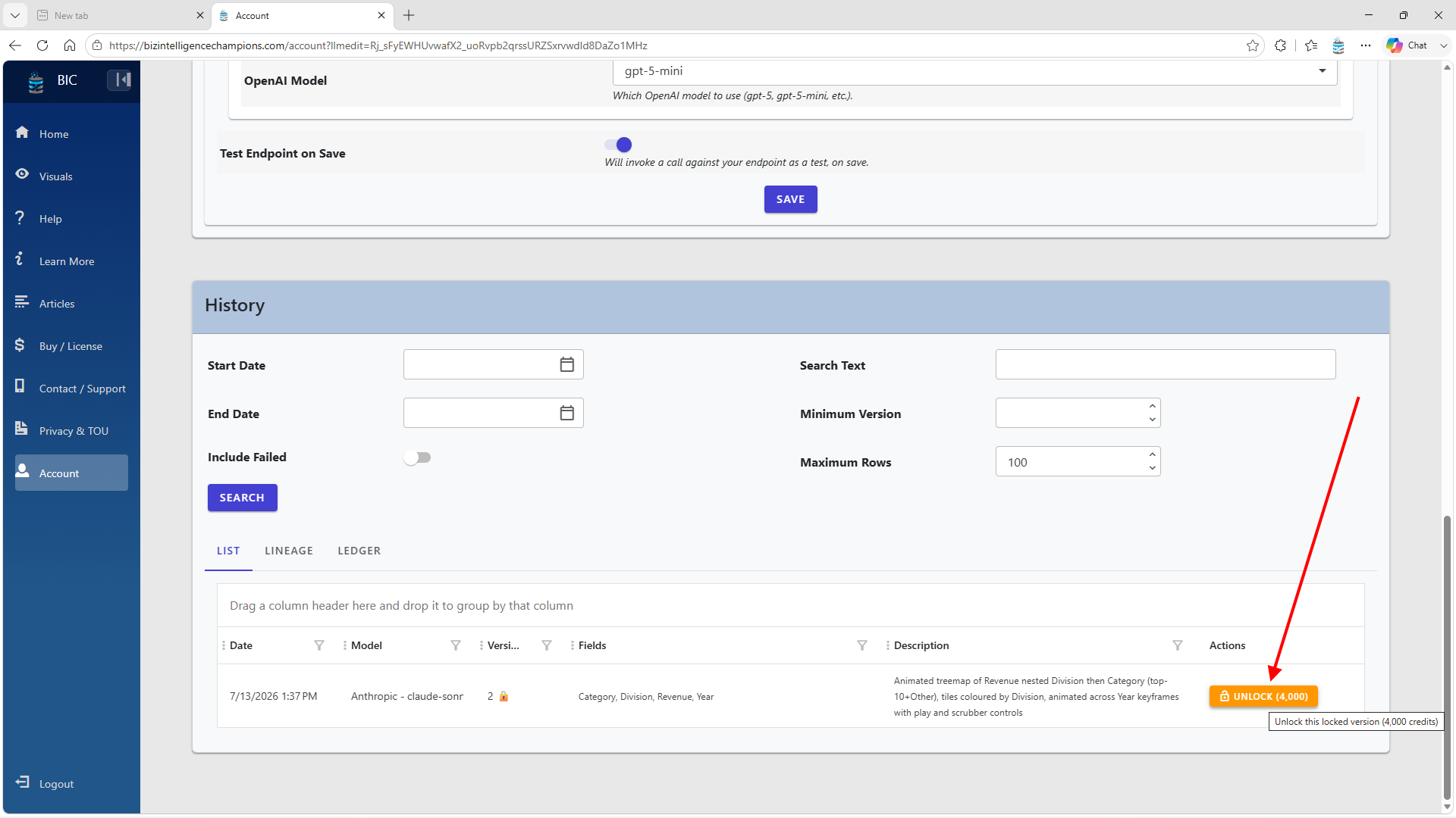
This is the second wow, and the deeper one: the animated treemap isn't a feature I shipped — it's an output. The same machinery will hand you the D3 for your bespoke chart. If you're a developer who's been meaning to learn D3, starting from a working, interactive, theme-aware chart built on your own data beats a blank index.html by a mile. If you're not a developer, keep reading.
Restyle it by typing a sentence
In the editor, BYO-key users get an AI edit box. I didn't like my timeline circles, so:
"Move the 'All' selector up to the same line as the legend. Make all timeline marks squares."
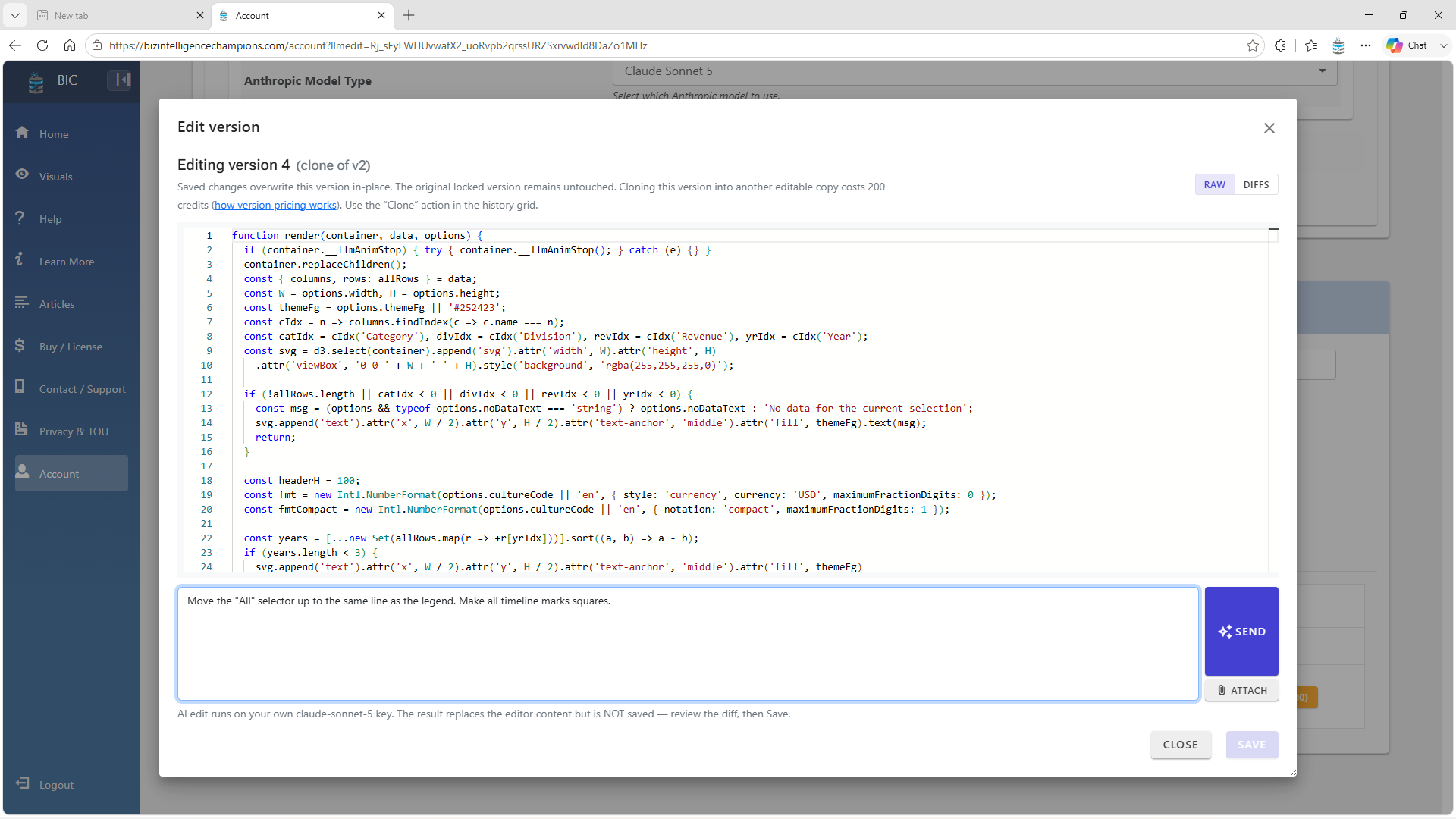
The result comes back as a reviewable diff — circles out, squares in — never auto-saved. You read it, then save:
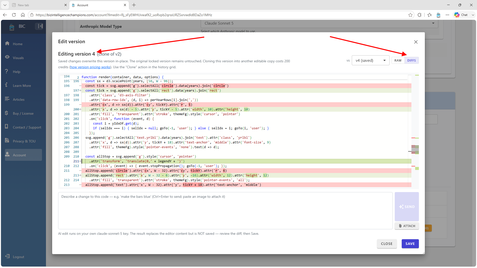
You can also attach an image or a data file to the request — paste a screenshot of the look you're after and say "match this."
Saving tells you exactly how to load it in Power BI — each report visual is bound to a specific Version Number, so nothing changes under your feet until you say so:
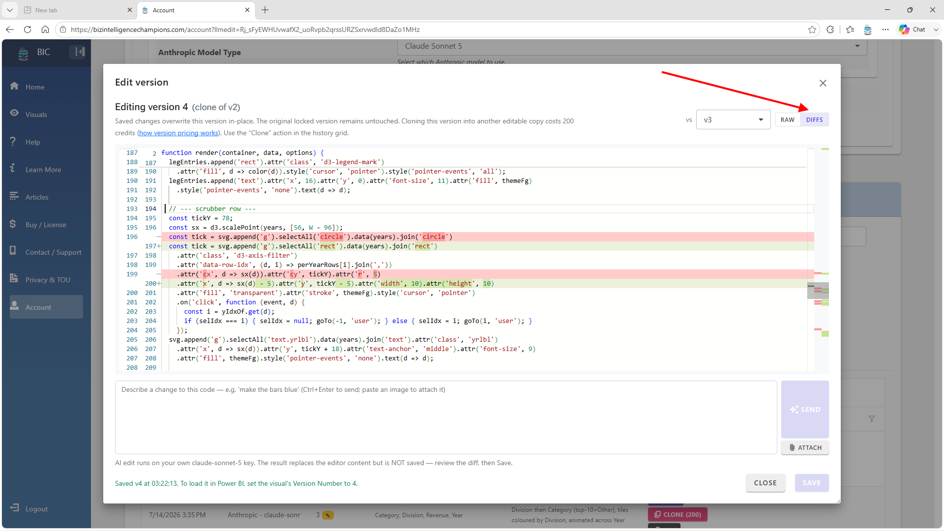
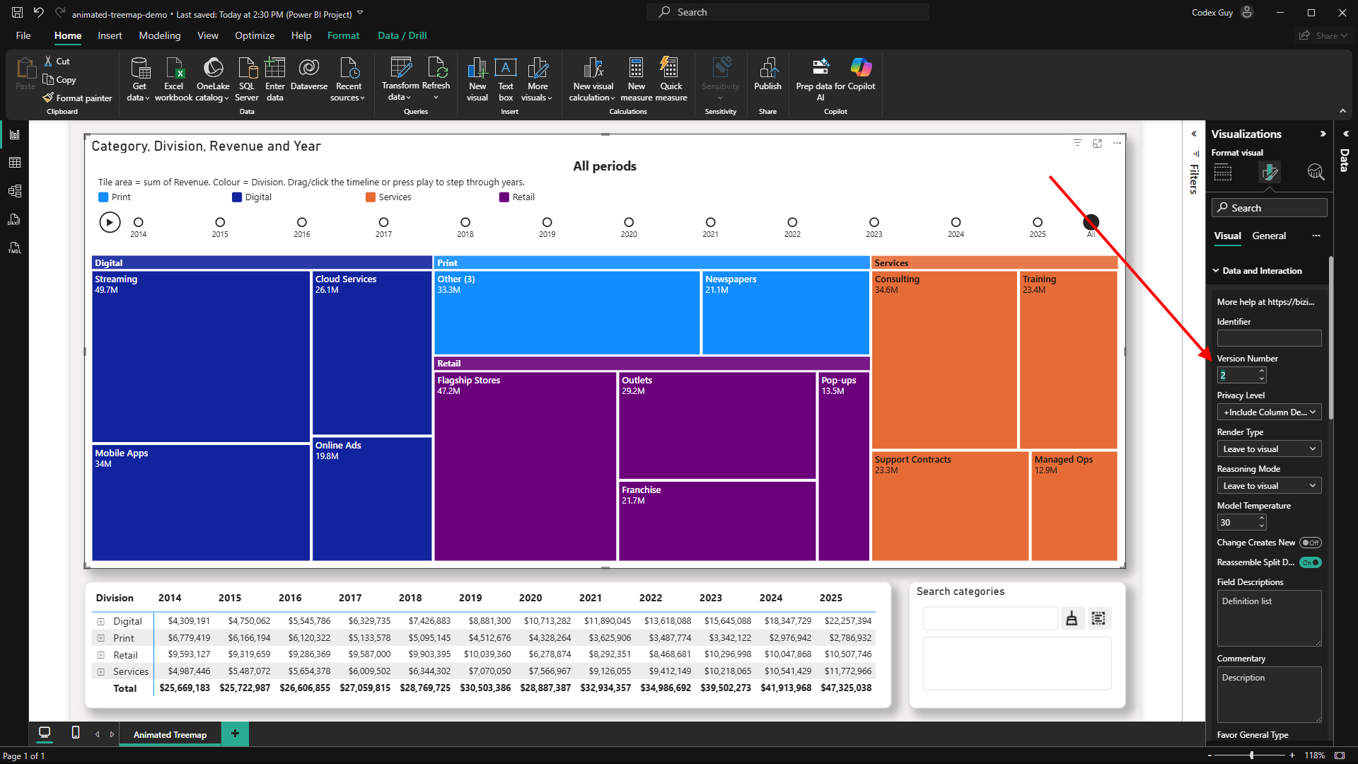
Squares it is. Here's the finished visual in motion — square timeline marks, the "All" control up on the legend line, and the animation settings doing their job:
Ship it without shipping your keys
One more wow, and it's the one IT will care about: pinning. Pin a version and the next time the report connects, your license key, secret, and account credentials are removed from the report file. The chart still renders — the code is cached inside the report and executes locally, in the sandbox — but nobody can generate against your account from a shared copy.
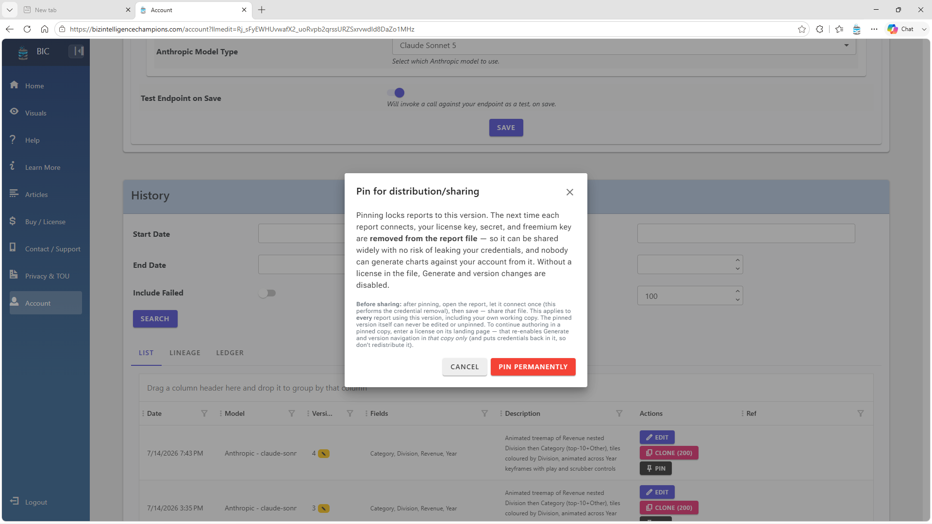
The demo report for this article uses a pinned version. Download it, open it, poke at it — no license needed.
"Couldn't I just ask ChatGPT for D3 code?"
You could — and I'd genuinely encourage you to try, because the comparison is instructive. My experience building this product: a raw LLM's first attempt at a chart like this typically arrives with broken tweening, colliding labels, a legend that lies about the colors, or interactivity that silently doesn't work. How do I know these failure modes so specifically? Because I've watched a lot of generations go sideways and built the guardrails accordingly (... with my own secret sauce).
It's worth being precise about why the first attempt misses: the model isn't analyzing your data, it's predicting what a chart for data like this probably looks like — a plausible guess, not an analysis. Which is why generating the chart is only half of what matters; being able to edit and version what comes back is the other half.
That's the actual product: not "an LLM that writes charts," but a domain-tuned pipeline — layers of rules that turn a plausible first guess into output you can trust, and wire every mark into your report's cross-filtering along the way. It's also why I generate JavaScript and Python rather than Vega: there's vastly more training data in the world for JS and Python, and models are simply better at them. (Do you disagree? Leave a comment, would love to hear about alternatives.)
And it's why the animated treemap went from idea to the library in an afternoon — the pipeline did the heavy lifting, the guardrails kept it honest, and the D3 host contract made it interactive for free. That's the real headline: the same path is open to hundreds of chart types that aren't in the library yet. New types show up on a cadence that feels a lot like a fast-moving dev tool (e.g. Claude Code?!) — mostly on the server side now, so improvements land without you reinstalling anything (the landing page flags when a newer pre-release build is worth grabbing).
Not every generation is perfect — and when one misses, the escape hatches are right there: a Try Again button that keeps the same chart type, versioning so you lose nothing, and the editor for surgical control. But that occasional miss is the flip side of the whole point: a rigid template only ever gives you what it was built for, while letting a model write real code opens the door to outcomes those templates could never reach.
And if you tried earlier and hit a rough edge? Come back and run it again in a day or two — there's a good chance that exact problem is already fixed. That's the nature of this kind of engine: it keeps improving between visits, most fixes landing server-side with nothing for you to reinstall.
Fine print worth knowing
- Cost: hosted generations use credits — they cover the models and keep the platform running; bring your own API key and you pay essentially your provider's rate, usually pennies a chart, with the AI edit box running entirely on your key.
- The visual controls what's inside the visual. Container-level formatting — background, border, shadow — is still yours in the normal Power BI format pane. Don't forget it exists; it's how the demo report got its card look.
- Pre-release builds: I ship them because marketplace certification takes time and improvements come fast (server-side ones deploy continuously already). A pre-release is technically a separate visual ID — you'll see it in the About dialog — and the landing page shows a link whenever a newer pre-release exists.
So here's my challenge to you
The animated treemap went from "wouldn't that be nice" to a live, interactive, distributable Power BI visual in an afternoon. It's one of 78+ curated types today — and I'm betting the same path works for hundreds more.
So name one. The chart you've always wanted in Power BI and could never get — the one you were told needs a custom-visual project, or a BI tool you don't own, or a learning curve you don't have time for. A radial timeline, a world choropleth, a slopegraph, or your own weird hybrid. Keep checking in and I guarantee you'll see new types appearing rapidly, given the framework supports it and it's inspiring to push the limits.
The demo report from this article is yours to download — pinned, license-free, with the data embedded, so there's nothing to hook up. Open it, click a tile, scrub the timeline, watch the whole report cross-filter. The wall took a lot longer to build than it's taking to come down.
Comments
No comments yet — be the first.
Leave a comment
Your email is never shown — we use it once to confirm the comment.