
North America Choropleth
The countries of North America shaded by a measure on a filled map framed on North America, a closer view than the world map when the data sits in one continent.
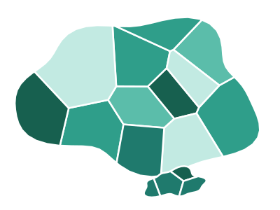
An illustration of the type, not a chart made from data.
When it fits
Use it for one measure per country in North America: sales by market, or a rate you track country by country. The frame on the continent draws its countries larger than a world map allows.
When it doesn't
If your data is really about the United States, Canada and Mexico alone, three shaded shapes say very little; a bar chart, or a map by state or province, tells more. Raw totals also favor the largest countries, so use bubbles when volume is the point.
The data it needs
Best for country-level metrics when the countries are in North America: sales, users, or population by country (keyed to country names or ISO codes).
Smallest size it draws at: 294 by 300 pixels.
How to ask for it
Pick North America Choropleth from the list of what fits your data, or describe it in your own words:
- “Shade North American countries by revenue growth”
- “Map customer count per 100,000 people by country in North America”
Try it
Start with your own data in Power BI or Excel, or build it into your own app through the MCP server. Each one lists the types that fit your data before it builds anything.