
Lag plot (scatter of value vs lag)
Lag plot for autocorrelation of time series.
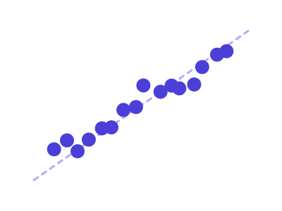
An illustration of the type, not a chart made from data.
The data it needs
Requires a datetime series with one continuous variable.
Smallest size it draws at: 280 by 280 pixels.
Try it
dataset Try it with Solar Panel Energy OutputStart with your own data in Power BI or Excel, or build it into your own app through the MCP server. Each one lists the types that fit your data before it builds anything.