
Cycle plot
Splits a time series into one mini-panel per seasonal sub-period (e.g. a small line for each quarter across years), so within-period trend and across-period seasonality are both visible at once.
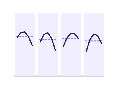
An illustration of the type, not a chart made from data.
The data it needs
Best for multi-year monthly/quarterly/weekly data where the question is seasonality vs trend ('is Q4 always highest, and is each Q4 growing?').
Smallest size it draws at: 320 by 280 pixels.
Try it
dataset Try it with Fitness Tracker — Daily Steps, Sleep & Heart RateStart with your own data in Power BI or Excel, or build it into your own app through the MCP server. Each one lists the types that fit your data before it builds anything.