
Motion bubble chart
A bubble chart played over time: each entity is ONE bubble that TRAVELS across two continuous axes period by period, sized by a third measure - the axes stay fixed, so a bubble moves only when its own values do.
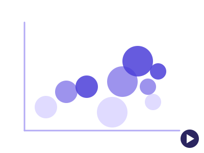
An illustration of the type, not a chart made from data.
The data it needs
Requires one categorical whose members are the bubbles, two measures for position and a time column with 3 or more ordered periods; best for watching entities travel - plans by subscribers and churn, countries by wealth and lifespan, teams by cost and output.
Smallest size it draws at: 294 by 320 pixels.
Try it
dataset Try it with SaaS Subscription Metrics by PlanStart with your own data in Power BI or Excel, or build it into your own app through the MCP server. Each one lists the types that fit your data before it builds anything.