
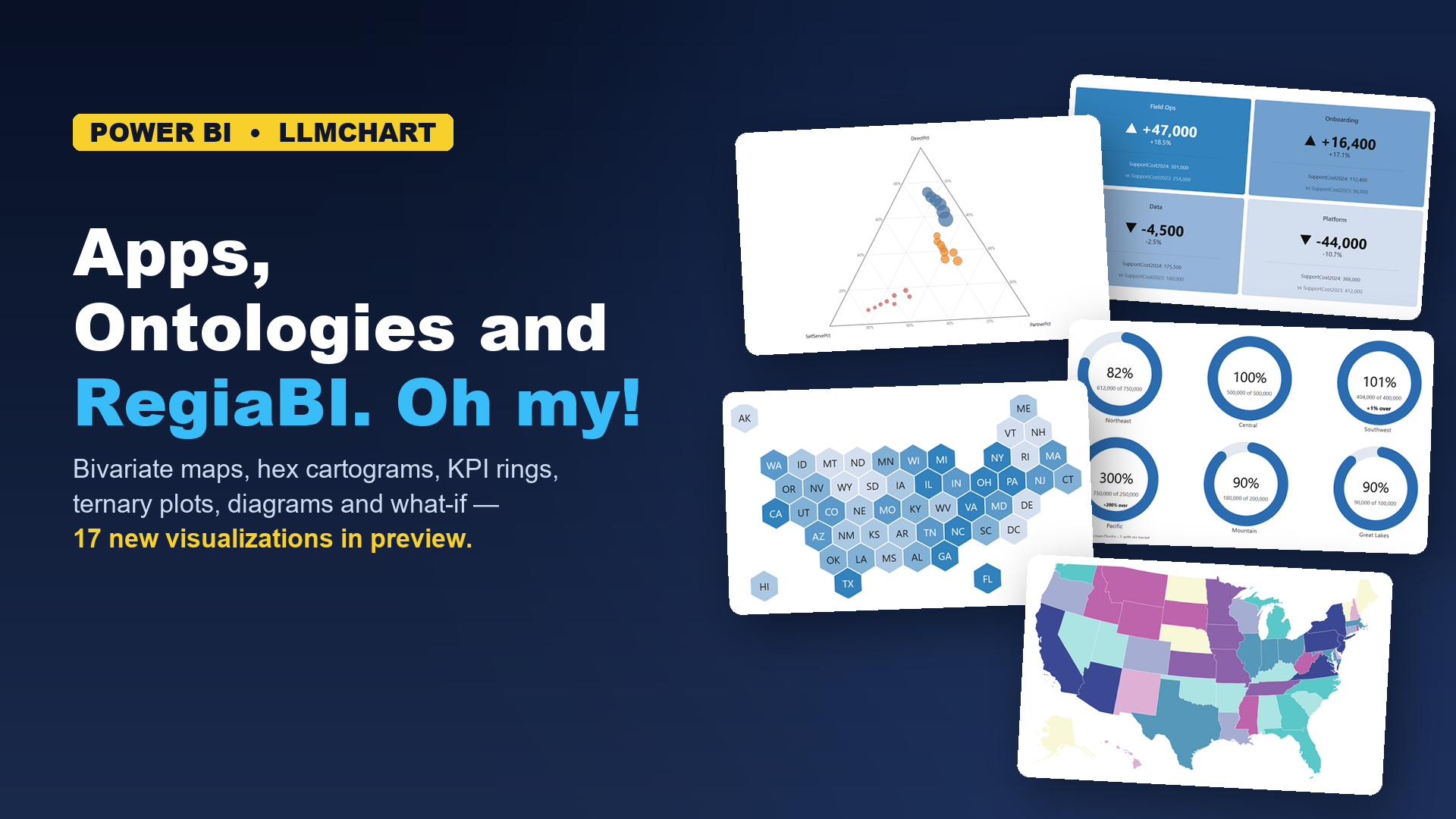
This one isn't a single topic taken to its conclusion - it's an update on recent work across several fronts.
1. The engine continues to evolve
The engine that decides which charts your data can legitimately support, and then generates them, has an actual name now: RegiaBI (more details). It's better at telling "impossible" from "possible but poor", and it can project your data into a different shape - an identifier, a category and a measure become a chart grouped by the category with the measure aggregated, no DAX required, and it tells you it did so.
The question I keep asking: can this be made accessible to non-programmers? The standing answer is yes. Excel became the second chart surface (section 3), and there are millions of Office users who shouldn't need a charting library, a programming language or an AI agent to get a better chart. Office is just one new surface: many more are possible (and coming!).
That's also why the names have changed. What was "LLM AI Charts" is now LLM AI Charts and Maps for Power BI, with a sibling, LLM AI Charts and Maps for Excel. Same engine, same catalogue, same licence - the name now says where it runs, and "for Power BI" leaves room for every "for ..." still to come.
The short version of why any of this exists
Ask an AI to draw a chart and it'll produce something plausible - and plausible can be the problem. It can reference a column you don't have, pick a type your data can't support, or invent an aggregation that quietly fabricates a number. It looks right, so you find out late or never. I hear plenty of "got what I want - after 50 prompts!" The problem isn't that AI is bad at charting. It doesn't know what your data actually is, or what a good chart actually is.
The honest limit: an ontology can tell you a choropleth is the right encoding for country-level revenue. It can't tell you the legend will collide with the Antarctic peninsula at 400 pixels wide, or that 195 labels need pooling. That's rendering quality - a different kind of knowledge, accumulated from actual failures on actual data at actual sizes. The ontology is one strong input among several.
A footnote if you follow this space: Microsoft announced Fabric IQ at Ignite, with an ontology over OneLake. That one models your business - Customer, Shipment, Breach. This one models the grammar of graphics. They stack; they don't substitute - and the largest vendor in the space arriving at the same premise is a good sign for anyone who's been arguing it to a sceptical room.
Is it finished? No. It improves by running: every diagnosed failure becomes a rule stated once, and every correction comes from something that actually went wrong for somebody, not from a whiteboard.
2. A pile of new visualizations, in preview
The catalogue grew a lot, and most of the new arrivals are in preview - two have already earned their way out. Every screenshot is drawn from a dataset in the dataset gallery, linked in its caption, so you can try the same chart on the same data.
Variance chart (budget vs actual) - the actual against the budget, plan or target the data itself names, with the difference drawn as its own marks rather than left for you to subtract.
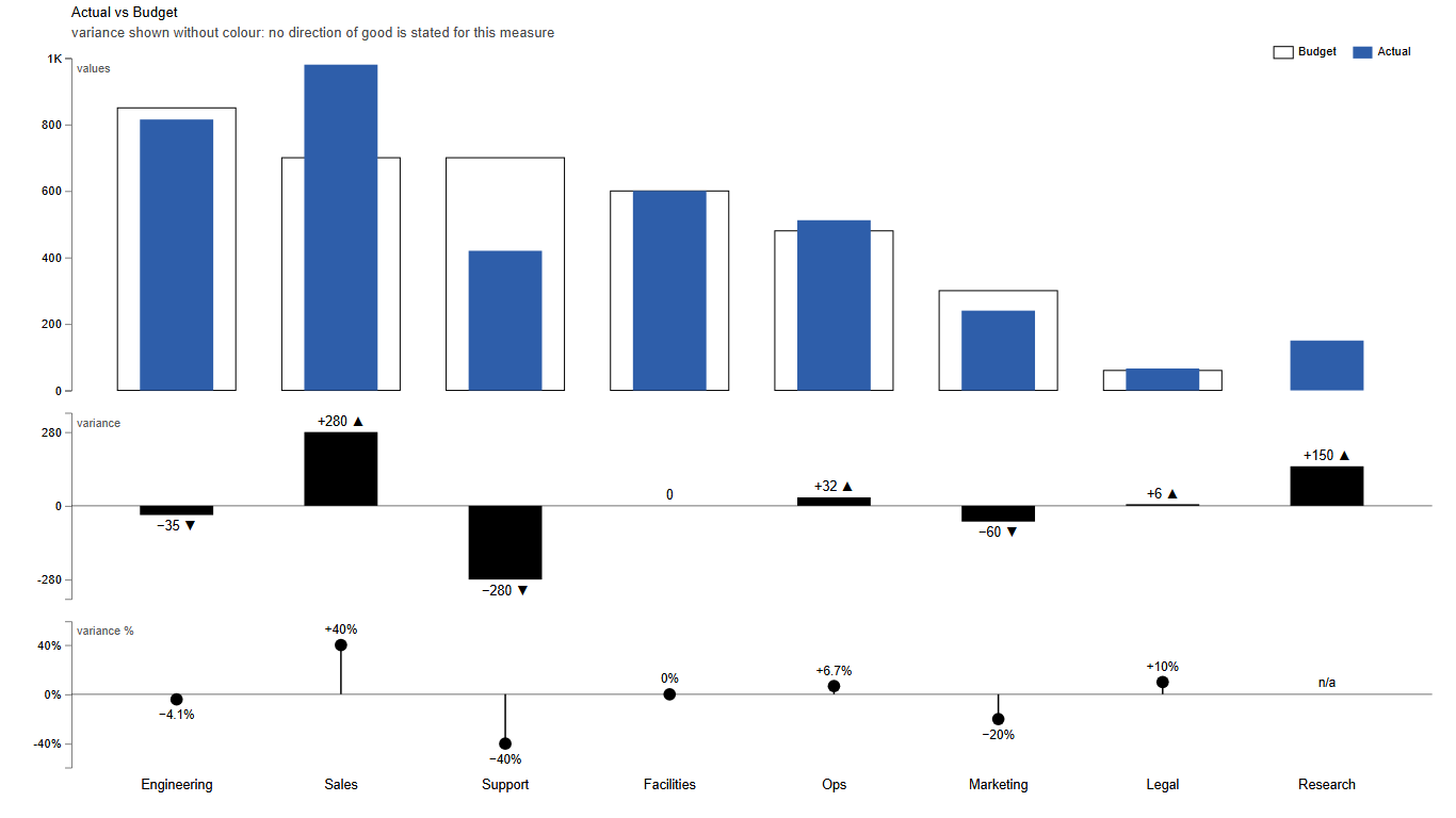
Variance chart - each department's actual against budget, with the gap and percentage as their own panels Data: Department Budget vs Actual (CSV) Delta KPI - a headline number beside its comparison, the change as an amount and a percentage, coloured only when the data says which way is better. Falling costs shouldn't be red.
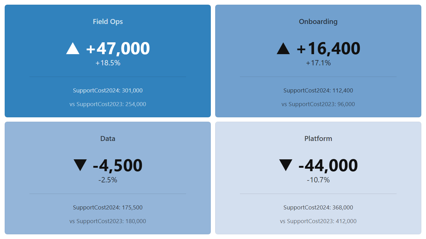
Delta KPI - support cost by team, left uncoloured because nothing says whether higher is better Data: Support Cost by Team, Year over Year (CSV) Card with embedded - a headline number with one small drawing inside: its target, its history, its split, or on a large tile the spread behind it.
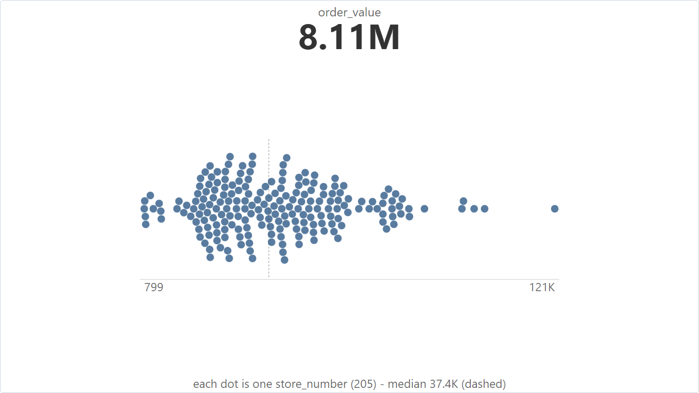
Card with embedded - total order value, every store's total beneath it as a beeswarm Data: Order Value by Store, Raw Order Rows (CSV) Gauge, Linear gauge, Thermometer and Progress ring - one value against a ceiling, in four forms, each offered only on a tile it fits: the linear track for wide tiles, the thermometer for tall ones, the ring for a share of a whole.
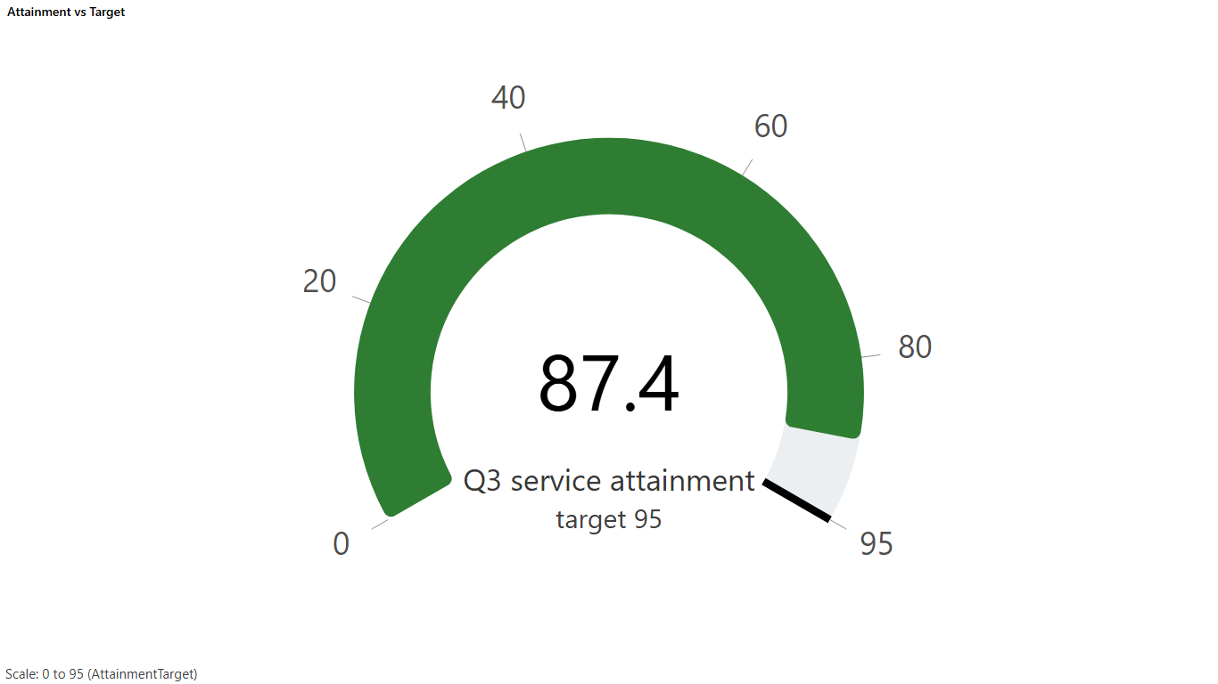
Gauge - one attainment value against its target ceiling Data: KPI Attainment vs Target (CSV) 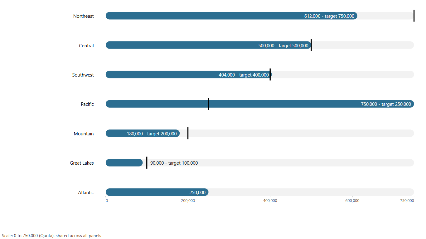
Linear gauge - each team's attainment against its quota Data: Team Quota Attainment (CSV) 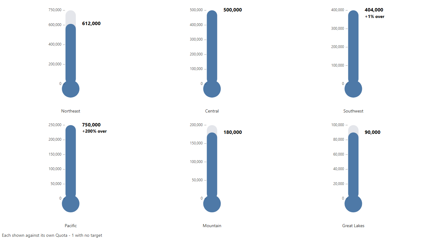
Thermometer - the same teams, for a tall narrow tile Data: Team Quota Attainment (CSV) 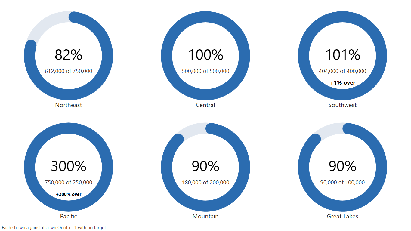
Progress ring - attainment as a share of quota Data: Team Quota Attainment (CSV) Bivariate World Choropleth and Bivariate USA Choropleth (by state) - two measures on one map through a 3x3 colour matrix, so the places where they disagree stand out.
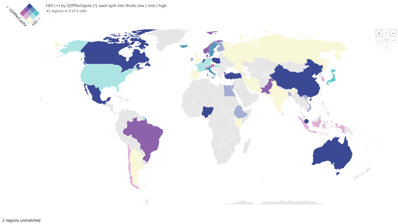
Bivariate World Choropleth - human development against GDP per capita Data: Country Development Indicators (Illustrative) (CSV) 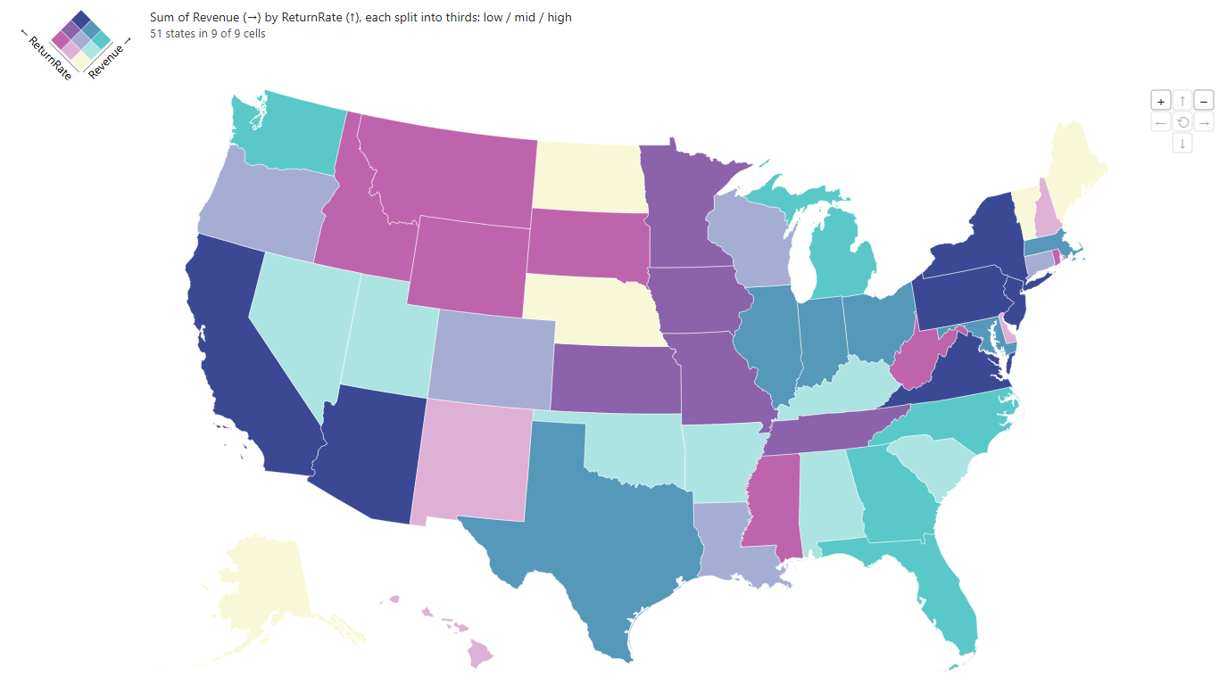
Bivariate USA Choropleth - revenue against return rate by state Data: US State Store Metrics (CSV) US hex-tile cartogram and World tile-grid cartogram - every state one equal hexagon, every country one equal square, so Rhode Island and Singapore get read.
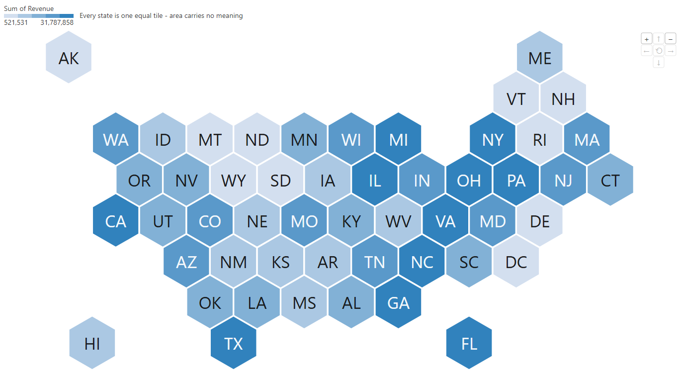
US hex-tile cartogram - store revenue, one equal hexagon per state Data: US State Store Metrics (CSV) 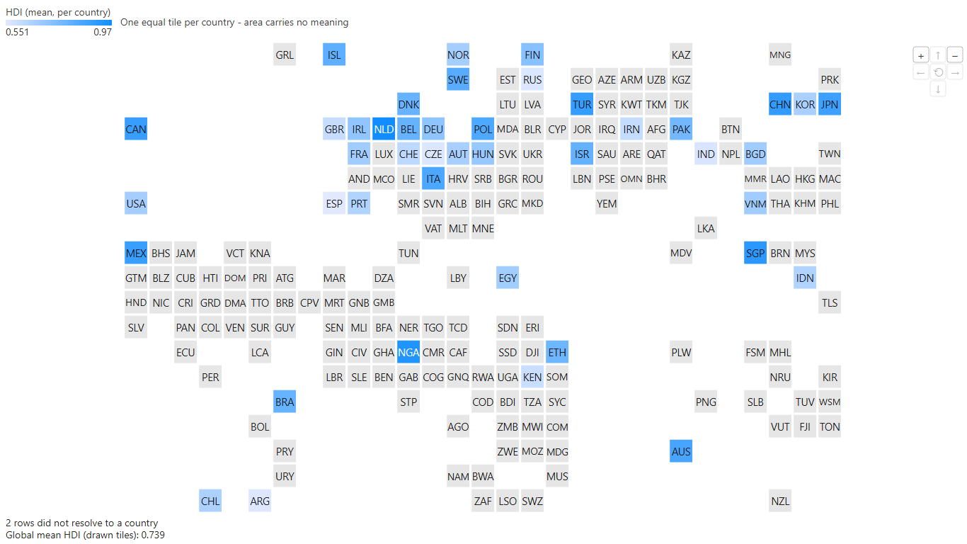
World tile-grid cartogram - human development, one equal square per country Data: Country Development Indicators (Illustrative) (CSV) Motion bubble chart, Animated bar chart and Animated World (Bubbles) - entities travelling across two axes period by period, the classic bar-chart race, and bubbles growing on a map that never moves.
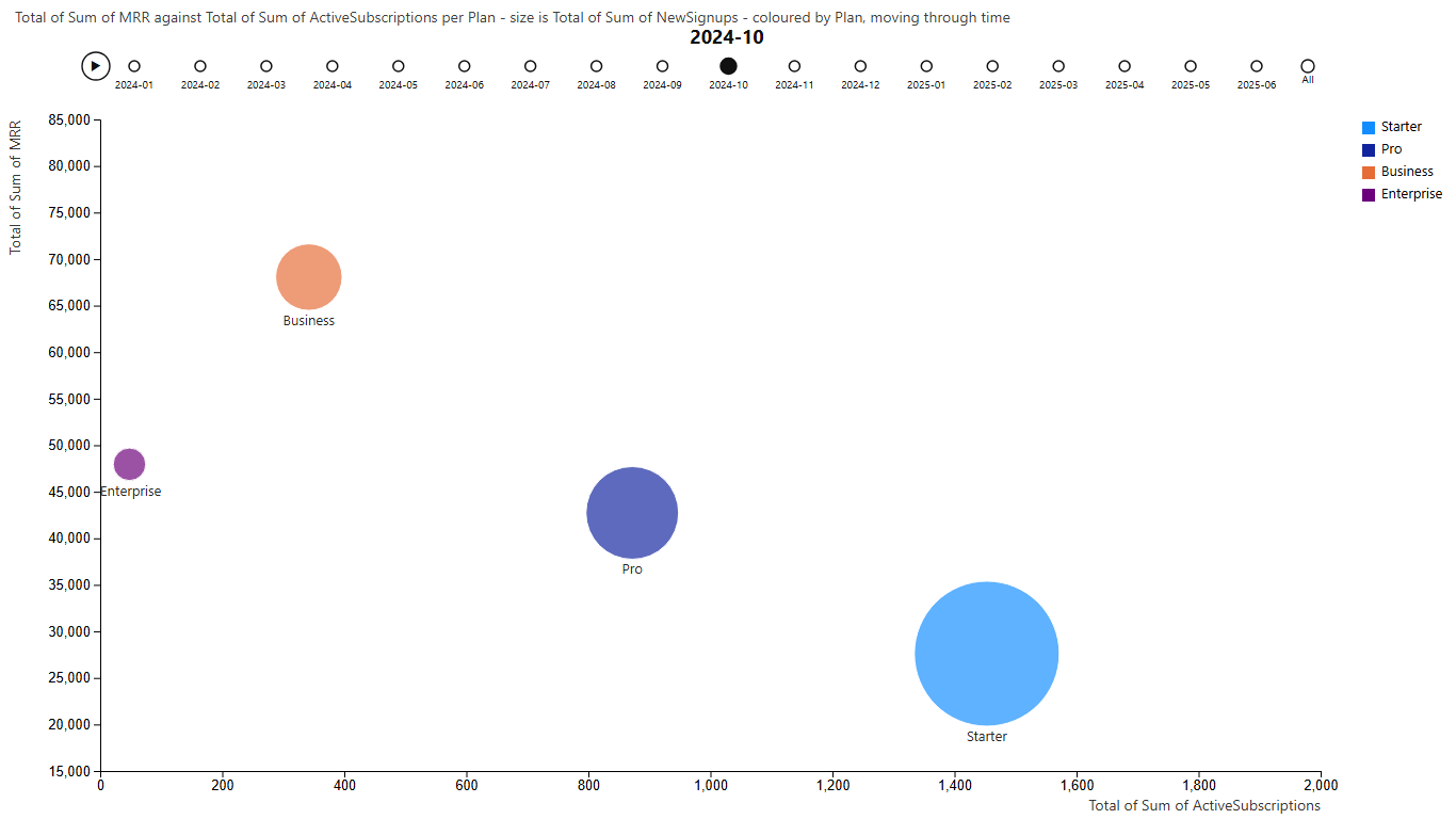
Motion bubble chart - subscription plans month by month, one frame shown Data: SaaS Subscription Metrics by Plan (CSV) 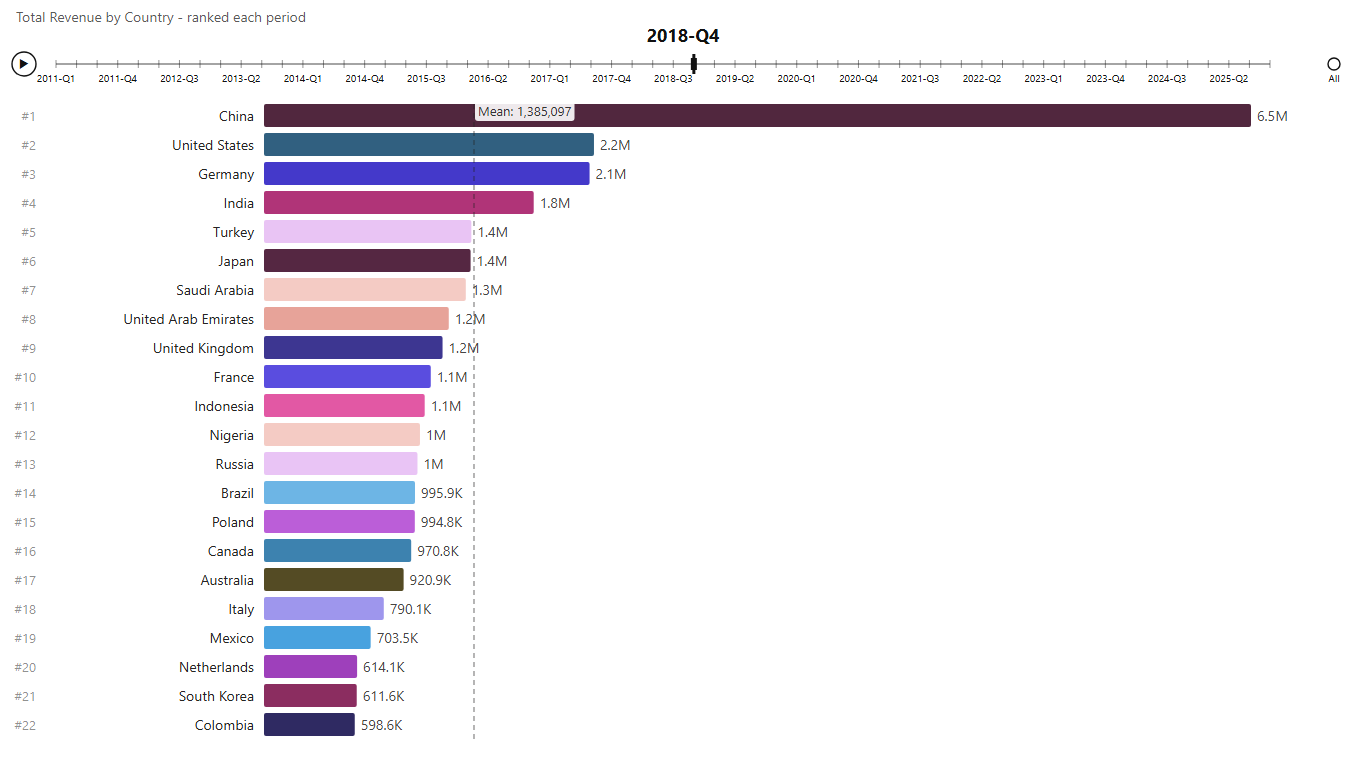
Animated bar chart - fifteen years of revenue by country, one frame shown Data: Store Revenue by Country, 15 Years (CSV) 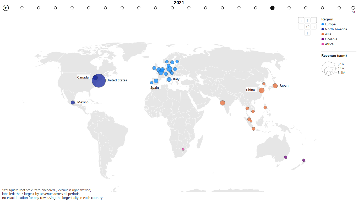
Animated World (Bubbles) - a company opening one market at a time, 2021 shown Data: Global Revenue Expansion (CSV) What-if projection and What-if scenarios - one measure over time, then where it could go. Drag the growth rate or horizon and the end value, and the period a target is reached, update beside it; scenarios draws every rate at once. In Power BI, a bound What-If parameter can drive the rate.
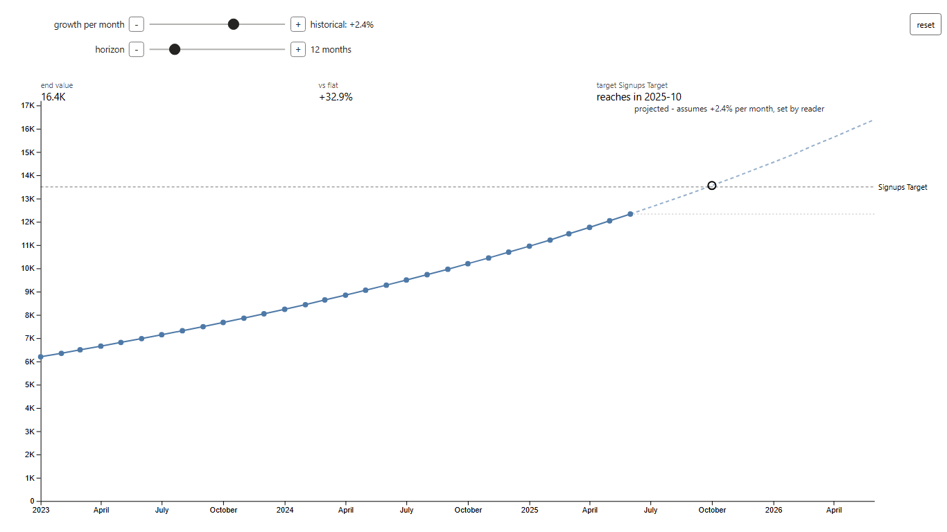
What-if projection - signups projected forward, with the month the target is reached Data: Monthly Signups with a Target (CSV) 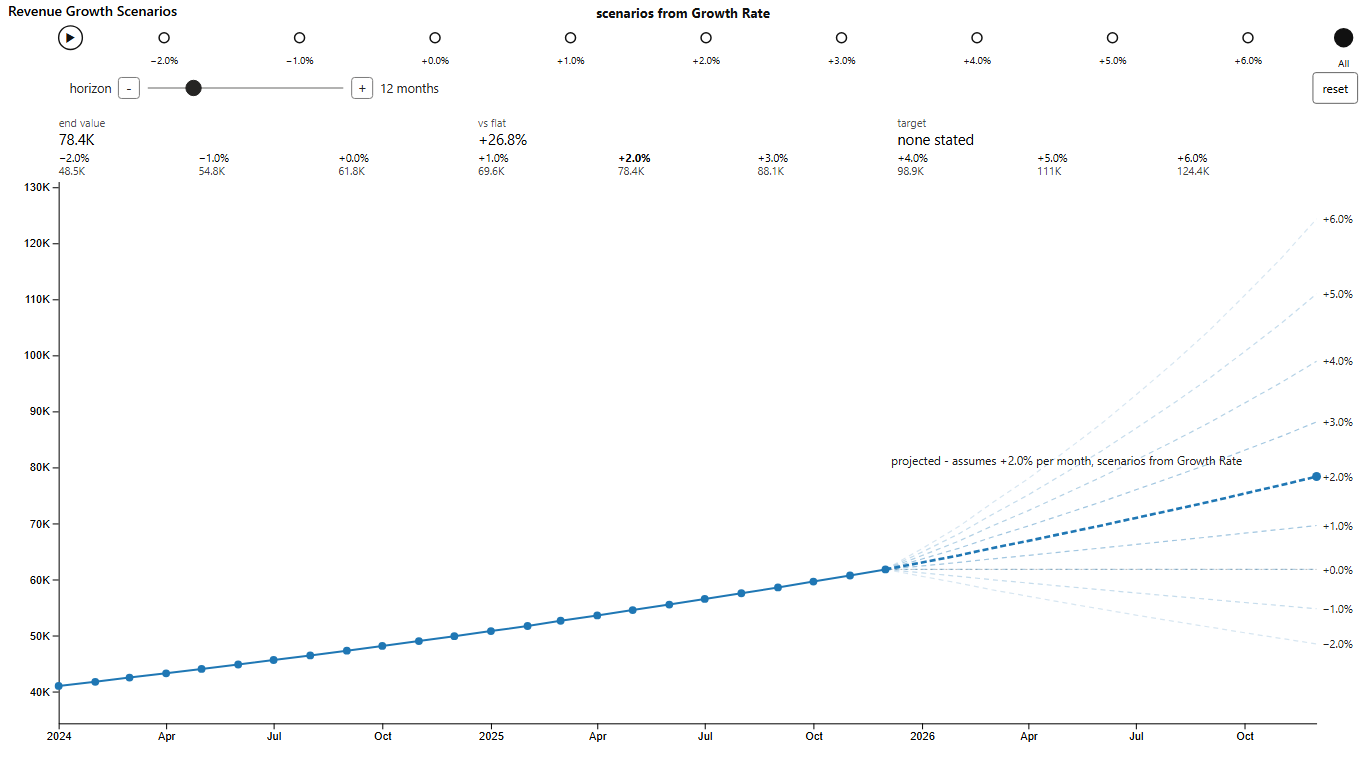
What-if scenarios - every growth rate on one plot, one emphasised Data: Monthly Revenue at Nine Growth Rates (CSV) Ternary plot - three measures sharing a total, placed in a triangle, so clusters in a mix show.
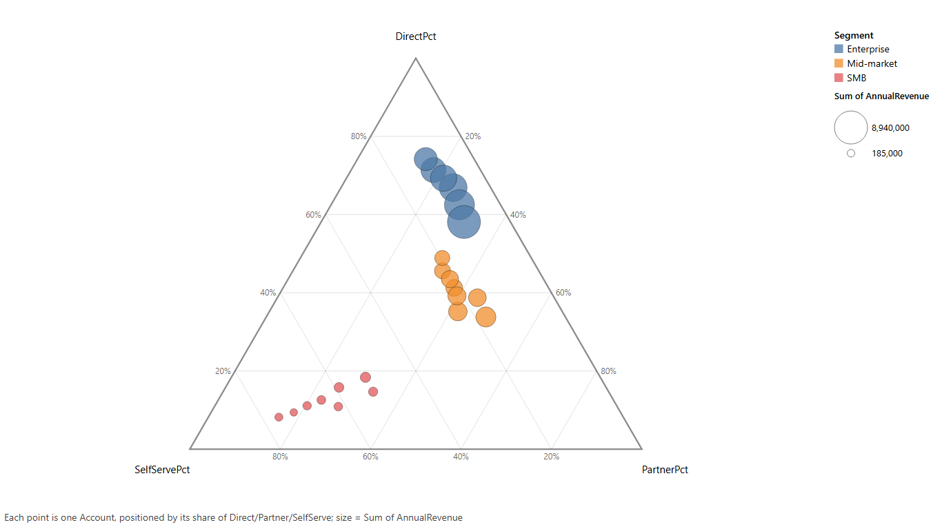
Ternary plot - revenue split across direct, partner and self-serve Data: Revenue Mix by Account (CSV) Normalized stacked bar chart - every bar stretched to 100%, so you read how the mix shifts; it flips between stacked, grouped and normalized with one set of controls.
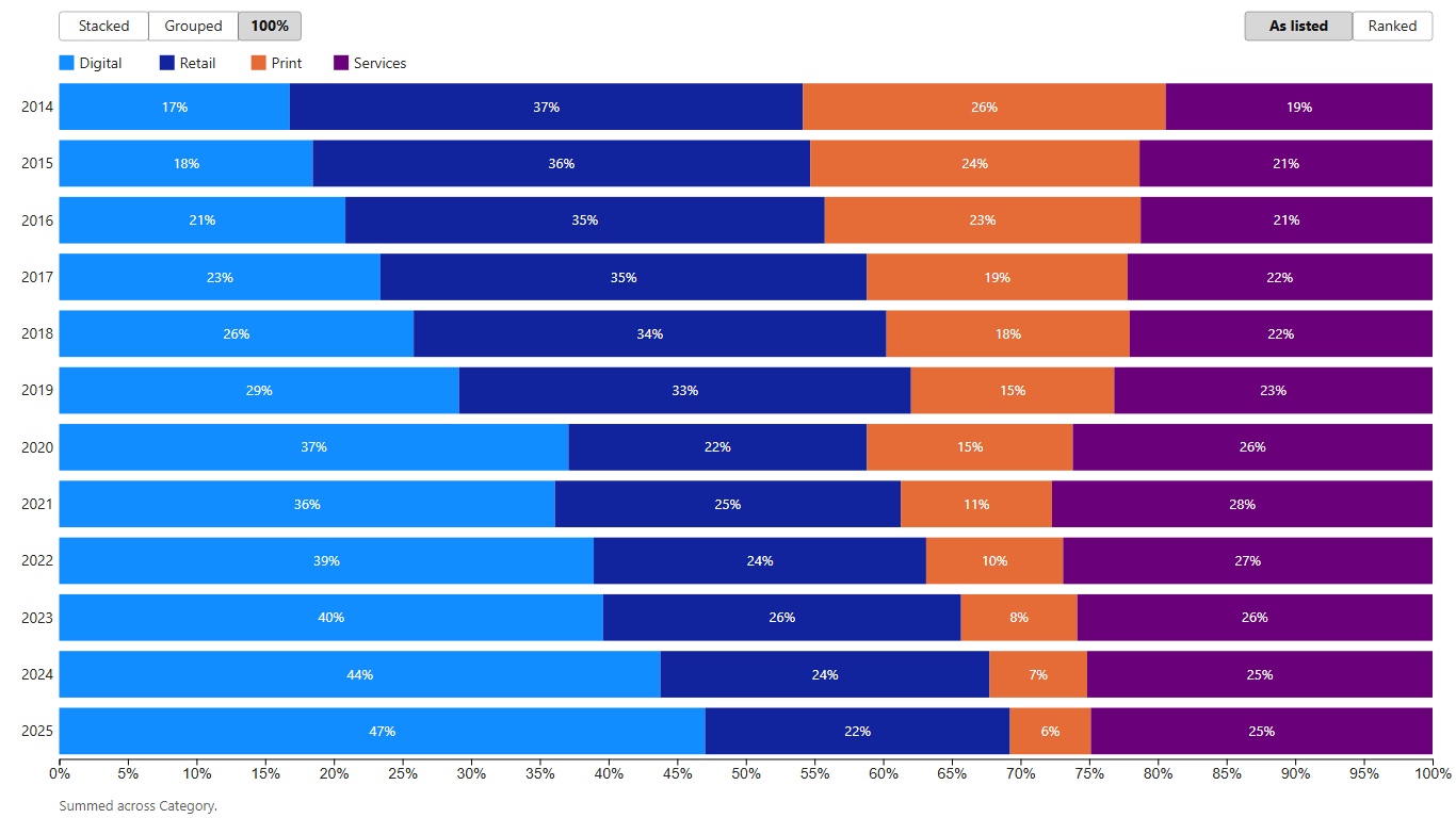
Normalized stacked bar chart - Digital climbing from 17% to 47% while Print fades to 6% Data: Divisional Revenue by Year (CSV) 3D scatter plot - a cube you turn with the mouse, for three measures at once. Graduated out of preview.
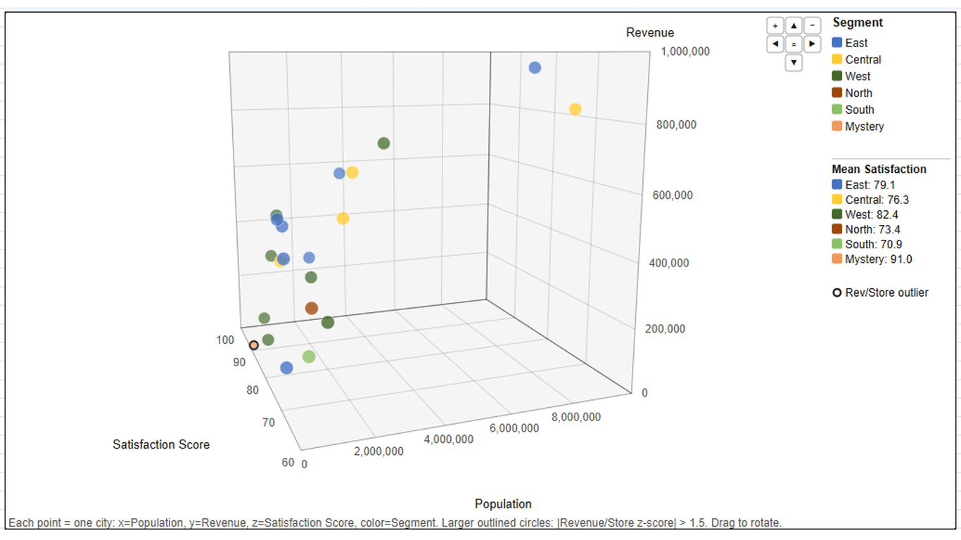
3D scatter plot - three measures per city in a cube you rotate Data: North America City Metrics (CSV) Mermaid diagram - boxes and arrows built from columns you already have: a source and target give a flowchart (a swimlane per team if a column names one), nested categories give an org tree or mind map, and a date beside an event gives a timeline. It's a chart, not a pasted picture: it's rebuilt from your rows on every render, so it cross-filters and follows your slicers, and a tree can carry a measure as a small bar in each box. Also graduated, so the picker can choose it for you.
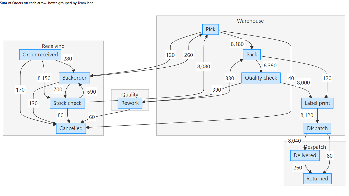
Mermaid flowchart - order fulfilment, a swimlane per team Data: Order Fulfilment Process Flow (CSV) 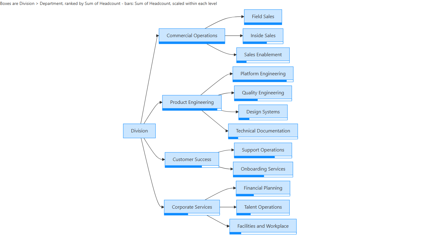
Mermaid org tree - each box with a headcount bar Data: Company Org Chart with Headcount (CSV) 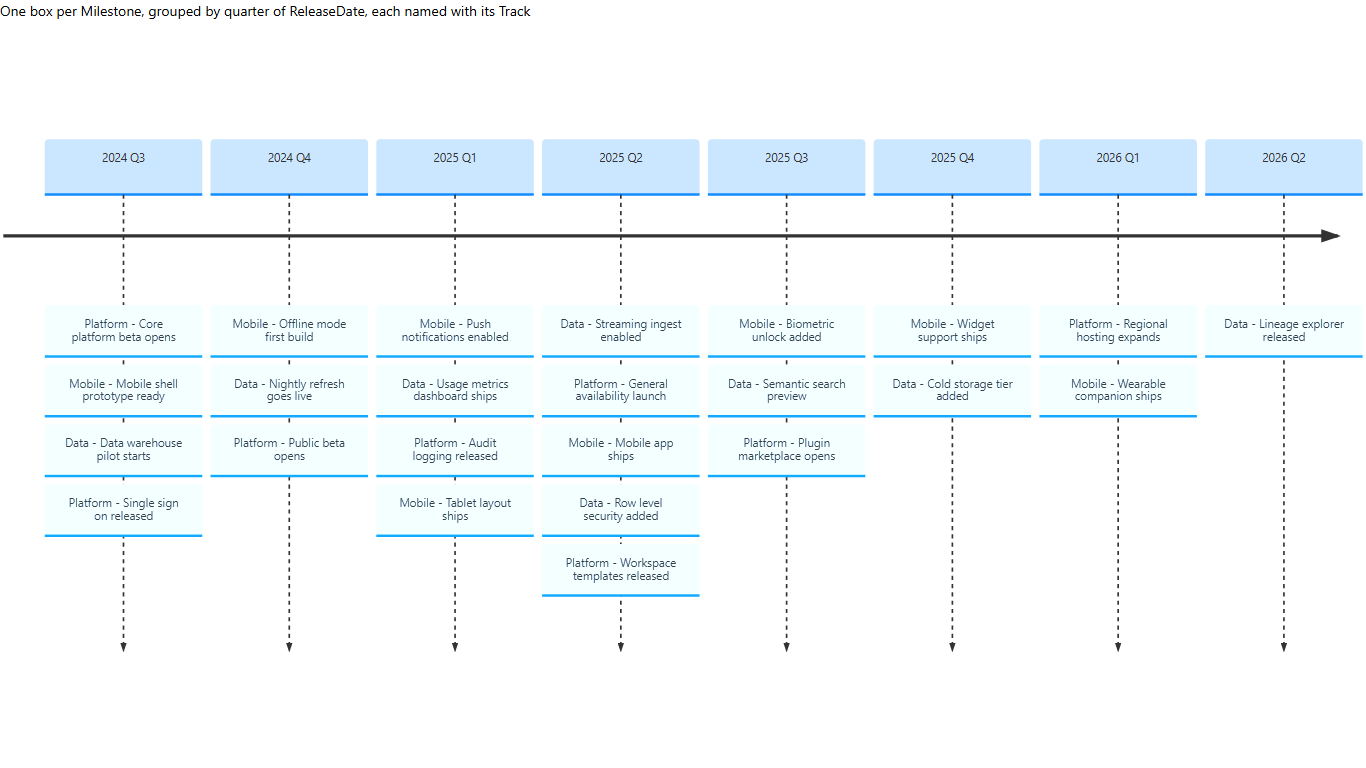
Mermaid timeline - releases grouped into quarters Data: Product Release Timeline (CSV)
What "preview" means here. A preview type is fully live: it's in the catalogue, badged in the "What fits?" list, and generates like anything else when you pick it. It just isn't chosen automatically - so go and ask for it, because that's how one earns its way in.
It's time to stop talking about "chart types"
A chart type is a way of drawing data: data goes in, a picture comes out, nothing travels the other way. The what-if types break that. Drag the growth rate and the end value moves - a value that isn't a column in your model, captured from you. That isn't a picture of your data any more; it's a small app that lives inside a tile. Expect more of it: once a tile can ask you for a value, the list of possibilities is far longer than the list of chart shapes ever was. So the question shifts from "which chart fits this data?" to "what would I like to be able to do with it?"
3. The Excel add-in is here
I promised to bring the same engine to Excel, and it's now live in the commercial marketplace.
The goal is parity with the Power BI visual, not a cut-down cousin: the same engine, the same account, one licence covering both, and the same chart catalogue bar three types. Excel renders through one path where Power BI has several, so eighteen chart types needed a new renderer, and all eighteen are done - including regression with confidence intervals, joint plot and autocorrelation, where a wrong answer looks completely fine, so each has its method pinned down. Seasonal decomposition, clustered heatmap and word cloud stay out on purpose: redone for the browser, each would be a different method wearing the same name.
Why it matters more than the feature list suggests: Excel's audience is vastly larger than Power BI's, and full of people who just want it to work - a spreadsheet, a question, and no wish to become a developer. Good data visualization should be accessible to everyone, and the same engine should also be something developers can build on. Put those together and data solutions can live anywhere: a Power BI report, a spreadsheet, and places neither reaches (section 5).
"Is all of this AI generated?"
Yes and no. These days I lean on AI heavily as a force multiplier - but that isn't handing over the keys. It's a lot of testing, architecture and design patterns dictated up front, then reading what comes back until I can honestly say "I could see myself having written that." When I can't, it doesn't ship. Plausible isn't the bar, for code any more than for charts.
4. Keyed visuals are free now - and nobody touches them
A policy change, effective now: keyed visuals cost nothing. A keyed visual is a build of one of our visuals with your licence compiled in. It used to be a paid add-on with a two-to-three business day turnaround, because a human ran the build. Now it's automated end to end: request it from the buy page and it's emailed to you, usually within minutes (and it's on your account page under Products and Keys). No human in the loop, which is exactly why it can be free.
In plain terms: an organizational licence is $39/month for your entire organization - unlimited viewers, no named users, every visual we make. With a keyed build your licence is baked in, so renewals need nothing re-applied. Keyed builds are available for Autocomplete Filter, Timeline and Multi-Format / Animation Card (the same licence covers LLM AI Charts and Maps for Power BI), as many as you like with an active licence. Caveats (they're not Power BI certified; test them first) are in the keyed visual guide, and requests start on the buy page.
5. A Blazor app, built by an agent that never saw our code
Can someone build a real app on this engine using nothing but the public MCP server - no access to our
source, no hand-holding from me? I ran the experiment. A fresh Claude agent, denied any access to our
repository, got only the published @bicharts/chart-mcp package and a CSV of US state sales. From an
empty folder it scaffolded a standalone .NET Blazor WebAssembly app, picked its own two charts (a USA
choropleth by revenue and a revenue-against-return-rate scatter), and wired them to cross-filter each
other: two generate_chart calls, about fifteen minutes, and no server calls once the app runs.
It isn't the first time the MCP has been tested this way - the React app in
One Does Not Simply Draw a Choropleth drove the same
engine with no Power BI in sight. The difference is the bar: every bit of friction the agent hit was
fixed in the MCP itself and the build re-run from scratch, until a run needed nothing from me and passed
all 28 checks I hold these demos to. So once again, the MCP does what it says on the tin - this time for
a .NET developer. That was also the gate for the next step: it's heading for the official
MCP Registry soon. Until then it's one line from npm:
npx -y @bicharts/chart-mcp.
The result is public: a live demo and the Blazor recipe it's built from.
Why Blazor? Because it's neither of the places people expect these charts. Power BI and Excel are someone else's product; a Blazor WebAssembly app is yours, served as static files from anywhere. The engine isn't a button bolted onto Power BI or Excel - it's something you build on, in whatever surface you're working in: a report, a spreadsheet, a React page, a .NET app, and whatever comes next.
6. Autocomplete Filter 5.4 is here and 6.0 is coming!
Version 5.4 has been available for a few weeks, and its Autocomplete Filter 5.4 Release Notes are worth reading.
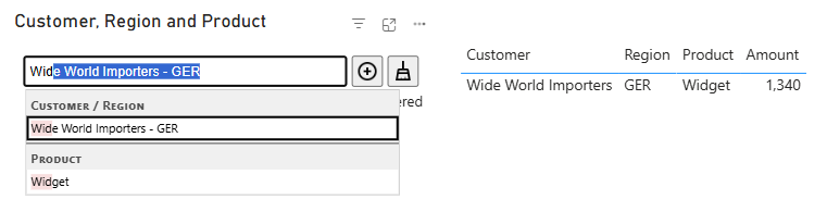
6.0 is next, downloadable from the site as a pre-release before it reaches AppSource - certification and propagation can take weeks. A pre-release installs alongside the public version, so it won't disturb your reports; the Prerelease Guide walks through it. A first look at one of the bigger features, Also Search: one box searches several columns at once, with suggestions grouped under each column's name. Typing "wid" offers a customer and a product, and picking one filters the column it came from:
Version 6 is included in the release notes: a decent amount of reading, but worth it!
That's the state of things. The deeper argument behind the engine is on the RegiaBI page, LLM AI Charts and Maps for Power BI is the visual it drives, and LLM AI Charts and Maps for Excel is the add-in. If something here affects you, you want the 6.0 pre-release, or Excel isn't behaving, say so - it genuinely changes what I work on next.
Comments
No comments yet — be the first.
Leave a comment
Your email is never shown — we use it once to confirm the comment.