
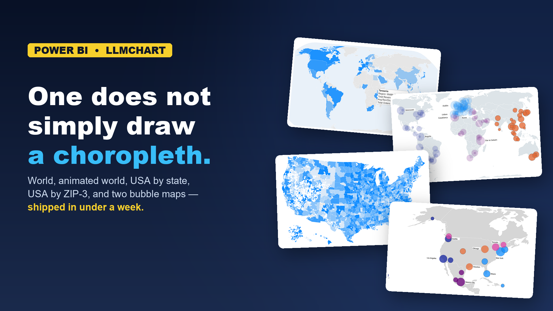
At the end of the last article I said: keep checking in, and new chart types will keep showing up — fast.
This is me making good on the promise, starting with maps.
Six geographic types went from "not in the library" to shipping in days (version 2.1) — a World Choropleth, an Animated World Choropleth, USA by state, USA by ZIP-3 (~900 regions), North America (Bubbles), and World (Bubbles) — most maps here can zoom and pan.
A choropleth is a map that shades regions by a value. The regions are predefined — countries, states, postal areas, sales territories — and the values come from your data. Done well, they can be beautiful, convincing, and easy to understand.
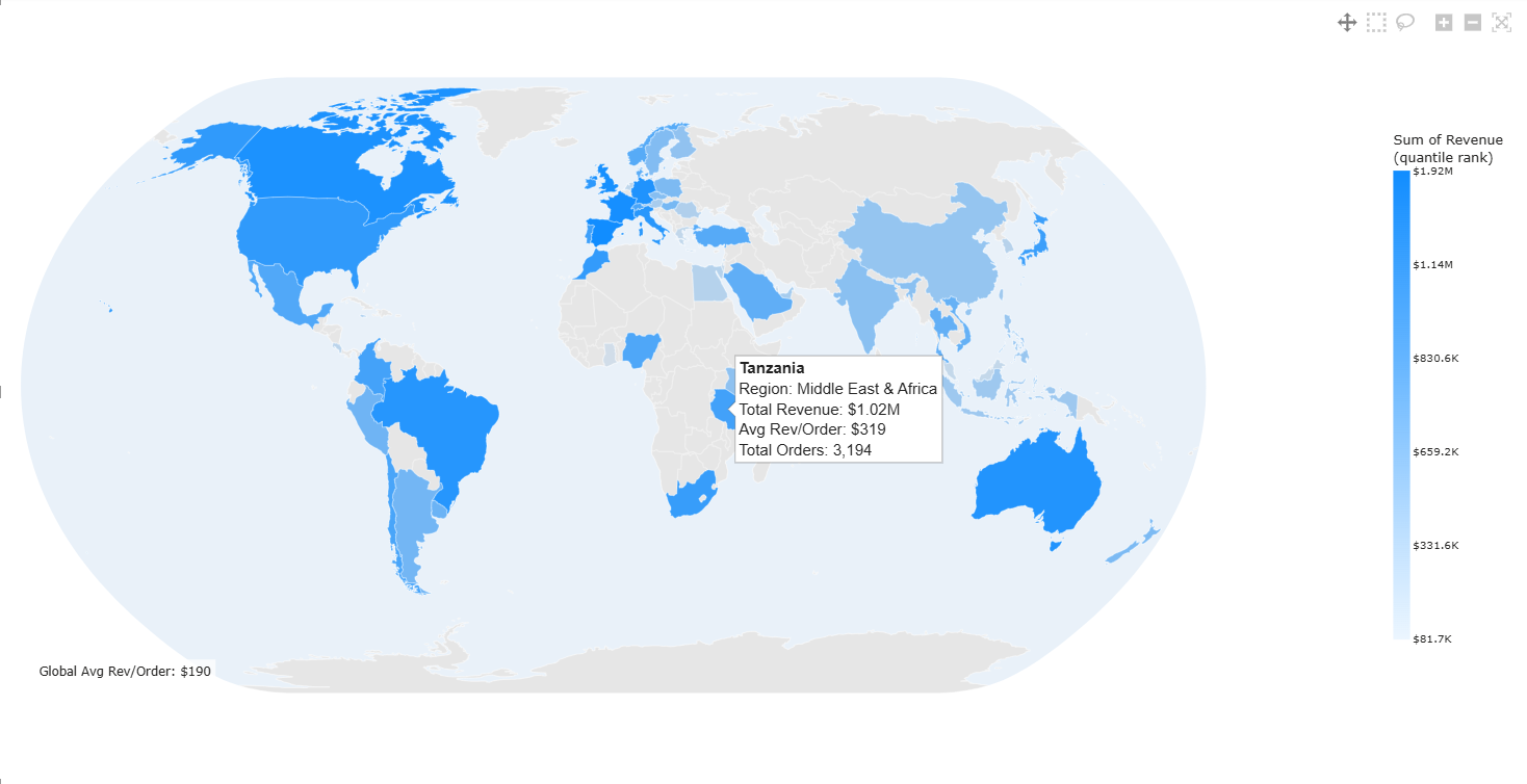
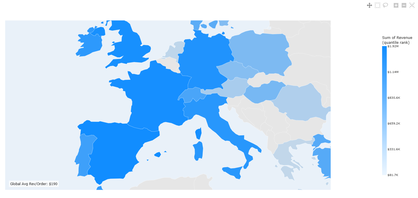
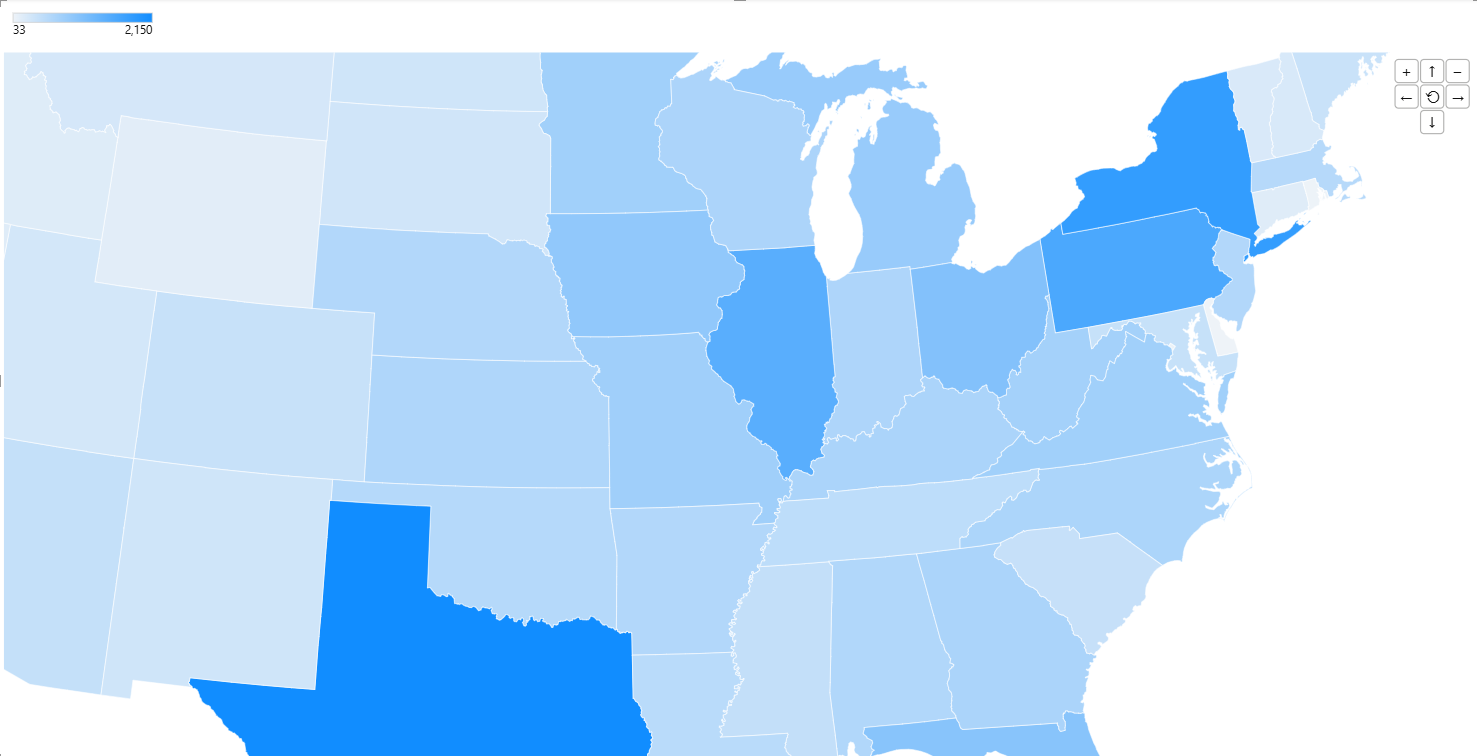
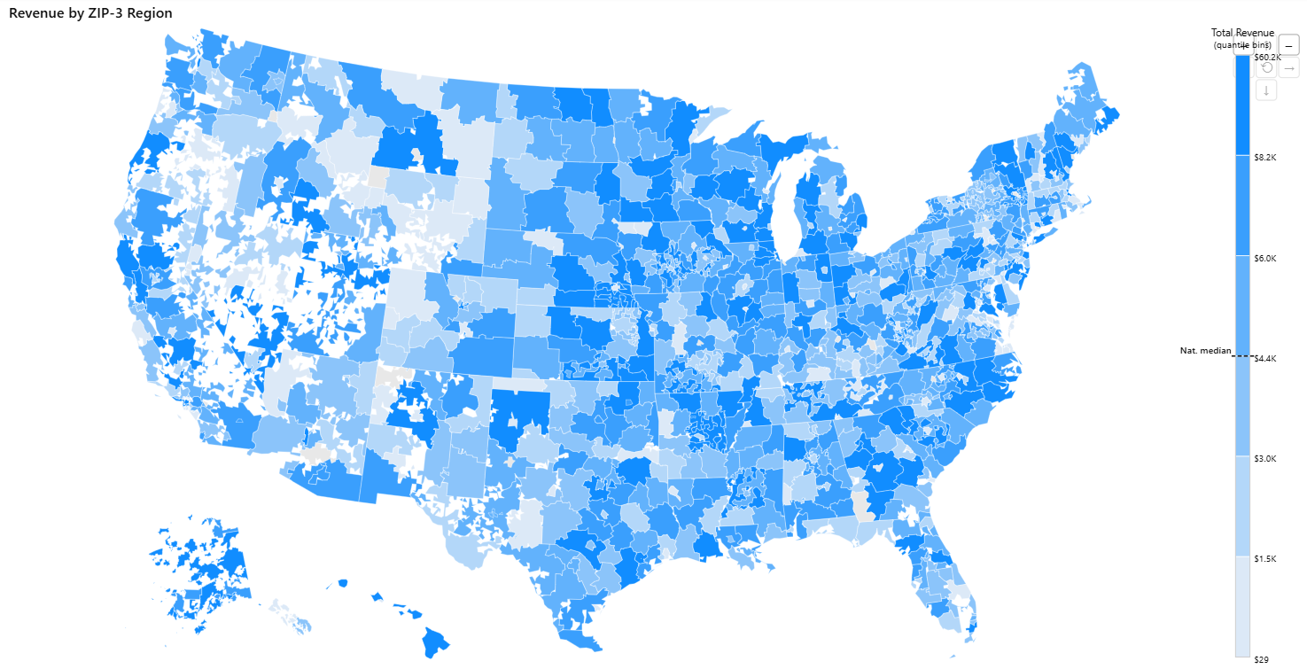
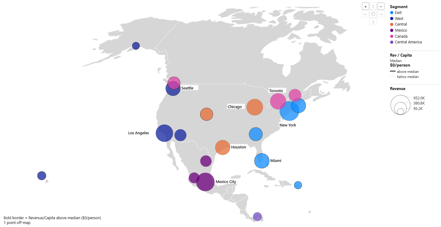
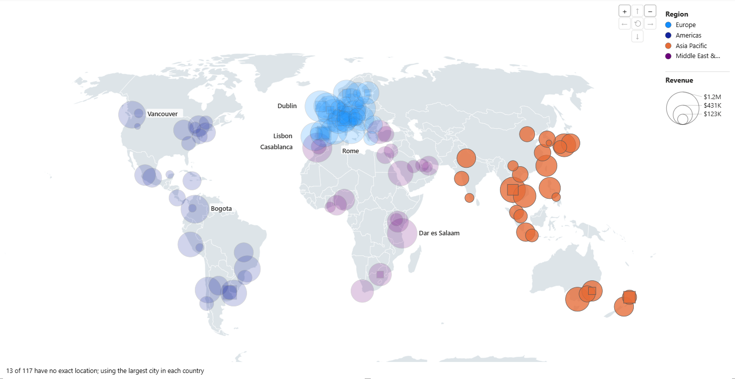
The challenge LLM AI Charts goes after is making these rich visualizations easy. You drop your data in, and the engine figures out what to do with it. A map makes perfect sense when your data carries geographic fields — countries, states, cities, ZIP codes, etc. The visual detects the common naming conventions and matches them to their regions on a real map.
And honestly: how much "AI" did that drag-and-drop feel like? None — which is the point. You didn't write a prompt or configure a model; the field detection above is the engine's deterministic side, and the LLM stays behind the scenes writing the chart itself. Some people revel in the gory details of LLMs — there's plenty further down — but a lot of people just want something that works, first try!
What's actually underneath
Six map types in days is not really a story about maps. It's what happens when the thing doing the work isn't a chart library.
The closest name I have for what sits underneath is an ontology for data visualization: a machine-readable account of what your data is — its grain, the role each column plays, what is genuinely a measure and what merely looks like one, which columns are places and at what resolution — and, from that account, what can honestly be said with it. The chart types are entries in a catalog that reasons over that account. They're not features compiled into a product.
Two consequences are worth stating plainly.
For anyone maintaining a report estate: a generative visual stands in for a long list of single-purpose ones — one vendor, one privacy review, one update cadence. Honest bounds: 84 chart types today, not a thousand, and a dedicated visual can still win at its own one picture. But "84" undercounts — each type is generated against your data and adjusted in plain sentences, where a marketplace visual is one frozen configuration. And the trade compounds: it improves when the catalog grows, not when somebody ships another visual.
And the account doesn't have to stay inside my visual. That account, the catalog that reasons over it, and the checks that vet whatever comes back are a system in their own right — and it now has a name of its own: RegiaBI. The Power BI visual is one front end to it. A React page or a coding agent is another. Neither the ontology nor the eligibility rules care which one is asking — that is the whole point of naming it separately.
It's worth being exact about where the line between the two falls, because it decides what runs on your own machine and what anything costs:
- Client — local, open, free. Profiling: the account of what your data is. And rendering: turning marks into pixels, and reporting what got clicked. No credentials, no network, nothing charged. This is the half I'm pushing further into the open.
- Server — RegiaBI, licensed. Deciding what can honestly be drawn from that account, generating the code, and verifying what came back.
That split isn't arbitrary. The client half is the part genuinely better off shared: everyone gains from one good profiler and one interaction contract, and nobody's competitive position rests on either. The server half is accumulated judgement — the catalog, the rules earned from real failures, the checks that catch a chart lying about itself — and that's where the product is.
That story is further down.
Example of use
Here's the whole workflow, and I do mean the whole workflow: drag a geographic column and a
measure or two into the visual, and click Generate. If your data has a Country column, the
engine recognizes it — full names, ISO-2, ISO-3, or a mix of all three in one column — and
offers the map types your data can actually support. Pick one, or let the engine pick.
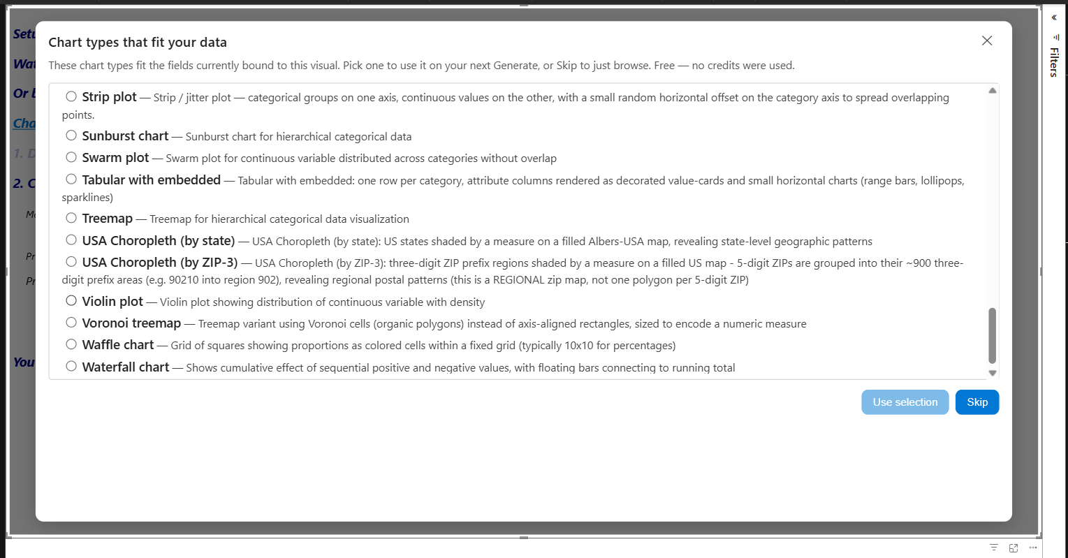
Two affordances are worth knowing before you spend anything. The "What fits?" link shows which chart types your current data can support — so a map that isn't offered tells you what to change instead of leaving you guessing.
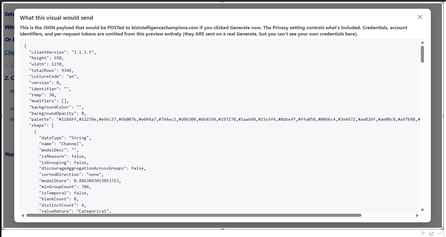
And the "what's sent" preview shows the exact payload that would go to the back-end service under your current privacy settings, before you click Generate. You stay in charge of both the spend and the data.
What you don't have to build first
It's worth naming the work that isn't in that workflow.
No latitude and longitude columns to source, clean, and keep current. No shapefile or custom region map to import. No lookup table mapping your spelling of a country onto somebody else's region codes. And no measures written for the sole purpose of getting data into the shape a map wants — you give it the columns, and it picks the summarizations.
That last one gets underestimated a lot. A fair amount of the DAX in a typical report isn't answering a business question at all; it exists to serve a visual — a measure that only exists because some chart needed its input pre-shaped. Here the code is written around the columns you actually have, so that plumbing never needs to exist.
Tip: give LLM AI Charts maximum detail rather than pre-summarized measures. Some of the best suggestions become impossible when the data arrives already aggregated down to one row per category — there's nothing left to summarize a second way.
What's challenging about choropleths (or maps in general)?
At first glance, not much. A working choropleth is a couple of hundred lines of D3. The interesting part begins after the first version is cut.
Every real dataset uncovers another edge case: country names that don't match the map, legends that obscure the geometry, projections that behave differently as the viewport changes, or bubble positions that look plausible but quietly mislead. None of those lessons came from reading a specification — they came from charts that weren't quite right.
Those lessons feed back in two ways, and note that both land in RegiaBI rather than in the visual. Some become library code, which every future chart inherits automatically. The rest sharpen the code generation, so the next chart starts from a better prompt. That is why a fix earned in a Power BI report also shows up in a React page: the lesson was learned by the engine, not by the front end that happened to surface it. The library gets richer, the generated code gets smarter, and the host becomes mostly glue.
Name resolution is a good example of a problem already solved. You could write your own resolver with AI, but be prepared to iterate on diacritics, spelling variations, missing values — the list is long. The client half of all this is now open source on github — the profiler and the rendering runtime — so that work is there to build on and to contribute to, and more of it is heading that way. The engine that decides and verifies stays server-side. (More on that below.)
A deeper dive: putting vanilla AI to the test
A generated chart has to live somewhere — a standalone app, or, for Microsoft BI devs willing to try the preview, a Fabric data app. So I ran a bake-off between two builds of the same kind of app: the component build (my React app on the open client packages, driving RegiaBI through an MCP server — the "how" is further down; note there is no Power BI anywhere in it) and the from-scratch build ("vanilla AI": Claude Code, no special tools, writing everything itself). Three findings, all of them from-scratch gaps the component build doesn't have:
- Coordinates. The from-scratch build hand-typed forty-two latitude/longitude pairs from the model's own memory. Fine for forty-two famous cities; silently wrong for the forty-third that arrives in next week's refresh. The component build looks places up at render time against a real gazetteer.
- Clicks. Its markup, pasted into an HTML visual, can't reach Power BI's host channel — however good the map, it clicks like a screenshot. Component-build charts speak that channel natively.
- Row identity. Given a one-sentence ask — the way people actually ask — the page it built stopped saying which data row each mark stood for. It looked right (the two charts even filtered each other, through private page state), but nothing outside the page could connect to it. Cross-filtering that lives in one app's private state isn't a contract, it's a coincidence.
But the biggest finding is maintenance. The component build shares one runtime: a fix or a new capability — zoom, animation, high contrast — lands once and every chart inherits it. Fix one, fix all. The from-scratch build owns its generated code alone: a fix reaches one page. Component-based design isn't going away because of AI; AI can be educated to use components effectively, and the component build is a demonstration of that.
Alternatives — why not a dedicated map visual?
A dedicated map visual can be excellent at its one picture. But its choices are static — regions, encodings, interactions all fixed at install time. Generated charts are starting points, not fixed pictures: different legends, labels, color scales, the same geography re-cut another way. What would be a feature request to a vendor becomes a sentence you type.
The IT version of the same argument: every installed visual is another vendor to evaluate — update cadence, support relationship, privacy review — a cost paid per picture, not per problem solved. Consolidating onto one visual only helps if that one is a known quantity; we've shipped Power BI visuals through the marketplace for years, and this engine comes from the same shop.
Another way to use AI — against the chart you already have
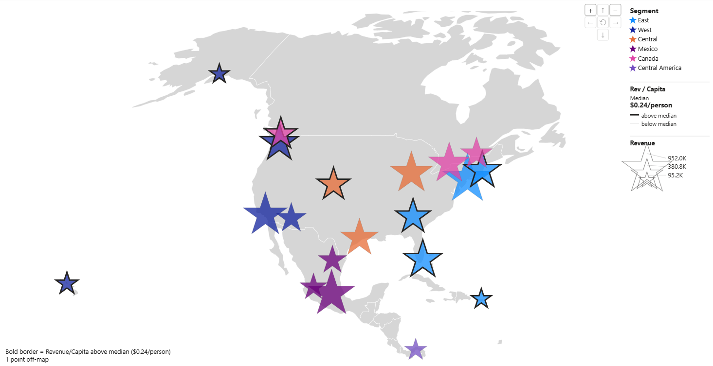
There's a third option between "install a fixed visual" and "own generated code yourself": use AI on the chart, through the visual. I took the North America bubble map and asked for the bubbles to be drawn as stars instead. That's a code modification — the engine edits the generated code, the quality pipeline re-checks it, and the result is still a fully wired, cross-filtering chart. Still a no-code experience for you; the code just happens to be the medium the request travels through.
The part that isn't about maps
The last article argued that letting a model write real code, inside a pipeline that checks it, means new chart types arrive at AI speed instead of roadmap speed. Six geographic types in under a week is that claim being cashed — not a one-off treemap, but a whole class of visualization: new geometry, a new join, a new legend grammar, new failure modes, and the guardrails to go with them. Every one of those guardrails now protects the next class too — and the traffic runs both ways: the animation engine came from the treemap, and the zoom/pan built for the bubble maps is now sitting there for any chart type that needs it. That compounding is why "keep checking in and expect a lot" is a promise I'm delivering on.
Outside Power BI entirely
This is a work in progress and I'll label it as one, but the direction matters.
The same charts now run in an ordinary React app with no Power BI anywhere — and the whole
app is public: github.com/codexguy/bicharts-react-demo.
Today that's the working code itself; a step-by-step walkthrough of building it from an
empty folder is coming. The rendering
runtime is on npm as @bicharts/chart-host (Apache-2.0) and it carries the interactive
grammar with it: two charts in a plain web page, click an element in one, the other filters.
Wiring that up is one wrapper element around the two charts — I wrote no cross-filtering code
of my own. This is the component build from the bake-off above — and the reason its marks
did carry identity is that they arrived with it.
Building that page is where the MCP server comes in.
@bicharts/chart-mcp is a stdio server,
so any MCP-capable client — Claude Code, Claude Desktop, Cursor, Copilot Studio — can drive
the same engine the visual uses (the npm page covers install and registration; for Claude
Code it's one claude mcp add line). Its three tools fall on either side of the client/server
line from earlier, and it's worth knowing which is which before you point an agent at them:
assess_data_shape— client. Local, free, no credentials. Profiles a CSV via@bicharts/shape-core, the same measurement code that runs inside Power BI. No data leaves the machine and nothing is charged. It's useful entirely on its own: it will tell you the column you've been summing is a rate, before anybody has drawn anything.list_eligible_charts— RegiaBI. Licensed. Which chart types can actually render that shape, ranked. No LLM in the loop — but it is not local. The profile goes to the server, because the ontology and the eligibility rules are the server. It needs an active licence, and it's metered: free within an hourly allowance, then per call, so an agent left spinning in a loop pays for the compute it burns.generate_chart— RegiaBI. Licensed. Returns code that has already been through the back end's render gates.
I'd rather be straight about why the middle one is licensed instead of thrown in free. It's the cheapest call in the system to make and by some distance the most expensive thing in it to have built — answering "what can this data honestly support?" well is most of what RegiaBI is. Charging for it is more honest than giving it away and pretending the value sits in the code generation layered on top.
The agent building my React app wasn't guessing at what would work: it measured, asked, and wired up code that had been checked before it ever reached the page. And the account of what a dataset is doesn't care whether the answer ends up drawn in a Power BI report, a React page, a Fabric data app, or a notebook. A host is then a fairly thin thing: somewhere to put the marks, and a channel to report what the user clicked.
Which is the real conclusion of this whole piece, and the reason the engine got its own name. The React app and the Power BI report in this article are not two products. They are two hosts over the same RegiaBI — the same profiler measuring the same columns, the same catalog ruling out the same impossible charts, the same gates rejecting the same bad code. The maps you scrolled past at the top are Power BI screenshots because that is where I built them, not because that is where they have to live.
It deserves a piece of its own, which it'll get: a complete walk-through of the building experience.
Play with the real thing
The report from this article is yours to download — pinned, license-free, data embedded, nothing to hook up. Open it, click a region, and watch the rest of the report cross-filter.
One note on versions: everything here runs on the 2.1.5 pre-release from our visuals page rather than the marketplace build. AppSource review takes time to propagate and the pre-release is the current build — the maps are in it today. And watch for a new host: we have Power BI today, and I've shown that React (and therefore a Fabric app) can be a host too. More hosts? Absolutely — stay tuned!
Try your own data against every chart type with the "What fits?" link before spending anything, grab something from the dataset gallery, and tell me what's missing — in the comments, or through support.
One does not simply draw a choropleth. One asks — and then checks what came back.
Try it: download the 2.1 pre-release · walkthrough · docs · more articles
Comments
No comments yet — be the first.
Leave a comment
Your email is never shown — we use it once to confirm the comment.