
Waffle chart
Grid of squares showing proportions as colored cells within a fixed grid (typically 10x10 for percentages).
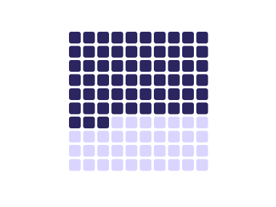
An illustration of the type, not a chart made from data.
The data it needs
Best for showing part-to-whole relationships with small number of categories; more accurate than pie charts.
Smallest size it draws at: 520 by 380 pixels.
Try it
dataset Try it with Support Cost by Team, Year over YearStart with your own data in Power BI or Excel, or build it into your own app through the MCP server. Each one lists the types that fit your data before it builds anything.