
Binned 2D heatmap
Two continuous variables binned into a rectangular grid with cell color encoding the count or an aggregate, revealing density where individual points would overplot.
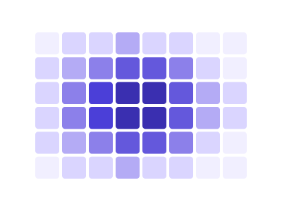
An illustration of the type, not a chart made from data.
The data it needs
Best for dense scatter data where points overplot: thousands of observations of two continuous variables, where the question is where the mass is rather than where each point is.
Smallest size it draws at: 320 by 280 pixels.
Try it
dataset Try it with Earthquake Locations & MagnitudeStart with your own data in Power BI or Excel, or build it into your own app through the MCP server. Each one lists the types that fit your data before it builds anything.