
Learn More...
Select a product:
Introduction to Multi-Format / Animation / Export / Text from Values Card
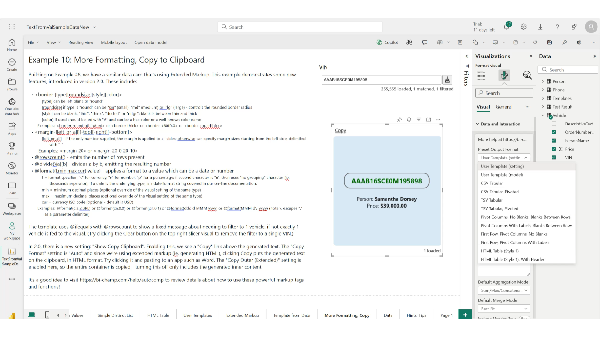
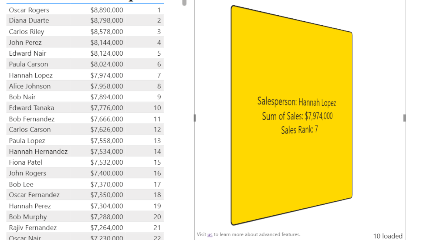
Table of Contents
- A Deep Dive Using an Example Template
- Using Change Tracking and Signaling
- Using Animations
- Using Transitions
A Deep Dive Using an Example Template
This section takes a detailed look at an example template you can find in "Example 10" of the Text From Values sample PBIX file. (This example will be available after version 2.0 is published in AppSource.)
The data for this is based on a randomized Vehicle table that has a VIN (vehicle identification number), a person's name, an order number, and a price field. We're going to use this template to render details about whatever vehicle is currently filtered to, on the report page.
Hover over the highlighted portions of the template to learn more about how they are used.
@rows(){@columns(,,1,1){@notempty(){@cell("","")}{Person: <b>@cell("","")</b>
}}}@rows(){@columns(,,1,2){@notempty(){@cell("","")}{Order: <b>@cell("","")</b>
}}}@rows(){@columns(,,1,3){@notempty(){@cell("","")}{Price: <b>@format(c,2,2){@divide(){@cell("","")}{0.0001}}</b>
}}}@rows(){@columns(,,1,3){@ifgtequals(){@cell("","")}{15}{\r\n<img-check />}{}}}}{<b>Filter to exactly one vehicle.</b>}
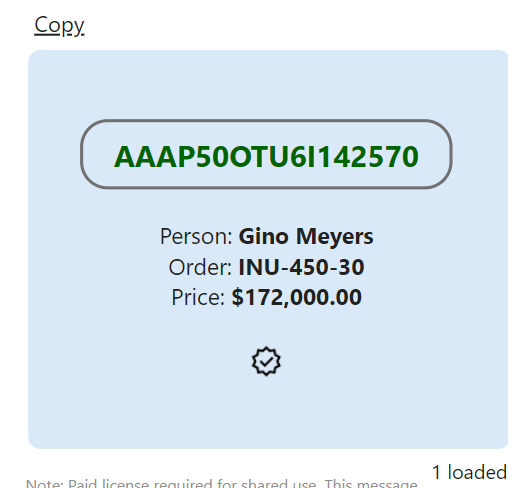
Here's an example of what type of output can be produced from this template:
Some other visual settings are important to achieve this effect, including:
| Parameter | Value | Description |
|---|---|---|
| Extended Mark-up | On | This changes the nature of the visual, from a text box that supports plain text, to rendering output using HTML elements. This increases what can be done in terms of style. |
| Show Copy Clipboard | On | When enabled, a Copy link is shown which, when clicked, copies generated text to the clipboard. With extended mode enabled, the default behavior is to copy the generated HTML to the clipboard, in HTML format. |
| Extended Mark-up: Horizontal Alignment | Center | Applies centering along the horizontal axis, for all generated content. |
| Extended Mark-up: Vertical Alignment | Middle | Applies centering along the vertical axis, for all generated content. |
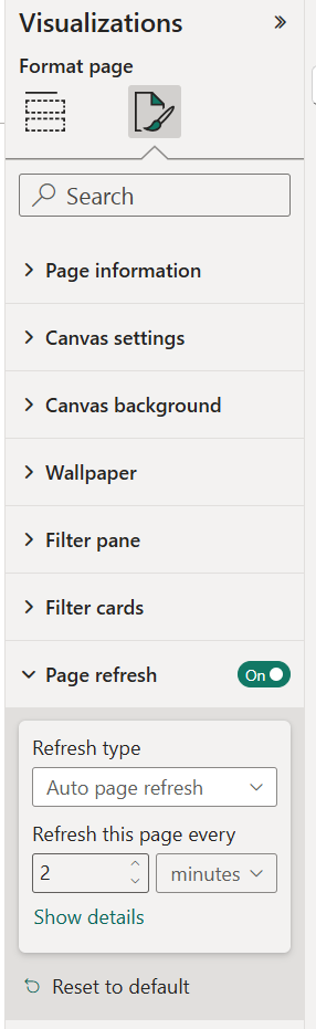
Using Change Tracking and Signaling
Starting in version 2.2, you can track changes in underlying data and use this to provide visual feedback. You can either as part of change tracking or on its own signal to the user that something has happened (i.e. an alert) - either requiring that they acknowledge it by clicking a link, or allowing the alert to "expire" after a set amount of time.
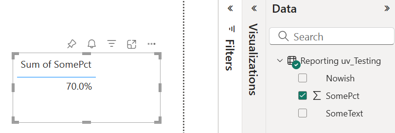
There are new settings and markup functions that were introduced to support these concepts. Let's take a look at a few tangible examples of how you might use these new concepts. Our example uses a semantic model that is very simple:
Example: Show value when changed or above a threshold
Let's say you want to show the percentage value, either when it changes between refreshes of the page, or if the value is 50% or greater. Furthermore, if it's 50% or greater, change the background color. We can accomplish that using the following user template:
In support of this template, we need the following settings:
| Parameter | Value | Description |
|---|---|---|
| Preset Output Format | User Template (setting) | The above template text would be included here. |
| Change Detection Type | First Cell Change | If we dragged in the SomePct field into the visual's Value Source well, then there is only one value, ever, so other choices such as 'First Row Change' would have also worked. The point here is when SomePct changes, the @changed markup function will tell us that, when the user template is evaluated. |
Let's break down how this template works...
- @or: This handles detecting a change or exceeding a threshold. The first body section is "@ifgtequals(){@getvar()}{0.5}{@bgcolor(#ffe0e0)1}{0}", and is evaluated first.
- @ifgtequals: There are multiple body sections. The first section is @getvar(), which is pulling the value determined by the "Change Detection Type" setting. Since this was set to "First Cell Change", it will be the SomePct value. It becomes the "left side" of our "greater or equals" comparison.
- 0.5: This becomes the "right side" of our "greater or equals" comparison. Therefore we're comparing SomePct >= 0.5.
- @bgcolor(#ffe0e0)1: If the comparison is true, then the background color is set to a light red. The "1" after the @bgcolor function is what is actually emitted into the output stream. This is needed by the @or to tell that the first body section was true.
- {0}: Conversely, if the condition was not met, "0" is treated as if "false", for the purposes of the @or function.
- Assuming that the first condition was not true, then the second body section of @or is evaluated, namely "@changed()"
- @changed: Since this function has no body, it will emit either "true" or "false". Since there is no variable name provided as a parameter, the change is being determined based on the "Change Detection Type" setting, which is "First Cell Change". Since SomePct is our first (and only) cell, it is the value of SomePct that is being written to the default variable, and this function will emit "true" if the value has changed since the last time the visual was rendered, such as through a refresh.
- Assuming that either of the @or conditions were met, then the third body section of @or is evaluated, namely "Value: @cellref(0, 0)". This includes some literal text ("Value: ") that will always be emitted without any changes.
- @cellref(0, 0): This function was added in version 2.2 to serve as short-hand for "@rows(,r){@columns(,,1,c){@cell()}}". (Where in this case r and c are "1", since in @cellref the references are zero-based.) We're simply emitting the value of SomePct, which is a scalar here. Note that the output value is formatted using whatever formatting rules you've chosen. (For example in 2.2, you can enable model formatting, where format strings are taken from the semantic model.)
- {N/A}: If the @or evaluated to false, then N/A as literal text will be shown.
Example: Show an up or down symbol, depending on whether a value increases or decreases between page refreshes
Staying with our simple percentage value, let's show a symbol after it - either an up arrow or a down arrow, depending on whether the value has increased or decreased since the last time the page was refreshed. We can accomplish that using the following user template:
We assume the same two settings as used in the prior example. Let's break down how this template works...
- @cellref: We will always show the percentage value.
- @notempty: When the visual first displays, it has no "previous value" for SomePct, and we cannot show a glyph in this case.
- @lastvar: This returns the previous value of the default variable, which was determined by our "Change Detection Type" setting, which is effectively SomePct here.
- @ifequals(){@getvar()}{@lastvar()}: We're checking if the current value is the same as the last value. If it is, then we rely on a named variable "i", which we set the last time a change was detected. We are trying to keep the same glyph showing, when we transition from a changed state to a non-changed state - until a new change might reflect a different direction.
- @ifgtequals(){@getvar()}{@lastvar()}{<img-greenup/>@setvar(i){1}}{<img-reddown/>@setvar(i){-1}}: If the current value of SomePct is greater than the previous value, then we show the "up" glyph - but also set a variable named "i" to be "1", which is available on the next refresh, in case the value does not change. Since we compared for equality in a prior step, @ifgtequals really only finds the "greater than" condition. Similarly, the "down" glyph is valid to show for the "else" condition, and we use "-1" as the value of "i" to indicate that there was a decrease.
When we put this in action in a report, we might want to enable scheduled refreshing of the report:
Our report might change like illustrated here, with values only updating when the underlying value changes:
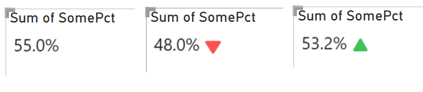
Example: No-code change detection with signal
Let's say that we only care about whether a value changes or not, and we want to signal to the user that a change has occurred. We can do this by changing the background color of the text area, and use a very simple user template, namely:
In addition to the previous settings for Preset Output Format and Change Detection Type, we will use:
| Parameter | Value | Description |
|---|---|---|
| Change Auto Signals | On | Enabling this means that any change will cause the visual to enter a signaled state. Think of it like an alert that the user must acknowledge. |
| Signal Dismissal Type | Link | This is the default value, and means that a link will appear when the visual is in a signaled state. It will remain in a signaled state until the user clicks the link. In doing so, the signal is dismissed and the link is hidden. Another option exists to have the signal dismissed after a fixed time interval, or do not allow it to be dismissed. |
| Signaled Background Color | Light Orange | This is an easy no-code way to indicate that the visual is in a signaled state. It will remain this color until the signal is dismissed. |
In this configuration, you might see something like this, as the report is refreshed, and the underlying value changes:
The text you see for the link can be changed using the "Clear Signal/Alert Text" setting.
Using Animations
Starting in version 2.2, support for different animations was added. You can show animations either through visual settings, or through a new function, @animation. You can combine settings with @animation values as an override, to control aspects of the animation based on model data. These animations are combined with generated text content, based on the full functionality of the visual. Using animations forces the extended markup mode to be enabled.
Currently there are four main animation types:
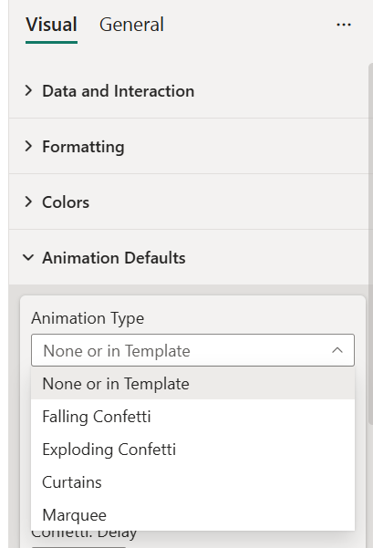
- Falling Confetti. Experience anywhere from a little to a lot of colorful confetti particles that fall behind any generated text.
- Exploding Confetti. Have your confetti initially rise, as if it's coming from a confetti cannon - then softly falling downward, and fade out.
- Curtains. Have your generated text be initially obscured by a curtain that can be timed to open - or the user can click the curtain to open it. Offers dramatic reveals of your data!
- Marquee. Have your generated text be scrolled - from a direction of your choice. Good for information that may be larger than the screen real estate occupied by the visual.
Example: Exploding Confetti Based on Report Data
Let's say we have report data that includes a salesperson name and their relative rank among all salespeople. The goal is to show the salesperson name, their rank, and if they're in the top 10 salespeople, show 400 particles of confetti. If they aren't - then we show nothing beyond the name and rank. Let's also have a short delay before the animation starts.
We can achieve this using a combination of settings and a user template:
Non-default Settings: (tip: you can find these using the Search box in the visual settings panel)
- Preset Output Format: User Template
- User Template: See above
- Extended Markup: Enabled
- Extended Markup - Horizontal Alignment: Center
- Extended Markup - Vertical Alignment: Middle
- Run After (seconds): 2
- Confetti: Particles: 500
Where the template uses @cellref(0,0), the first salesperson name is shown. @cellref(0,1) shows the ranking (via a DAX function in our model). We are only emitting the @animation function when the rank is less than or equal to 10. Since the animation default is "None or in template", this satisfies the requirement to only show the animation for the top 10 salespeople.
Of note, we've omitted the @animation function's parameters, so all defaults are used. We've overridden some defaults, such as the number of confetti particles and the delay before starting the animation. There are 18+ animation settings as of version 2.3.
Here's an example of one frame of the animation seen in our final product:
It's easy to play with variations for your animations, including data-driven scenarios using @animation. The full reference for the @animation function can be found here.
Using Transitions
Starting in version 2.4, support for transitions was added. How do transitions compare with animations?
| Feature | Animation | Transition |
|---|---|---|
What is it? |
Animations are visual effects that are applied to the generated content of the visual. |
Transitions are visual effects that let multiple sets of generated content to be viewed, sequentially. For example, one content set per row can be generated using a user template or a preset such as 'Single Field per Row: Flip Transition'. The process of moving between content sets can be accompanied by a visual effect, such as fading or flipping of the card. |
How can they be enabled? |
Can be enabled through the @animation function, or settings. |
Can be enabled through the @animation function, or settings. It is important to generate content that uses a delimiter string (default is ---) to help identify the different content sets. |
Use cases |
Animations can be used to add visual interest to the content of the visual. |
Transitions can be used to show multiple sets of content, sequentially over time. |
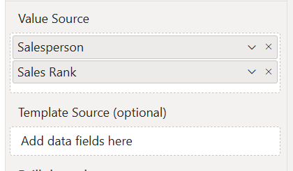
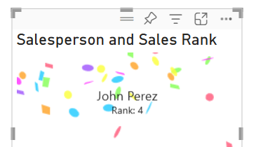
Let's take a look at an example of where you might consider using a transition. Let's say you have a model that includes salespeople, sales amounts, and a calculated rank (a DAX measure):
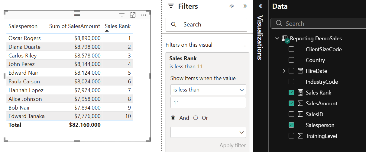
In this table, we're showing the "top 10" salespeople, based on their sales amounts. If we want to show these salespeople in a card-like visual, cycling through each person, we can use a transition.
If we stick largely with defaults, we can add a Text from Values card to the design surface and configure it to look like this:
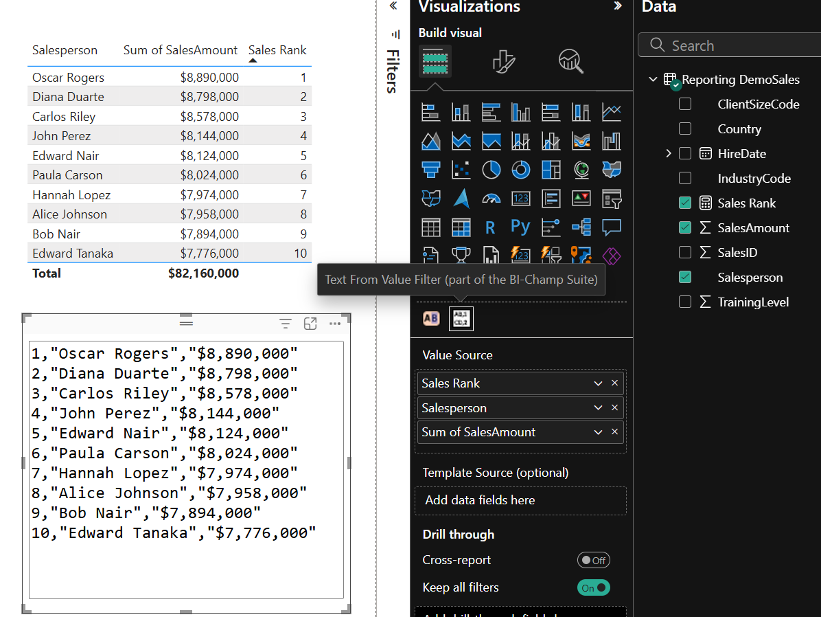
We've changed a few settings such as the font size and 'use model formatting' (notice the $ symbol). We've also added fields to the Value Source well, in the order that we'd prefer the data to be sorted. (By default, sorting is performed starting from the first field in the Value Source well.) We're still using the "CSV Tabular" preset format, which works well if you want to copy this data out of the visual. However, let's look at another option: showing the top 10 salespeople with a transition.
We can change the Preset Output Format to "User Template", and use the following template:
Without any further changes, our text output changes to this:
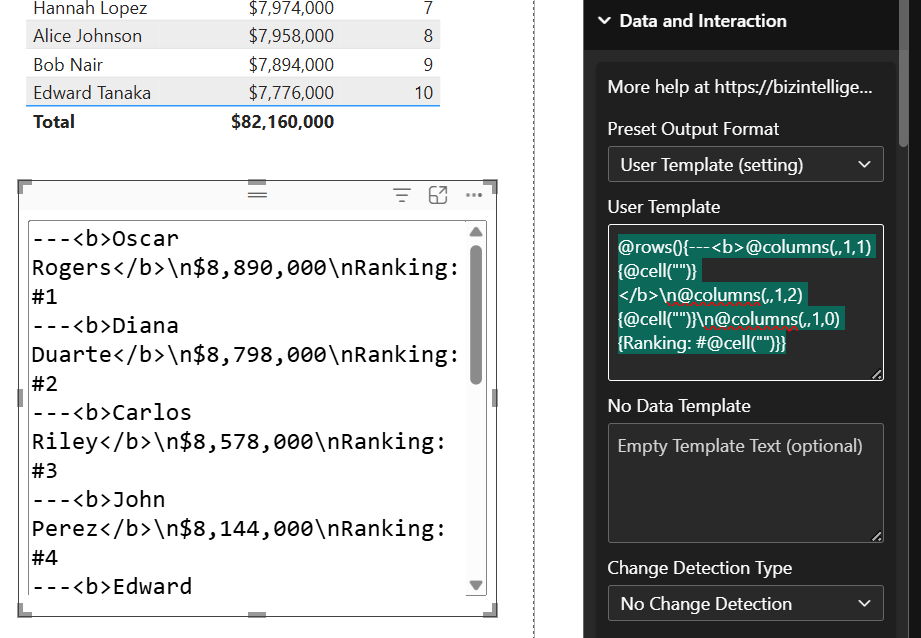
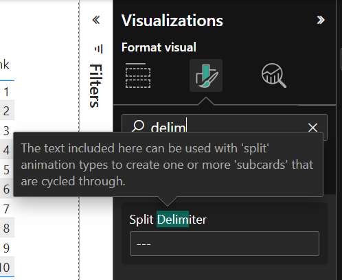
Of note, we have "---" included for each row, to separate each salesperson's data. There's a setting called "Split Delimiter" that can be used to change this default value. The "---" is not shown in the output, but is used to help the visual understand where one transition frame ends and another begins.
Now all we need to do is change the Animation Type setting to "Flip" or "Fade", and the nature of the visual changes completely:
Let's get more detailed on the user template we used:
- @rows: We'll iterate over all rows presented to the visual. We've used the same filter as shown for the table visual, to filter out salespeople who are not in the top 10 ranking.
- @columns(,,1,2): Effectively picks a single, specific column to get data from. Here we're "taking" 1 column, and "skipping" 2 columns. Notice from the screen-shot that this is really the third column, which is the numeric sales amount.
- @cell(""): Emits the value of the cell, which is determined based on the current row and current column being iterated over. For the "columns(,,1,2)" example, that's the sales amount. The "" means no delimiting will be performed on the output - it will be the same text that's in the semantic model, or formatted based on formatting settings. (e.g. the sales amount is shown as a currency because the "Use Model Formatting" setting is enabled, and the format is set to "Currency" in the semantic model.)
- The remainder of the template follows similar patterns for the two additional columns.