
Here's the problem I keep hearing, and the one this product exists to solve: "I want a genuinely custom Power BI report — but I don't want to learn Vega, or write a pile of DAX, or become a D3 developer on the side. Can I get something that either does what I want, or gets close enough that I can tweak the remainder?"
Raw AI alone isn't the answer — not yet, and not as foolproof as the demos make it sound. But AI plus the right harness gets you surprisingly far. That's what version 2 of LLM AI Charts is about, and with Claude Sonnet 5 now the default model and Claude Fable joining the catalog, it felt like the right moment for a bake-off.
How would you use Sonnet 5 or Fable with Power BI today?
You have options, and they're worth naming honestly.
You could point an AI coding agent — Claude Code, or OpenAI's Codex — at your PBIP files and let it craft reports and measures directly — that works, and it's a legitimately powerful workflow. But down that path you're still assembling reports from native Power BI visuals, perhaps reaching for the HTML Content visual to cover the gaps (sparklines inside cards, say). And that's where it gets frustrating: HTML Content renders pixels, not citizens of the report. No cross-filtering. No drill-through. Click on it and nothing happens.
What I'm going to show instead is the LLM AI Charts custom visual — specifically version 2, which adds generative D3 (JavaScript) alongside a stable of open-source Python graphing libraries — matplotlib, seaborn, and an interactive Python plotting library — all rendered client-side in your browser. Two goals drove v2:
- Interactivity. If you click on a mark, expect it to do something. Legend entries, axis labels, dots, lines, table rows — you name it. Cross-filtering the rest of your report page is the baseline expectation, not a stretch goal.
- More of the "intelligence" in AI. Expect the visual to propose derived measures that aren't in your semantic model but make sense in context — deviations from a cohort mean, per-group medians, spreads. And, just as important, expect it to avoid the useless ones: nobody needs a sparkline of a flat line.
Authoring vs. rendering (or: where your data does and doesn't go)
There are really two phases to using the visual, and the distinction matters.
During authoring, only statistical information about your data is shared with an LLM — column names, types, distributions, cardinalities. Not your rows, and no PII. That LLM can be your own via a bring-your-own key, or one of the hosted models we offer.
When it comes time to render, all code execution happens locally on the client — no LLMs involved at all. That's good for performance (no round trip per repaint) and very good for data security: the model that designed your chart never sees the data flowing through it.
A simpler, stronger model catalog
Building v2 made one thing clear: the v1 model catalog wasn't cutting it at the level we wanted. So we simplified — centered mostly on Anthropic, because internal testing kept showing the best results from models like Sonnet and Opus. (This doesn't mean this will always be true: things change fast in the LLM world, and we're adopting an open stance to AI players.)
We built most of v2 in the era of Sonnet 4.6 — at AI speed, that was not very long! Since then Sonnet 5 shipped, and our testing shows it's a solid upgrade, so it's now the default across every licensing mode: freemium, trial, and paid. (Sonnet 4.6 is still selectable — but more as a curiosity now.)
For trial and paid users, the picker also offers Opus 4.8, and — with its re-release — Fable, Anthropic's top tier. Version 2 also moves hosted-LLM credit pricing to token-based billing: cost scales with the size of your request and the per-million-token rate of the model you picked, rather than a flat per-generation charge.
And a genuine recommendation: consider bring-your-own key (trial and paid). It can work out cheaper than hosted credits, and it fits how many organizations already operate — you likely have API keys for your LLMs of choice. More hosted models will come, but the reality is you'll always have more options with BYO. That's the encouraged approach.
The bake-off: five models, two datasets, zero code
You may wonder about Fable: is it really that good compared to Opus or Sonnet? In the spirit of finding out, I used the question as an excuse to demonstrate a chart type that went live in v2: Tabular with embedded.
This type builds a tabular summary of your data where columns can be embedded mini-charts — sparklines, bars, lollipops, ranges, status chips… almost anything you can think of, one small honest visualization per column. It reads like a designed scorecard, not a grid of numbers. You won't get this from anything standard in Power BI. You might get there with Deneb — but now you're hand-coding Vega, which is exactly the "learn a new language first" tax we're trying to avoid.
My ground rules made it a fair fight — and a hard one:
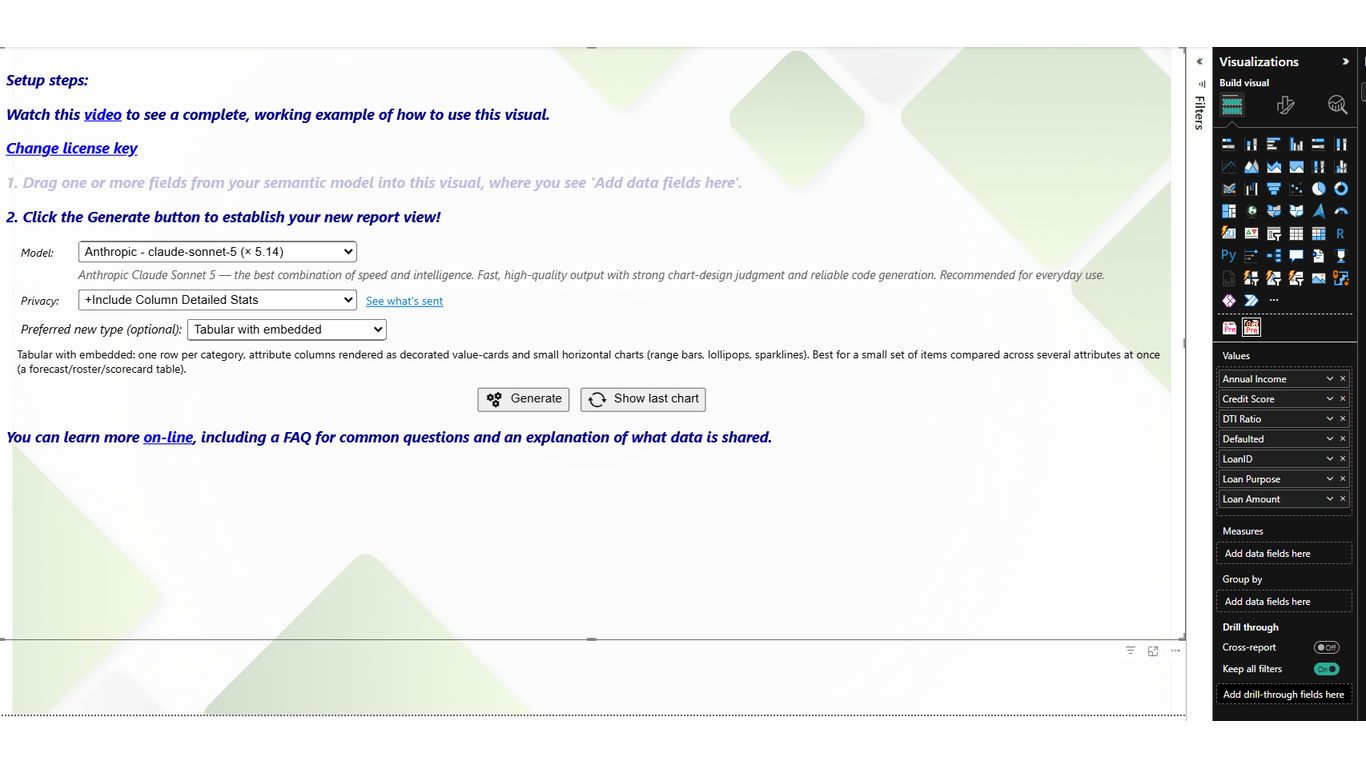
- Same setup for every run: model selection + chart type = Tabular with embedded.
- Every available field goes in the data well, with no hints about what anything means. Part of the test is how well each model infers value from raw columns.
- Zero code. Not initially, anyway — more on that below.
Tip: click any image in this article to enlarge it.
Round one: fitness tracker data
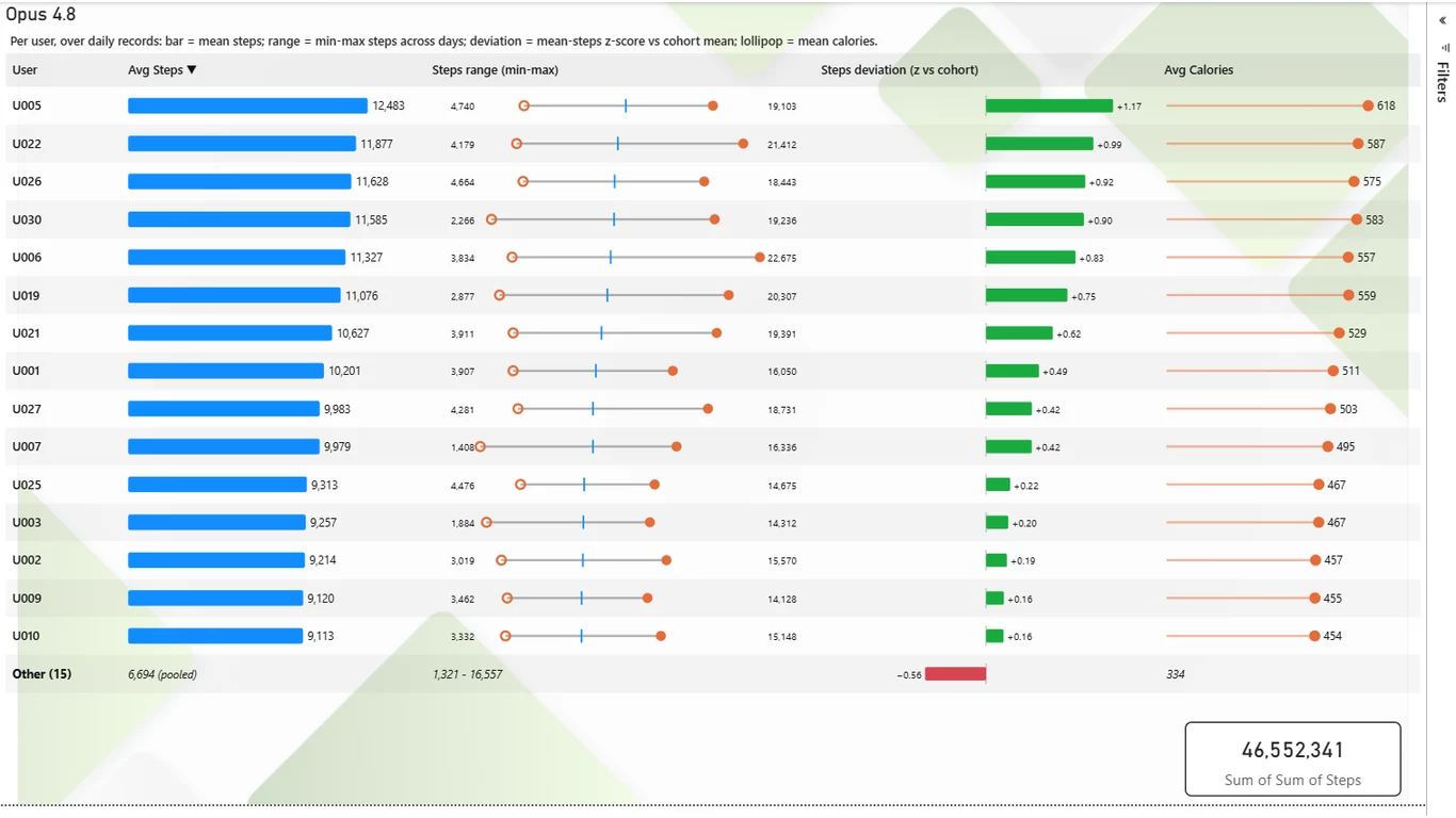
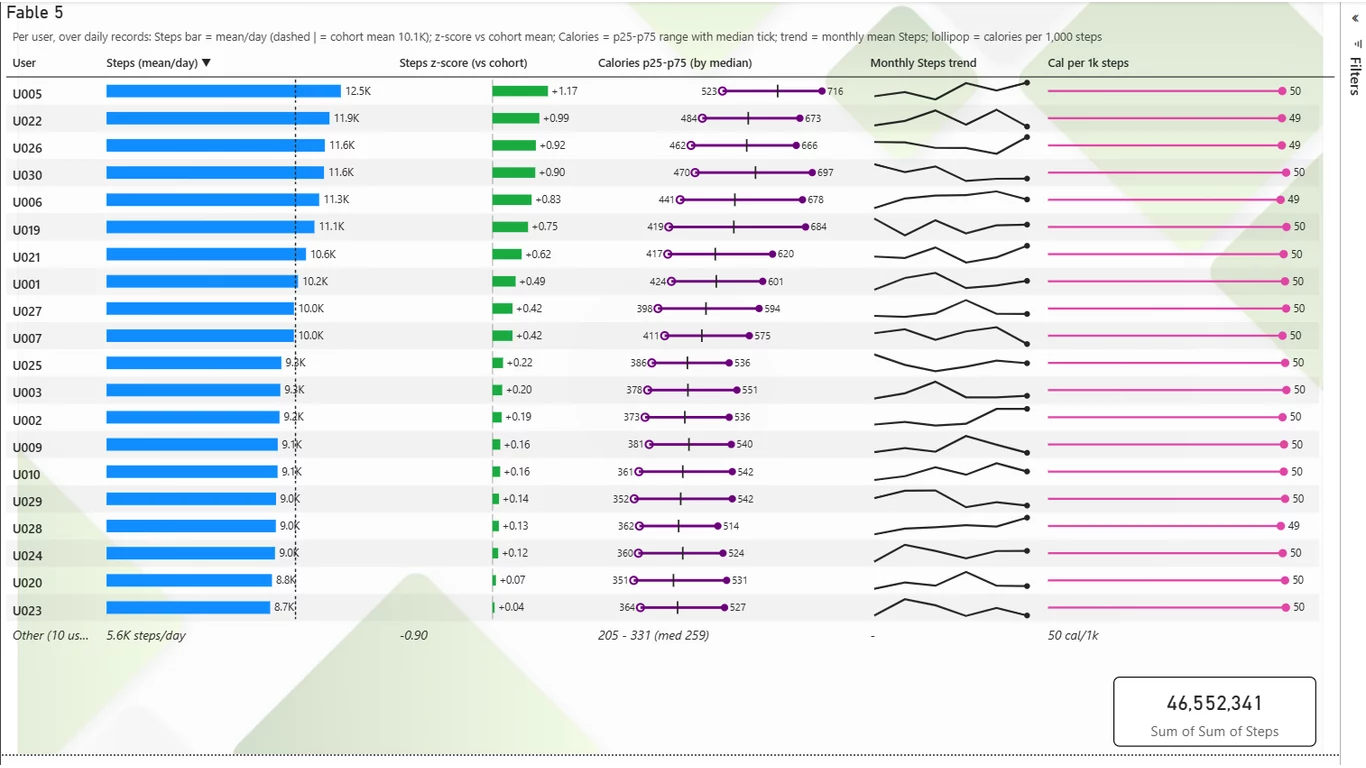
Results using the fitness_tracker_steps dataset (grab it from the
dataset gallery and play along):
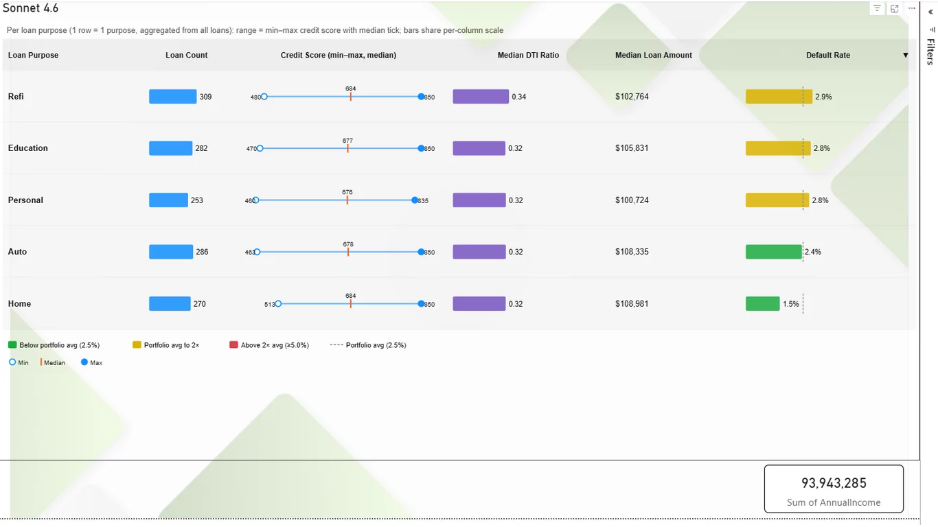
Round two: loan default predictors
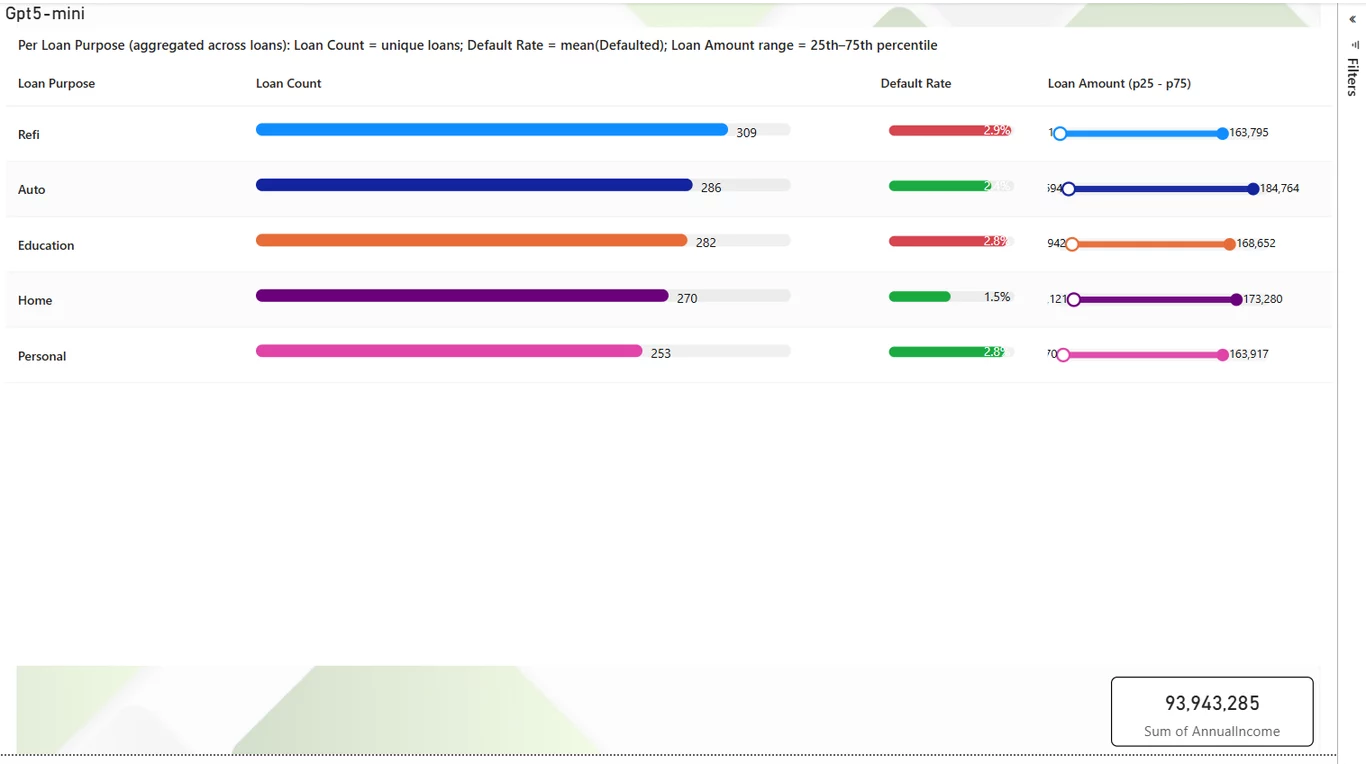
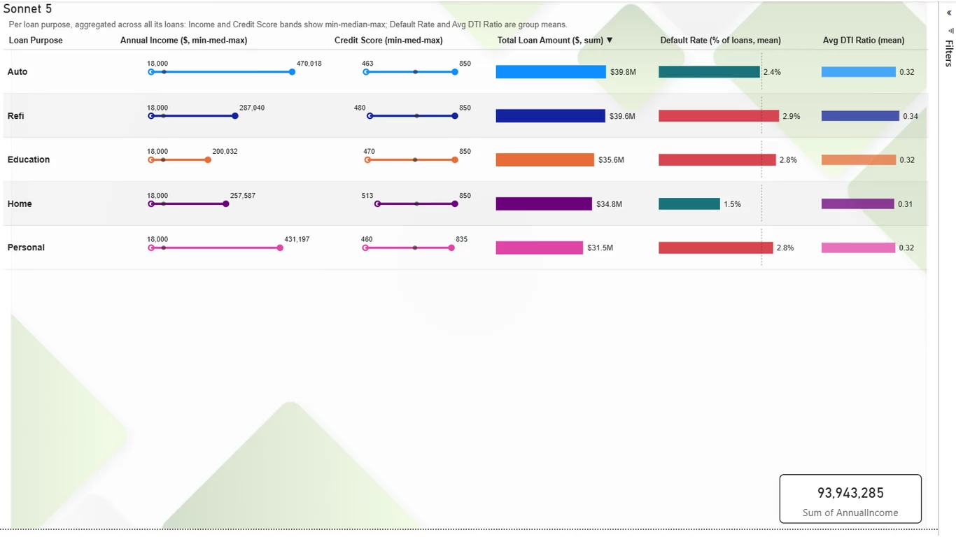
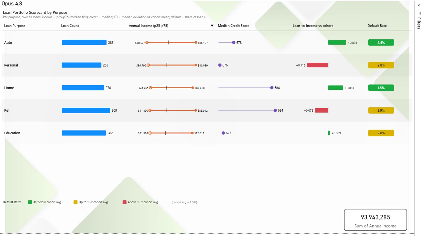
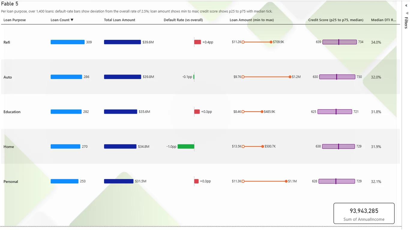
Results using the loan_default_predictors dataset:
What actually happened
First, the honest disclaimer: two runs per model is a small sample and probably unfair. But it is interesting — starting with the fact that every model rendered something usable, from all-fields-no-hints input.
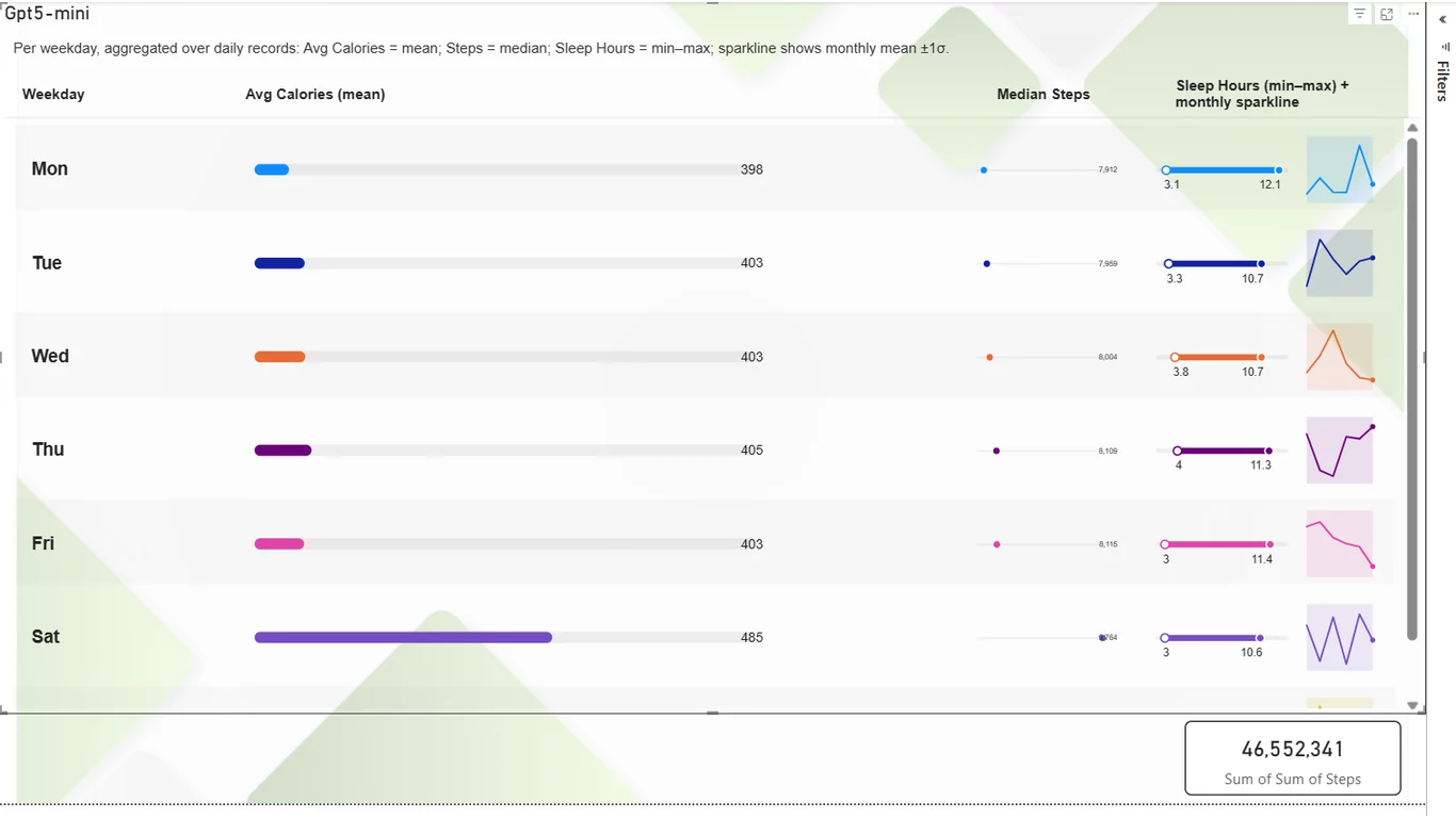
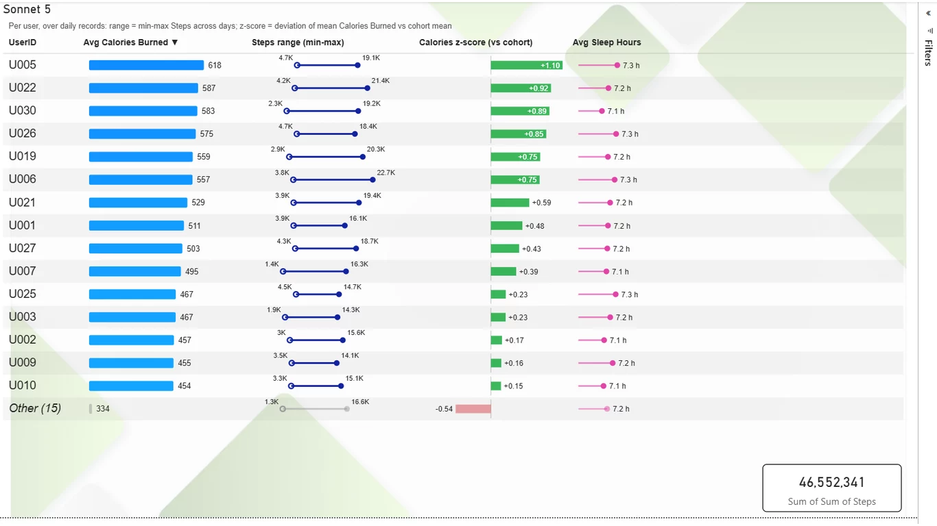
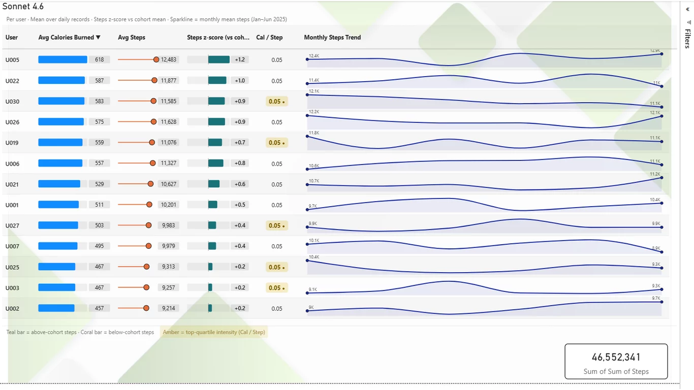
On the fitness data, the models split on summarization strategy: GPT-5-mini grouped by day of the week, while the rest chose a "top N users" framing. Sonnet 4.6 was arguably weakest here — it offered no "Other" grouping, so everything outside its top users simply fell off the page.
On the loan data, everyone independently converged on Loan Purpose as the grouping — a good sign for inference, since nothing in the field list said so. Aesthetically all did fairly well. GPT-5-mini had the most technical rough edges (text truncation, and no click-to-sort on column headers — a nicety the others all delivered). So what's mini's role? Not hopeless — it's cheap and quick — but the others kept winning on the details that separate "renders" from "polished."
Opus 4.8 revealed a genuine weakness on the loan run: the Median Credit Score column used a scale that visually exaggerated a tiny spread (scores from 676 to 684 rendered as dramatically different stem lengths). More on that below — it turns out to illustrate the whole philosophy.
Interactivity, demonstrated
All five models succeeded at cross-filtering. That little Card visual at the bottom of each page? Its entire job is to prove this point. Click a row in the AI-generated table and watch the card change, re-aggregating to just the selected member:
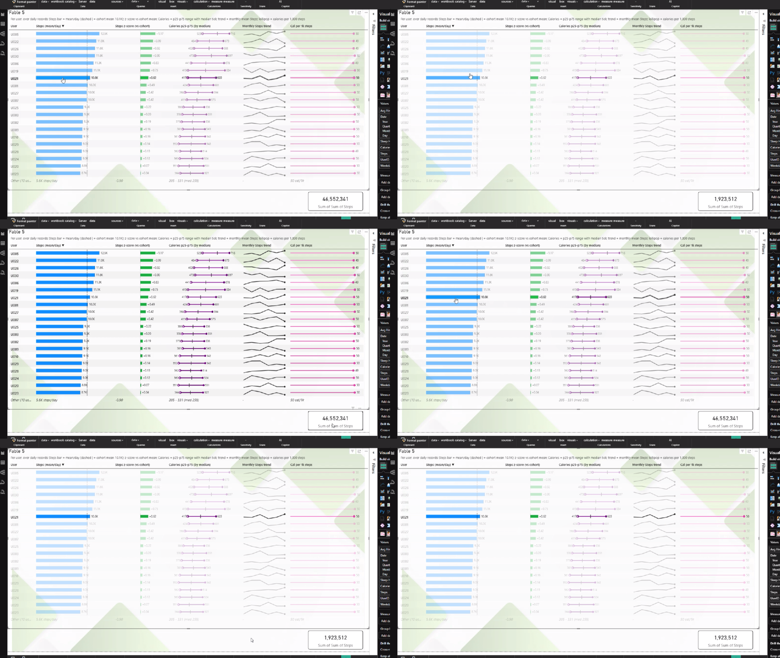
That's the difference between a picture of a chart and a citizen of your report — and it's the kind of thing a static screenshot can't do justice: click, and the rest of the page responds.
Imperfect by nature, better by design
Let's be direct about the Opus scale quirk, because it illustrates the whole philosophy. LLMs don't think; they predict, with some randomness, across a nearly infinite space of possible code. Occasional imperfections cannot be completely eliminated — by us, by Anthropic, by anyone. What can be done is continuous learning: detecting bad patterns, discouraging them, and encouraging good ones. That layer isn't Anthropic's or OpenAI's province — it's mine. Every render teaches the system something, and those guardrails compound.
That scale quirk? Already addressed for future generations — and the fix didn't require a new release of anything you install. That's the practical shape of this: server-side knowledge improves much more frequently than client releases. Something perceived as an issue today can be addressed tomorrow — no reinstall, no waiting on a marketplace approval cycle. (When client updates do matter, the visual's landing page tells you a newer version is available, including pre-release builds.)
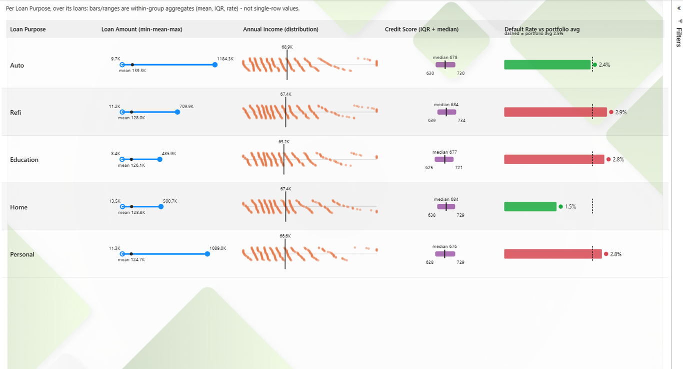
It also means: run these same tests in two months and expect different results — model improvements, catalog changes, and our own server-side refinements all move the needle, generally in one direction. Here's proof, captured after the bake-off above was done. I re-ran the loan dataset through Sonnet 5 — same zero-code setup, same fields, no new hints — and this time it reached for a full distribution plot: a per-purpose beeswarm of the individual loans' Annual Income, which I never asked for. Nothing about my input changed; the server-side guidance did, in the days between. That's the compounding I mean — and it's the kind of richer, more inventive output you should expect more of over time.
When you do want to touch the code
My suggestion is to let the LLM do the heavy lifting and finalize the rest yourself — if you really need to. Version 2 makes that a first-class path: unlock and edit the code-behind of any version you've generated.
From the visual, bring up the summary panel and click Edit code-behind:
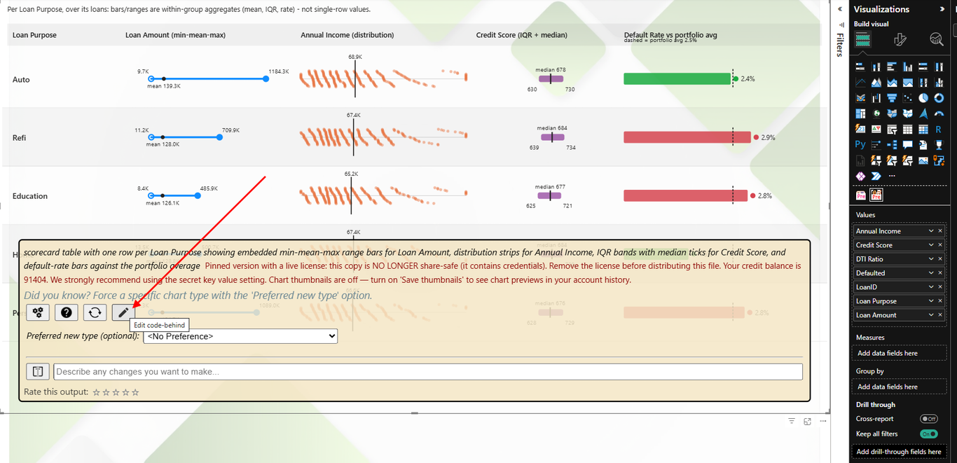
That takes you to your bizintelligencechampions.com account, where the version is exposed for unlocking and editing:
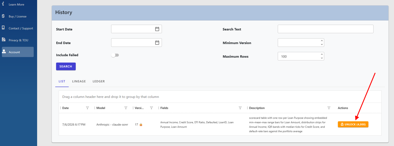
Once unlocked, you can also pin a version. Pinning locks reports to that exact version and strips your credentials from the report file — so clients can consume it without internet connectivity (air-gapped) and without a license, and nobody who gets the file can generate new charts on your dime. It applies per version, and it's what makes the report file itself safe to distribute. (Every visual in this article's demo report is pinned, for exactly that reason.)
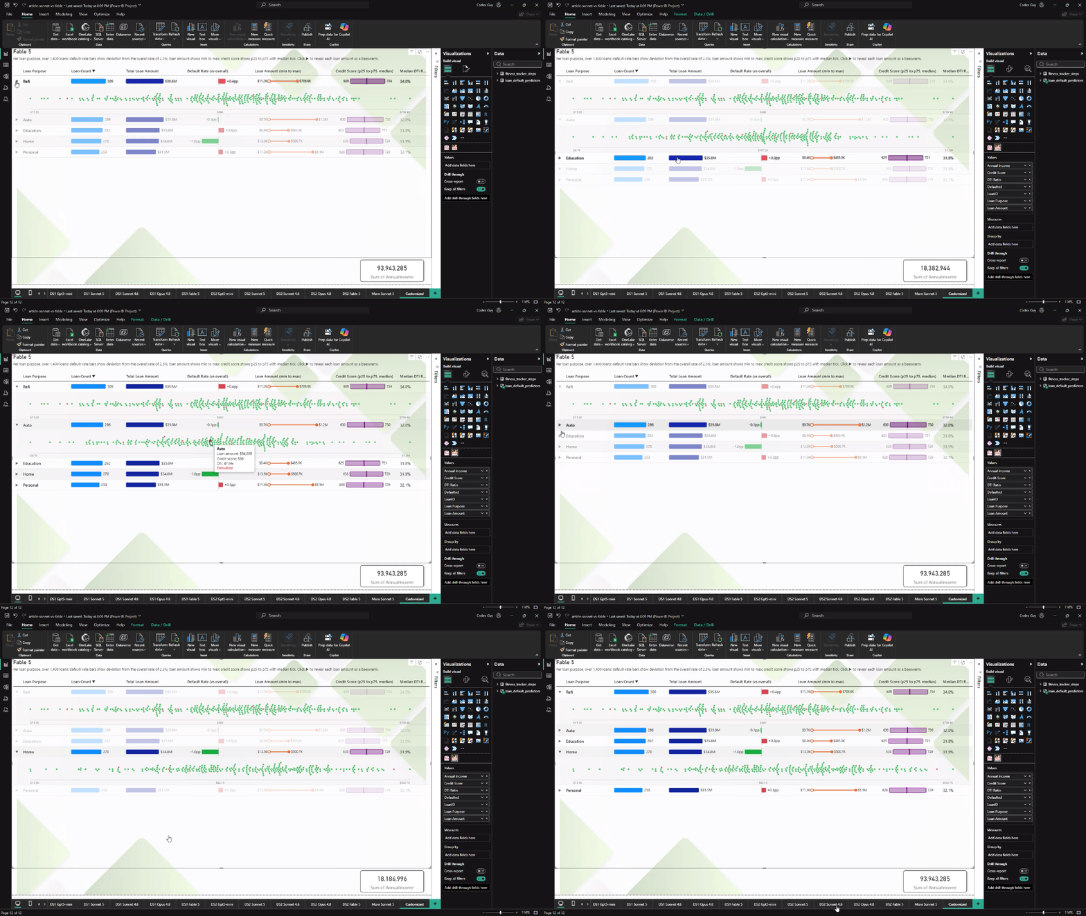
Here's where it gets fun — and where the story comes full circle. The demo report has one extra page, titled simply Customized. It began as the Fable render of the loan data — the same Tabular with embedded you saw above — and then I opened the code-behind and reshaped it.
Two additions. First, a per-row expander: click the ▶ on any loan-purpose row and a panel opens beneath it. Second, and more fun, that panel draws a beeswarm — every individual loan in that purpose plotted as a dot along a loan-amount axis, red for the ones that defaulted, with the exact amount, credit score, and DTI ratio on hover. The summary row tells you the shape of a group; the expander lets you drop straight into the raw loans behind it, without ever leaving the visual.
In fact, I refined the generated code with an AI coding assistant — describing what I wanted in plain English: "shorten the rows, add an accordion, and show a beeswarm of loan amounts in the expanded space" — and iterating a couple of times on the details. So the whole arc is AI-assisted end to end: an LLM generated the base chart inside the visual, and an LLM helped me finish the custom parts. The point isn't that code got written — it's how little of it I wrote by hand, and that the generated base already worked, so every change was incremental. The data binding, the header sorting, and the cross-filtering all kept working right through it.
And none of this is hypothetical — the actual report from this article, Customized page
and all, is yours to download. Open the .pbix in
Power BI Desktop and every render you've seen here works as-is: no license, no account, no
internet required, cross-filtering and all. The two datasets are embedded right in the
file, so there's nothing else to hook up. It's the best kind of proof for both stories —
click through the customization yourself, and confirm there's nothing in the file that
could spend a credit of mine.
So… is Fable worth it?
From this testing and ongoing observation: Fable is good — but it isn't ten times better than Sonnet 5, and it doesn't need to be. The honest framing is cost-benefit. Most days, Sonnet 5 is the right default: fast, strong, and free of drama. But if you have the budget and are looking to improve your odds of "first try wins", Opus and Fable can be worth the try. If a premium model costs $2 where the default costs $1, and it saves you thirty minutes of fighting to get a feature implemented, that's the cheapest half hour you'll buy all week.
Try it
This is what LLM AI Charts v2 delivers: a genuinely turn-key path from plain-English intent to a bespoke, interactive visual — one that folks with even modest Power BI knowledge can drive, and that developers can crack open when they want to.
- Add LLM AI Charts to your Power BI report — there's a free trial mode that needs no account.
- Drop in some fields — or start from a gallery dataset like the two used here.
- Pick Tabular with embedded (or let the model choose), click Generate, and then click on what it draws. That part never gets old.
Or skip straight to kicking the tires: download the article's finished report — everything above, fully interactive, no account needed.
Comments
No comments yet — be the first.
Leave a comment
Your email is never shown — we use it once to confirm the comment.