
Product Documentation
Select a Product:
Find Text:
Submit a question:
Not seeing an answer to a question you might have? You can ask it here and we'll try to update the documentation to address it. If you're making a feature request or reporting a problem, please create a support item for it, instead!
Time-line
Purpose
The time-line visual lets you visualize events on a time-line. Events have textual descriptions and dates of occurrence. The time-line places text intelligently, for readability, using lines to connect text back to points on the time-line. It's possible to group events by week, month, quarter or year, to reduce layout busyness. Events can be discrete points on the time-line (represented by "bullets"), or have both start and end dates (represented by a wider bar on the time-line). Other options are available to control coloring, display of images, layout direction, and categories of events.
Data Bucket
The data requirements for the Time-line include 8 bucket fields, listed here:
| Field | Type | Description | ||||||||||||||||||||||||
|---|---|---|---|---|---|---|---|---|---|---|---|---|---|---|---|---|---|---|---|---|---|---|---|---|---|---|
| Date Source | DateTime | The date on which the event occurred or started. Note: you should use a true date, not a date hierarchy for this value; for example: 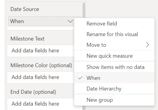 | ||||||||||||||||||||||||
| Event Text | Text | A text description of the event. | ||||||||||||||||||||||||
| Event Color (optional) | Text | If provided, controls the color of the event bullet and/or event text. It should be a valid web color. Invalid colors or an empty value will use the default color. | ||||||||||||||||||||||||
| End Date (optional) | Text or Textual DateTime | When provided, changes the display of the event from a discrete point on the line, to an elongated bullet that spans the start-to-end time range. Value can be the text "Today" (case-insensitive) to imply the current date (eg. an event that continues to and including today). | ||||||||||||||||||||||||
| Image Source (optional) | Text | If provided, needs to be of the form "data:image/XXXX;base64,YYYY", where XXXX is a valid image format (e.g. "png"), and YYYY is the base64 encoded version of the image binary content. Note: you can easily turn an actual image into its base64 encoded format using on-line tools such as https://www.base64-image.de. There is a size limit of approximately 20Kb. | ||||||||||||||||||||||||
| Category (optional) | Text | If provided, acts as a clickable label within the layout to show details, or it can be a static header for all events that share the same category, in a given time block. | ||||||||||||||||||||||||
| Category Color (optional) | Text | If provided, controls the color of the category label. It should be a valid web color. Invalid colors or an empty value will use the default color. | ||||||||||||||||||||||||
| Summary Level (optional) | Text | If provided, should evaluate to one of these text values (case-insensitive): "day", "week", "month", "quarter" or "year". Allows the layout grouping to change using a report slicer, for example. If not provided, a control setting determines the level of grouping. | ||||||||||||||||||||||||
| Value Formatting Expression (optional) (in 1.5) | Text |
If provided, should combine one or more formatting terms. Multiple formatting terms can be separated with semi-colons. Formatting terms are name/value pairs, with the setting name, followed by a colon, followed by a value. Supported formatting settings include:
|
Settings
Data and Interaction
| Field | Default | Description |
|---|---|---|
Range | ||
| Minimum Date (optional) | Optionally specify a start date (becomes the start-of-range and eliminates data prior to this date). | |
| Maximum Date (optional) | Optionally specify an end date (becomes the end-of-range and eliminates data after this date). | |
| End Date is Today | Off | When enabled, the end date is set to today. (Supersedes Start Date is Today.) (in 1.8) |
| Start Date is Today | Off | When enabled, the start date is set to today. (in 1.9) |
| Number of Days | UNSET | Identifies the number of days to show, prior (or after) to the end date. (This determines the start or end date.) 0 implies no day limit. (in 1.8) |
| Number of Months | UNSET | Identifies the number of whole months to show, prior (or after) to the end date. (This determines the start or end date.) 0 implies no month limit. Takes precedence over Number of Days. (in 1.8) |
| Range Padding (Start, days) | UNSET | Extends the timeline by this many days before the earliest event. Gives left-edge events more room to lay out their text and bullets without flipping or crowding the visual edge. 0 disables. (in 1.11) |
| Range Padding (End, days) | UNSET | Extends the timeline by this many days after the latest event. Gives right-edge events more room to lay out their text and bullets without flipping or crowding the visual edge. 0 disables. (in 1.11) |
Aggregation | ||
| Default Summary Level | Day | When the summary level is not set in data, this is the default grouping level for events. |
| Use Even Distribution | Off | When enabled, events are distributed evenly across the timeline. Useful for understanding order as opposed to exact timing. |
| Include Today | Off | When enabled, the current date is included as if an event. |
| Text to show for Today | Today | When the current date is being included, this is the text that is shown for today's date. |
Limits & Truncation | ||
| Maximum Events | 100 | Identifies the maximum number of events allowed to display. Acts as a throttle to ensure no run-away results - can be adjusted up or down as needed but a hard max of 500 events. |
| Truncate for Latest | On | Only useful for when data is being truncated: when enabled, shows the latest events; when disabled, shows the earliest events. |
Interaction | ||
| Enable Tool-tips | On | When enabled, hovering an event shows the Power BI tooltip with date, title, and any tooltip-bound fields. |
Formatting
| Field | Default | Description |
|---|---|---|
Layout | ||
| Line Orientation | Horizontal | Determines the line direction: horizontal or vertical. |
| Distribution Style | Top-Bottom | Controls how events are laid out with respect to the timeline. |
| Width Override | 0 | When greater than zero, becomes the width of the time-line, within the layout space. If the width is larger than the view-port, scrolling will be possible. (in 1.5) |
| Show Labels | On | When disabled, only shows the timeline and bullets - no text. |
| Show Count Label | On | When enabled, an event count is shown below the timeline. |
Spacing | ||
| Item Extra Padding | 0 | Optional additional padding to apply to entire (grouped) event. |
| Title Extra Space | 0 | Optional additional padding to apply on the top and bottom of the title (date). |
| Spacing from Line Override | UNSET | Optionally override the spacing away from the line. |
| Minimum Spacing from Line | UNSET | Minimum vertical (or horizontal in vertical orientation) clearance between the timeline line and any event text. Applied after the layout optimizer so edge events that the optimizer leaves close to the line still get this much breathing room. 0 disables. (in 1.11) |
| Maximum Label Width | UNSET | The maximum content width for items. (If omitted, uses a default.) |
| Minimum Text Width | UNSET | The minimum content width for text. (If omitted, uses a default.) |
| Main Line Thickness | 3 | The height of the main timeline. |
Bullets & Images | ||
| Bullet Style | Hollow Square | Controls the shape of bullets on the timeline. |
| Bullet Size | 2.5 | The size of each bullet. |
| Bullet Border | 3 | The thickness of bullets, on the timeline. |
| Color Style (from data) | Bullet Only | When a color is provided in the source data, identifies where that color is used. |
| Maximum Image Size | 24 | The maximum width and height allowed for any rendered images. |
Grouped Events | ||
| Category Format | Expandable | When a category is provided, identifies how items are rendered - categories can be expandable, only show the category text, or show both the category and event detail. |
| Grouped Format | Date | When displaying a group (multiple events under the same title/date), identifies how to separate events. |
| Grouped Date Style | Italics | When displaying a group (multiple events under the same title/date), identifies text formatting for event dates that are shown for each event. |
| Grouped Sorting | Date Ascending | When displaying a group (multiple events under the same title/date), identifies how to sort events. |
| Show Grouped Format | Only for Multiple | When displaying a group (multiple events under the same title/date), identifies how identifiers are shown for each event. |
| Grouped Value Size | 10 | The size of any caption text. |
Line per Category | ||
| Line per Category Placement | Left | When Line per Category is selected as the Category format, controls where the category text is included for each time-line. |
| Category Share Scale | On | When enabled and using line per category, all lines share the same time scale (automatic min/max date determination based on all category results). |
| Line per Category Font Size | 11 | When Line per Category is selected as the Category format, controls the font size for the category text. |
| Line per Category Text Font | The font family for the line per category text. (in 1.9) | |
| Line per Category Style | None | When Line per Category is selected as the Category format, controls the formatting between / around categories. |
| Line per Category Spacing | UNSET | When Line per Category is selected as the Category format, allows for extra spacing to be included between categories. |
| Line per Category Min Height | UNSET | Optionally set a minimum height for each group band when using line per category. |
| Category Min Label Width | UNSET | When Line per Category is selected as the Category format, sets the minimum width for the category text. |
Date Legend | ||
| Legend Font Size | 12 | When showing date legend text, the font size to use. (in 1.5) |
| Date Legend Text Font | The font family for the date legend text. (in 1.9) | |
Date Formats | ||
| Day Format | yyyy-MM-dd | When displaying at the day level, the format for the date. |
| Week Format | yyyy week wiso | When displaying at the week level, the format for the date. |
| Month Format | yyyy-MM | When displaying at the month level, the format for the date. |
Fonts | ||
| Title Text Size | 11 | The size of the title (date) text. |
| Title Text Font | The font family for the title text. (in 1.9) | |
| Text Size | 10 | The size of the event text. |
| Text Font | The font family for the text. (in 1.9) | |
Localization | ||
| Auto Localize | On | When enabled, many text strings / messages in the visual will be converted to the language determined by the browser, or if a value is provided in the 'Localize to Language' setting, that language code will be used explicitly. Only applies to default message strings. One can provide their own (localized) text though a number of settings (e.g. those with names starting with 'Message:'). (in 1.7) |
| Localize to Language | When 'Auto Localize' is enabled, this setting can override the browser language. This should be the first 2 characters of a standard BCP 47 language code. (in 1.7) | |
| Message: No Data | There is not enough data available to show on a timeline. | The message to show when there is not enough data to show on a timeline. (in 1.6) |
Colors
| Field | Default | Description |
|---|---|---|
Timeline | ||
| Line Color | The color to use for the main timeline. | |
| Title Fore Color | The title foreground color. | |
| Default Bullet Fill Color | The color to use to fill hollow bullets. | |
| Hollow Border Color | For bullets that are hollow (eg. adopts central color from data), the border color to use. | |
Event Text | ||
| Alt Fore Color 1 | For event text, one of two possible foreground colors to use, in alternation. | |
| Alt Fore Color 2 | For event text, one of two possible foreground colors to use, in alternation. | |
| Alt Back Color 1 | For event text, one of two possible background colors to use, in alternation. | |
| Alt Back Color 2 | For event text, one of two possible background colors to use, in alternation. | |
Grouped Events | ||
| Alt Group Back Color 1 | For grouped event text, one of two possible background colors to use, in alternation. | |
| Alt Group Back Color 2 | For grouped event text, one of two possible background colors to use, in alternation. | |
Line per Category | ||
| Alt Back LPC Color 1 | When using Line per Category, one of two possible background colors to use, in alternation over all categories. | |
| Alt Back LPC Color 2 | When using Line per Category, one of two possible background colors to use, in alternation over all categories. | |
Date Legend | ||
| Line Legend Color 1 | When using a colored line legend, one of two possible background colors to use, in alternation. (in 1.5) | |
| Line Legend Color 2 | When using a colored line legend, one of two possible background colors to use, in alternation. (in 1.5) | |
| Legend Text Color | When set, becomes the color used for legend text labels. When not set, picks a color based on rules such as whether a line legend color is set or not. (in 1.5) | |
Mini-chart
| Field | Default | Description |
|---|---|---|
Common | ||
| Placement | Auto | Where the mini-chart sits relative to the event text. Auto lets the chart sit beside or wrap below depending on the surrounding markup. Right, Top, and Bottom force the chart to that position. (in 1.11) |
| Width | 60 | Width of the mini-chart in pixels. (in 1.11) |
| Height | 8 | Height of the mini-chart in pixels. (in 1.11) |
| Scale Minimum | UNSET | The numeric value that maps to an empty bar. Leave blank for auto (uses the smallest mini-chart value found in the data). (in 1.11) |
| Scale Maximum | UNSET | The numeric value that maps to a full bar. Leave blank for auto (uses the largest mini-chart value found in the data). (in 1.11) |
Bar & Blocks | ||
| Fill Color | Color drawn for the value portion of the bar (or filled blocks). For per-row coloring, bind a column or DAX expression returning a color string to the Mini-chart Color data role — that overrides this setting per row. (in 1.11) | |
| Gradient End Color (optional) | When set, the bar style's fill is drawn as a left-to-right gradient from Fill Color (low end of scale) to this color (high end). Ignored when conditional formatting is providing a per-row Fill Color, and when the style is Blocks. (in 1.11) | |
| Background Color | Color drawn behind the value portion (the unfilled part). (in 1.11) | |
| Border Color (optional) | When set, draws a border around the mini-chart. (in 1.11) | |
| Border Thickness | 1 | When a border color is set, the thickness of the border in pixels. (in 1.11) |
| Block Count | 10 | Number of blocks shown when style is Blocks. Filled blocks are proportional to the value within the scale range. (in 1.11) |
Data Label | ||
| Show Data Label | Off | When enabled, shows the numeric value next to the bar, formatted using the column's format string. (in 1.11) |
| Data Label Font Size | 9 | Font size for the data label. (in 1.11) |
| Data Label Font | Font family for the data label. (in 1.11) | |
| Data Label Font Color | Color of the data label text. When unset, the label inherits the surrounding event text color. For per-row coloring, bind a column or DAX expression returning a color string to the Mini-chart Label Color data role — that overrides this setting per row. (in 1.11) | |
License
| Field | Default | Description |
|---|---|---|
| Licensed By | Provide the name that the product was registered with, as found in the confirmation email. | |
| License Key | For site licensing. Provide the 22 character license key, as found in the confirmation email. | |
| Single-user Mode | Off | Enable this only if the report is used by one person and not shared. This hides the footer in Power BI Desktop. The footer never appears outside Desktop. In the Power BI Service, unlicensed use still shows watermarks, which are removed only after licensing. |
Other Resources / Links:
Learn more about purchasing one or more user licenses from Microsoft AppSource.